Exploring College Football Non-Conference Rivalries with {ggraph}
We’re in the middle of College Football’s bowl post-season and I’d been wanting to do a more in-depth post on networks using {tidygraph} and {ggraph} for a while. So now seemed like as good a time as any to explore some College Football data. I had used {ggraph} in prior posts on exploring season’s of MTV’s The Challenge and when sequence mining my web browsing but this post will be more focused on the network visualization than those two posts.
In this post I will explore what are the most common non-Conference games?
But really the goal is to create some fun visualizations that hopefully will tell a story.
Getting Started + The Data
For many of the posts on this blog I tend to web scrape my own data. Initially I had planned to use Wikipedia to get a list of all the Football Bowl Subdivision (FBS) teams and their 2019 schedule to do this analysis. However, this proved difficult to find the right data that was easily accessible. However, there truly is an R package for everything and enter {cfbfastR} which provides access to the College Football Database API and provided me with easy access to all the information I needed. To use this package all that’s needed is registering for a free API key and adding it to your .Renviron file.
In addition to {cfbfastR} for getting the data, I’ll be using {showtext} to access Google Fonts, {tidyverse} for general data manipulation, {tidygraph} for handling the network data, and {ggraph} to handle the network graph plotting. Access to the Google Font Roboto is done using {showtext}’s font_add_google function and then showtext_auto().
library(tidyverse)
library(cfbfastR)
library(tidygraph)
library(ggraph)
library(ggtext)
library(showtext)

font_add_google('Roboto', "roboto")
showtext_auto()
What are the largest non-Conference Rivalries in College Football’s FBS?
The goal will be to create a map showing the links between College Footballs largest non-Conference rivalries. In this case, “largest” will be defined as most frequent. While College Football has many rivalries that are between Conference rivals I wanted to focus on non-Conference because I felt it would make for a better visualization. Additionally, since Conference teams generally have to play each other frequently it would be more difficult to discern a “chosen” rivalry vs. one dictated by conference membership.
The data that I’ll need for this analysis are:
- A list of the FBS schools. I’ll use 2019 data since the 2021 season is still in progress and the 2020 was abnormal.
- A list of all the games played between 2010 and 2019 which is the time-frame I’ll be using for this analysis.
Fortunately, both of these are really easily available from the College Football Data Base. The helper function cfdb_team_info returns all of the FBS schools for the 2019 season with information on the school itself as well as the latitudes and longitudes of the schools saving me the need to geocode.
cfdb_game_info provides all the games for a specified year. In order to get all the seasons between 2010 and 2019 I use map_dfr to iterate over the vector 2010-2019 and row bind each output into a combined data frame.
schools <- cfbd_team_info(year = 2019)

schedule <- map_dfr(2010:2019, cfbd_game_info)
To create a network graph I will need to create datasets to represent the nodes of the graph, in this case schools, and the edges, the match-ups between the two schools. For the nodes this will be straight-forward since I will just need a subset of the columns in schools:
nodes <- schools %>%
  select(id = team_id, school, conference, latitude, longitude)

knitr::kable(head(nodes, 5))| id | school | conference | latitude | longitude |
|---|---|---|---|---|
| 2005 | Air Force | Mountain West | 38.99697 | -104.84362 |
| 2006 | Akron | Mid-American | 41.07255 | -81.50834 |
| 333 | Alabama | SEC | 33.20828 | -87.55038 |
| 2026 | Appalachian State | Sun Belt | 36.21143 | -81.68543 |
| 12 | Arizona | Pac-12 | 32.22881 | -110.94887 |
Edges will be a little trickier since I want this graph to be undirected. If Notre Dame plays USC, I don’t really care who was the home team or the away team, so I’ll need to find a way to count these as the same match-up. While I’m sure there’s a better way to do this I decided to solve this problem by making the team that goes first alphabetically school1 and the other team school2. This will apply a consistent ordering between any match-up.
In order to use the {tidygraph} package the edge list needs to have from and to columns even if the graph is undirected. Then once I have the edge list I construct a weight column by using the count() function from {dplyr}.
I also exclude all conference games using a field that comes in the data set as well as an additional filter to ensure that both nodes are FBS schools since FBS schools can play non-FBS schools during the season.
edge_list <- schedule %>%
  # Remove any conference games
  filter(conference_game == F,
         #require that both the home and away teams are in our graph
         home_id %in% nodes$id,
         away_id %in% nodes$id) %>%
  # apply alphabetical ordering to the two teams
  mutate(
    first_team = if_else(home_team < away_team, home_team, away_team),
    first_id = if_else(home_team < away_team, home_id, away_id),
    second_team = if_else(home_team < away_team, away_team, home_team),
    second_id = if_else(home_team < away_team, away_id, home_id)
  ) %>%
  select(from = first_id, to = second_id, first_team, second_team) %>%
  count(from, to, first_team, second_team, name = 'weight')

knitr::kable(head(edge_list, 5))| from | to | first_team | second_team | weight |
|---|---|---|---|---|
| 2 | 23 | Auburn | San José State | 2 |
| 2 | 97 | Auburn | Louisville | 1 |
| 2 | 166 | Auburn | New Mexico State | 1 |
| 2 | 228 | Auburn | Clemson | 5 |
| 2 | 264 | Auburn | Washington | 1 |
An interpretation of this first row is that Auburn played San Jose State twice between 2010 and 2019 and only played Louisville once.
The {tidygraph} package has its own structure called a tbl_graph which combines the nodes and edges into a single data structure and allows the user to manipulate either portion. While there is a constructor specifically for the tbl_graph object, I was having trouble getting it to work so I used graph_from_data_frame from {igraph} and then cast the graph to a tbl_graph.
Also, no disrespect to the University of Hawaii but their presence really messes up the graph since Hawaii is so far from the other schools. So I’m just going to exclude them.
g <- igraph::graph_from_data_frame(d = edge_list, directed = F, vertices = nodes) %>%
  as_tbl_graph() %>%
  filter(!str_detect(school, 'Hawai'))

print(g)
## # A tbl_graph: 129 nodes and 1137 edges
## #
## # An undirected simple graph with 1 component
## #
## # Node Data: 129 x 5 (active)
## name school conference latitude longitude
## <chr> <chr> <chr> <dbl> <dbl>
## 1 2005 Air Force Mountain West 39.0 -105.
## 2 2006 Akron Mid-American 41.1 -81.5
## 3 333 Alabama SEC 33.2 -87.6
## 4 2026 Appalachian State Sun Belt 36.2 -81.7
## 5 12 Arizona Pac-12 32.2 -111.
## 6 9 Arizona State Pac-12 33.4 -112.
## # ... with 123 more rows
## #
## # Edge Data: 1,137 x 5
## from to first_team second_team weight
## <int> <int> <chr> <chr> <int>
## 1 10 90 Auburn San José State 2
## 2 10 52 Auburn Louisville 1
## 3 10 70 Auburn New Mexico State 1
## # ... with 1,134 more rowsNote that the output contains two sets of data, one for nodes and one for edges. Also note, that the nodes are noted as (active). There is a function called activate which will let a user switch between node and edge data within the tbl_graph object and use functions like mutate, filter, etc. on the data.
Visualizing the Graph
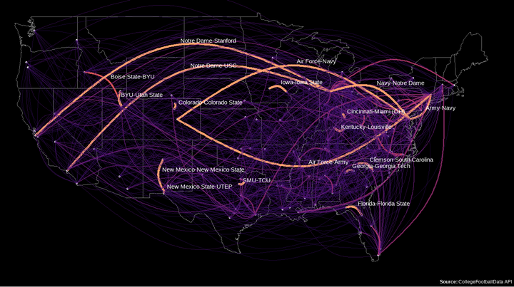
Normally, a graph can be displayed using any number of algorithms to show optimal clustering and separation. However, in this case my nodes are actual schools with actual locations given by their latitudes and longitudes. So for my graph, if I want to show them on a United States map I will need to create a layout that forces the nodes in their true geographic positions. This can be done using the create_layout function which takes the graph and then x and y positions. Since those x and y positions need to be in the same order as the nodes in the graph object I’m just going to reference the graph object directly when populating x and y.
lay = create_layout(g, 'manual', x= g %>% pull(longitude), y=g %>% pull(latitude))With the layout in place I can construct the graph. The syntax for {{ggraph}} isn’t much different from {{ggplot2}}. The main difference is in the starting function where {{ggraph}} takes in a graph and/or a layout. In this case because my custom layout already contains the graph I can just pass in the layout. Then there are some specific geoms for the graphs such as geom_node_point which places a point at each node, and geom_edge_arc which draws an arc for each edge with the strength parameter controlling how “arc-y” to make the edge (as opposed to a straight line which could be done with geom_edge_link). Then there are some specific styles like edge_alpha vs. alpha. But if you’re familiar with {ggplot2}} then this syntax shouldn’t be too different. The only other piece which I had never used before was borders("state", color = 'grey90') to draw the US state borders.
While the more common games will show up with thicker and brighter lines not everyone knows the location of every FBS college in the US. So for the match-ups that occurred in at least of 8 of the 10 available years, I’ll add labels to the edges.
ggraph(lay) +
  borders("state", color = 'grey90') +
  geom_node_point(color = 'grey90') +
  geom_edge_arc(strength = 0.1,
                aes(edge_alpha = weight,
                    edge_color = weight,
                    edge_width = weight,
                    label = if_else(weight >= 8,
                                    paste0(first_team,'-',second_team), "")
                ),
                vjust = -.5,
                hjust = 0,
                label_colour = 'white',
                label_size = 6) +
  scale_edge_color_viridis(begin = .2, end = .8, option = "A", direction = 1,
                           labels = round) +
  scale_edge_width_continuous(range = c(.5, 1.5), guide = 'none') +
  scale_edge_alpha_continuous(guide = 'none', range = c(0.1, 1)) +
  labs(title = "NCAA FBS Non-Conference Games (2010 - 2019)",
       caption = '**Source:** CollegeFootballData API',
       edge_color = "# of Games Played") +
  theme(
    panel.background = element_rect(fill = 'black'),
    plot.background = element_rect(fill = 'black'),
    plot.caption = element_markdown(color = 'white', size = 16),
    plot.subtitle = element_textbox_simple(family = 'roboto', size = 20,
                                           color = 'white'),
    plot.title = element_markdown(hjust = .5, family = 'roboto',
                                  color = 'white', size = 40),
    legend.position = 'bottom',
    legend.title = element_text(family = 'roboto', size = 20, color = 'white',
                                vjust = 1),
    legend.text = element_text(family = 'roboto', size = 20, color = 'white'),
    legend.background = element_rect(fill = 'black')
  )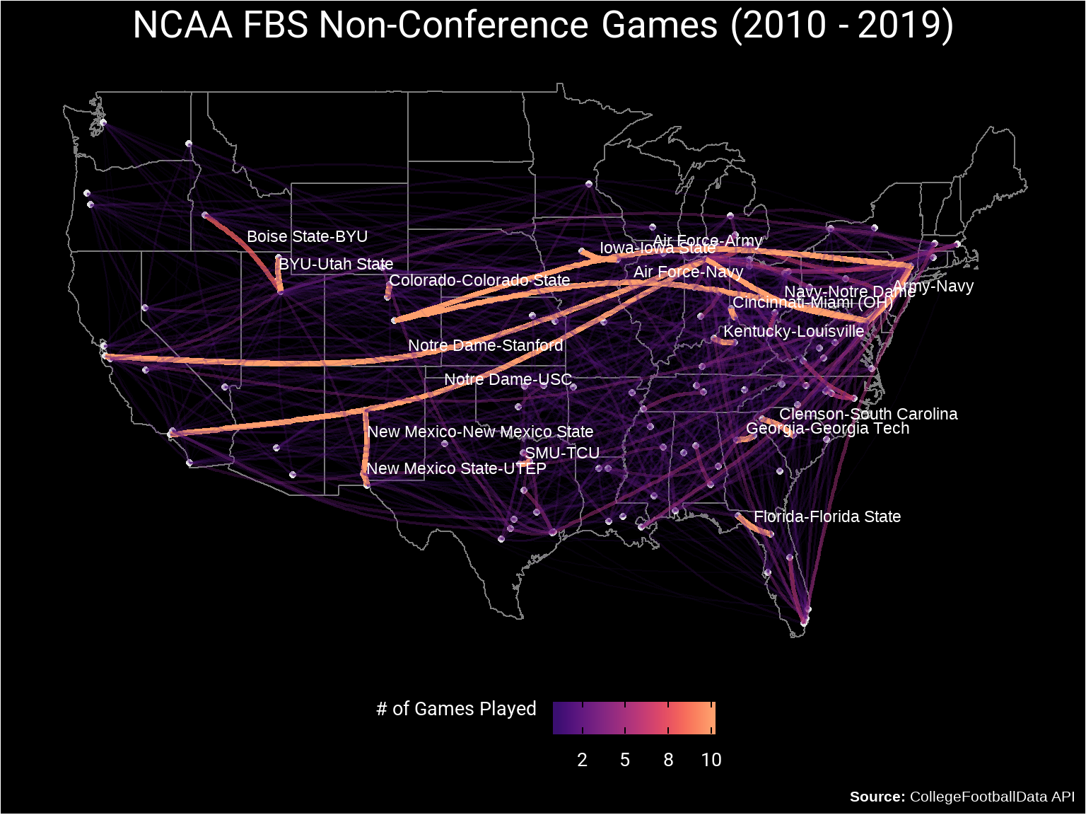
Analysis
Besides looking cool (in my opinion) this chart shows an edge for every non-conference game that occurred between 2010 and 2019 which is a lot of games. But to answer the questions of the largest Non-Conference rivalries there are a couple of patterns that arise:
- The independent schools are over-represented which is not surprising since all of their games are non-conference games. This includes Notre Dame and BYU.
- Games between schools that are in-state but in different conferences (Florida vs. Florida State, Colorado vs. Colorado State, Clemson vs. South Carolina, Georgia vs. Georgia Tech).
- Games between schools that have functional reasons to be rivals such as the three service academies (Army, Navy, and Air Force).
While not terribly surprising for anyone that follows college football, this post hopefully shows how you can create a network graph out of geographic coordinates and fix the layout so that it can be applied on top of a real map.
In the next post I’ll be continuing on the theme of College Football and network graphs to see what we can learn about Conference Realignment!