How have the AFI Top 30 Movies Changed Between 1998 and 2007?

During COVID I’ve started watching some older “classic” movies that I hadn’t seen before but felt for whatever reason I should have seen as a movie fan. Last week, I had watched The Third Man after listening to a podcast about Spy Movies. After watching it I was surprised to find out that while it was named the Top British Film of All-Time it is NOT in the AFI Top 100 list that was refreshed in 2007. However, it was in the original list of 1998.
This got me thinking about what were all the differences between the original 1998 list and the revised 2007 list. And while the results are very clearly in the Wikipedia table I though it would be fun to try out a visualization using bump charts. This posts utilizes the ggbump package to make the bump chart and much of the code and style in this post is influenced from the package README.
Libraries
The main parts of this post will be:
- Scraping the table from Wikipedia using
rvest - Doing some light transformations with
dplyr - Doing the plotting with
ggplot2,ggbump, and a couple of other packages for fonts.
library(rvest)
library(tidyverse)
library(glue)
library(ggbump)
library(ggtext)
library(showtext)
When making the plot I wanted to leverage the font that’s actually used on the American Film Institute web-page which turned out to be the Google Font Nunito. Using the showtext package, I can install the Google fonts into the R session and load them for use in plotting. The function font_add_google from the showtext package takes two arguments, the name of the Google Font and a family alias that can be used to refer to the font later. For example, in the code below, I’ll be referring to “Nunito” as the “afi” family later on. The showtext_auto call allows for the family aliases to be used in future code.
# Load Google Font
font_add_google("Nunito", "afi")
font_add_google("Roboto", "rob")
showtext_auto()
Scraping the Data
The data for the original and new AFI Top 100 Lists are in the same table on the AFI 100 Years… 100 Movies Wikipedia table. I’ll be using rvest to grab the table and import it into a tibble. I do this by providing rvest with the URL using read_html, search for a specific CSS class with html_element and then extract the information from the table with html_table. Since rvest will take the column names exactly from the table, which will include spaces, I’ll use the janitor::clean_names() function to replace spaces with underscores and add characters before names that start with numbers. 1998 Rank will then become x1998_rank.
tbl <- read_html('https://en.wikipedia.org/wiki/AFI%27s_100_Years...100_Movies') %>%
  html_element(css = '.sortable') %>%
  html_table() %>%
  janitor::clean_names()
The first three rows of this data set will look like:
| film | release_year | director | x1998_rank | x2007_rank | change |
|---|---|---|---|---|---|
| Citizen Kane | 1941 | Orson Welles | 1 | 1 | 0 |
| Casablanca | 1942 | Michael Curtiz | 2 | 3 | 1 |
| The Godfather | 1972 | Francis Ford Coppola | 3 | 2 | 1 |
Data Transformation
In order to get the data ready for use in ggplot there are a few data transformation steps that need to happen:
- I’d like the labels for the plot to include both the title of the film as well as its year of release. I will use the
gluepackage to easily combine the film and release_year columns. - I want to clean up the rows for movies that aren’t in both lists by replacing the “-” label with
NAs. This is done usingacross()andna_ifto replace the “-” characters in the two rank columns withNA. - I need to turn the tibble from wide format to long format with
pivot_wider - Finally, I want to have rank be an integer and I want to remove the leading “x” character from the year column
tbl2 <- tbl %>%
  mutate(title_lbl = glue("{film} ({release_year})"),
         across(ends_with('rank'), ~na_if(., "—"))
  ) %>%
  pivot_longer(
    cols = contains('rank'),
    names_to = 'year',
    values_to = 'rank'
  ) %>%
  mutate(year = str_remove_all(year, '\\D+') %>% as.integer(),
         rank = as.integer(rank))
Now we have 1 row for each instance on a movie for each list. For example, Citizen Kane appears in both lists so it appears in two rows in the data.
| film | release_year | director | change | title_lbl | year | rank |
|---|---|---|---|---|---|---|
| Citizen Kane | 1941 | Orson Welles | 0 | Citizen Kane (1941) | 1998 | 1 |
| Citizen Kane | 1941 | Orson Welles | 0 | Citizen Kane (1941) | 2007 | 1 |
| Casablanca | 1942 | Michael Curtiz | 1 | Casablanca (1942) | 1998 | 2 |
Creating the Plot
In order to make the plot readable, I’ll only be looking at the Top 30 films rather than the full Top 100. I’ll be using a bump chart do the comparison. Bump charts are a visualization technique good for looking at changes in rank over time. There is a package ggbump which provides a ggplot2 geom (geom_bump) to handle the lines for a bump chart. Movies that appear in only one list will not have a line.
As for what the code does, the first section above the theme() call does most of the work by having the points, lines, and titles as well as scaling the axes to the right sizes. Note that in the geom_text calls, I’m using family = ‘rob’ to refer to the Roboto font downloaded earlier. The theme call handles a lot of the formatting and the geom_text() and geom_point() calls after the theme() section create the white circles that contain the ranks.
##Plot
num_films = 30

tbl2 %>%
  filter(rank <= num_films) %>%
  ggplot(aes(x = year, y = rank, color = title_lbl)) +
  #Add Dots
  geom_point(size = 5) +
  #Add Titles
  geom_text(data = . %>% filter(year == min(year)),
            aes(x = year - .5, label = title_lbl), size = 5, hjust = 1, family = 'rob') +
  geom_text(data = . %>% filter(year == max(year)),
            aes(x = year + .5, label = title_lbl), size = 5, hjust = 0, family = 'rob') +
  # Add Bump Lines
  geom_bump(size = 2, smooth = 8) +

  # Resize Axes
  scale_x_continuous(limits = c(1990, 2014),
                     breaks = c(1998, 2007),
                     position = 'top') +
  scale_y_reverse() +
  labs(title = glue("How has the AFI Top {num_films} Movies Changed Between Lists"),
       subtitle = "Comparing 1998 and 2007s lists",
       caption = "***Source:*** Wikipedia",
       x = "List Year",
       y = "Rank") +
  # Set Colors and Sizes
  theme(
    text = element_text(family = 'afi'),
    legend.position = "none",
    panel.grid = element_blank(),
    plot.title = element_text(hjust = .5, color = "white", size = 20),
    plot.caption = element_markdown(hjust = 1, color = "white", size = 12),
    plot.subtitle = element_text(hjust = .5, color = "white", size = 18),
    axis.line = element_blank(),
    axis.ticks = element_blank(),
    axis.text.y = element_blank(),
    axis.title.y = element_blank(),
    axis.text.x = element_text(face = 2, color = "white", size = 18),
    panel.background = element_rect(fill = "black"),
    plot.background = element_rect(fill = "black")
  ) +
  ## Add in the Ranks with the Circles
  geom_point(data = tibble(x = 1990.5, y = 1:num_films), aes(x = x, y = y),
             inherit.aes = F,
             color = "white",
             size = 7,
             pch = 21) +
  geom_text(data = tibble(x = 1990.5, y = 1:num_films), aes(x = x, y = y, label = y),
            inherit.aes = F,
            color = "white",
            fontface = 2,
            family = 'rob') +
  geom_point(data = tibble(x = 2013.5, y = 1:num_films), aes(x = x, y = y),
             inherit.aes = F,
             color = "white",
             size = 7,
             pch = 21) +
  geom_text(data = tibble(x = 2013.5, y = 1:num_films), aes(x = x, y = y, label = y),
            inherit.aes = F,
            color = "white",
            fontface = 2,
family = 'rob') 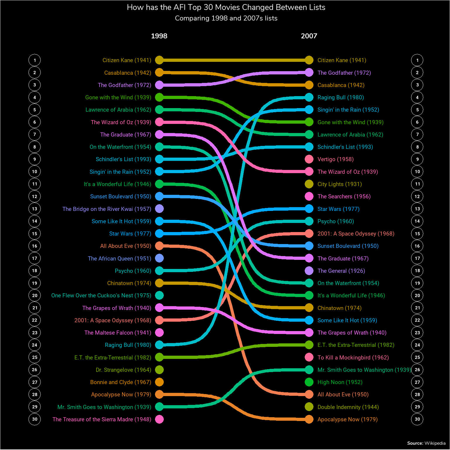
Conclusion
While the Wikipedia page tells you exactly what changed between the two lists it provided an opportunity for me to get some practice with making some “nicer” looking ggplot charts and to try out a bump chart and the ggbump package. As for an interpretation of the chart, there’s a couple of things I don’t really understand between the two lists. Mainly why Raging Bull suddenly jumps from the 24th best film to the 4th. Or why City Lights jumps 65 places from 76th to 11th. I guess I’ll just have to watch and find out.