Predicting When Kickers Get Iced with {tidymodels}
I’m constantly on the lookout for things I can use for future posts for this blog. My goal is usually two-fold. First, what is a tool or technique I want to try/learn and second is there an interesting data set that I can use with those tools. I’d been wanting to play around with {tidymodels} for a while but hadn’t found the right problem. Watching some of the NCAA bowl games over the winter break finally provided me with a use-case. My original question of whether icing the kicker really works? will be explored in a future post but it led to the question for this post which will explore predicting when coaches will choose to ice the kicker.
This post will explore the data gathering process from the College Football Database, the modeling process using tidymodels, and explaining the model using tools such as variable importance plots, partial dependency plots, and SHAP values.
Huge thanks to Julia Silge whose numerous blog posts on tidymodels were instrumental as a resource for learning the ecosystem.
Part I: Data Gathering
To determine whether or not a potential field goal attempt will get iced or not I’ll need data on each field goal attempt, I’ll need a definition of what is icing the kicker, and I’ll need other features that would be predictive of whether or not a kicker will be iced.
Wikipedia defines “icing the kicker” as “the act of calling a timeout immediately prior to the snap in order to disrupt the process of kicking a field goal”. Therefore, we’ll define a field goal attempt as being iced if a timeout is called by the defense directly before it.
The data for this post comes from the College Football Database More details on this API can be found in my earlier post on Exploring Non-Conference Rivalries so the set-up will not be covered here. Play-by-Play data from any game can be accessed from the cfbd_pbp_data() function.
Looking at the returned data, the features that I’ll explore as potentially predictive are:
- Regulation Time Remaining in the Game (or if the game is in overtime)
- Distance of the Field Goal Attempt
- The Score Difference
- Whether the kicking team is the home team
- Whether the kicking team has missed earlier in the game
- The pre-game winning probability of the kicking team (to assess whether the game is expected to be close)
The packages needed for the data gathering process are tidyverse for data manipulation and cfbfastR to access the API.
library(cfbfastR)
library(tidyverse)
For convenience I’ll be looking at NCAA Regular Season football games between 2013 and 2021. The API notes that prior to the College Football Playoff in 2014 the regular season was weeks 1-14 and since 2014 its been weeks 1 to 15. To create a loop of the weeks and years to pass to the data pull function I’ll use expand.grid() to create all combinations of weeks and years and then apply a filter to keep only valid weeks.
grid <- expand.grid(
  year = 2013:2021,
  week = 1:15
) %>%
  arrange(year, week) %>%
  # Before 2014 there were only 14 regular season weeks
  filter(year > 2014 | week <= 14)
The API does provide options to specify which types of plays to return. However, to determine whether or not a timeout was called immediately before it I’ll need to pull the data for EVERY play to accurately apply a lag function. Since I don’t want to keep every play at the end of the day, I’ll create a function to handle the API call and some post processing using the grid of weeks and years above as inputs to the function. I use map2_dfr() from purrr to iterate over two parameters into a function.
The call to cfbd_pbp_data() with week and year parameters will return the play by play data for every game in that week. To process the data I subset to relevant columns, create some lagged columns to determine the time that the play started (since the time in the data reflects the end of play) and the plays that came immediately before. The information from the lagged variables get used to define the dependent variable is_iced as if the prior play was a timeout called by the defensive team during the same drive then we’ll consider the attempted to be iced.
Then I create some additional values that will be used in the modeling, subset my data to only be field goal attempts (and remove any duplicated rows that unfortunately exist), and create the variable for whether the kicking team had a prior miss in the game.
###Get Play by Play Data
fg_attempts <- map2_dfr(grid$year, grid$week, function(year, week){


  plays <- cfbd_pbp_data(year=year, week=week, season_type = 'regular') %>%
    group_by(game_id) %>%
    arrange(id_play, .by_group = TRUE) %>%
    #Subset to only relevant columns
    select(offense_play, defense_play, home, away,
           drive_start_offense_score, drive_start_defense_score,
           game_id, drive_id, drive_number, play_number,
           period, clock.minutes, clock.seconds, yard_line, yards_gained,
           play_type, play_text, id_play,
           drive_is_home_offense,
           offense_timeouts,
           defense_timeouts,
           season, wk) %>%
    mutate(
      # Get prior play end time to use as current play start time
      play_start_mins = lag(clock.minutes),
      play_start_secs = lag(clock.seconds),
      # Get previous plays
      lag_play_type = lag(play_type),
      lag_play_text = lag(play_text),

      # Create Other Variables
      is_iced = coalesce(
        if_else(
          # If the same drive, the immediately prior play was a timeout
          # called by the defensive team
          drive_id == lag(drive_id) &
            play_number - 1 == lag(play_number) &
            lag_play_type == 'Timeout' &
            str_detect(str_to_lower(lag_play_text), str_to_lower(defense_play)),
          1,
          0
        ),
        0
      ),
      score_diff = drive_start_offense_score - drive_start_defense_score,
      time_remaining_secs = 60*play_start_mins + play_start_secs,
      fg_made = if_else(play_type == 'Field Goal Good', 1, 0)
    ) %>%
    ungroup() %>%
    ## Keep only Field Goal Attempt Plays
    filter(str_detect(play_type, 'Field Goal'),
           !str_detect(play_type, 'Blocked')) %>%
    #Distinct Out Bad Rows
    distinct(game_id, drive_id, period, clock.minutes, clock.seconds, play_type, play_text,
             .keep_all = T) %>%
    ## Determine if the offensive team has missed a field goal once already during the game
    group_by(game_id, offense_play) %>%
    mutate(min_miss = min(if_else(play_type == 'Field Goal Missed', id_play, NA_character_), na.rm = T),
           prior_miss = if_else(id_play <= min_miss | is.na(min_miss), 0, 1)
    ) %>%
    ungroup()
  }
)
Getting the offensive win probabilities has to come from a separate function, cfbd_metrics_wp_pregame(). This function came return a season’s worth of data by only calling the year. Using map_dfr with the years 2013 to 2021 will return this data.
betting_lines <- map_dfr(unique(grid$year), ~cfbd_metrics_wp_pregame(year = .x, season_type = 'regular'))The final step is adding the win probability data to the play by play data by joining the data and assigning the win probability for each play to the offensive team vs. home/away. Finally, I do some final data cleaning to not have negative timeouts remaining, extracting the attempted distance of the field goal from a play-by-play string, and defining the regulation time remaining. The last step is removing attempts where icing the kicker would be impossible. Since the defense needs a timeout to be able to ice, any attempt where the defense has no timeouts gets excluded.
fg_data <- fg_attempts %>%
  inner_join(betting_lines %>%
               select(game_id, home_win_prob, away_win_prob),
             by = "game_id") %>%
  mutate(offense_win_prob = if_else(offense_play == home, home_win_prob, away_win_prob),
         defense_timeouts = pmax(defense_timeouts, 0),
         regulation_time_remaining = if_else(
           period > 4, 0, (4-period)*900+pmin(time_remaining_secs, 900)),
         attempted_distance = coalesce(str_extract(play_text, '\\d+') %>% as.numeric(),
                                       yards_gained)
         ) %>%
  #Need to Ensure that Icing Could Occur
  filter(defense_timeouts > 0 | is_iced)
The result of this is a dataset of 19,072 field goal attempts covering 6,435 games over 9 seasons. of the 19,072 attempts, 804 (4%) would be considered as iced.
Part 2: Building the Model
Normally, I would do some EDA to better understand the data set but in the interest of word count I’ll jump right into using tidymodels to predict whether or not a given field goal attempt will be iced. In order to make the data work with the XGBoost algorithm I’ll subset and convert some numeric variables including our dependent variable to factors. A frustrating thing I learned in writing this post is that with a factor dependent variable the assumption is that the first level is the positive class. I’m recoding is_iced to reflect that. The libraries I’ll be working with for the modeling section are tidymodels for nearly everything and themis to use SMOTE to attempt to correct class imbalance, and finetune to run the tune_race option.
library(tidymodels)
library(themis)
library(finetune)
model_data <- fg_data %>%
transmute(
regulation_time_remaining,
attempted_distance,
drive_is_home_offense = if_else(drive_is_home_offense, 1, 0),
score_diff,
prior_miss = if_else(prior_miss==1, 'yes', 'no'),
offense_win_prob,
is_overtime = if_else(period > 4, 1, 0),
is_iced = factor(is_iced, levels = c(1, 0), labels = c('iced', 'not_iced'))
)One of the powerful pieces of the tidymodels ecosystem is that its possible to try out different pre-processing recipes and model specifications with ease. For example, this dataset is heavily class imbalanced, I can easily try two versions of the model where one attempts to correct for this and one that does not. To assess how good a job my model does at predicting future data I’ll split by data into a training set and test set, stratifying on is_iced to ensure the dependent variable is balanced across the slices. The initial_split() function creates the split with a default proportion of 75% and training() and testing() extracts the data.
set.seed(20220102)
ice_split <- initial_split(model_data, strata = is_iced)
ice_train <- training(ice_split)
ice_test <- testing(ice_split)
One thing to note is that XGBoost has many tuning parameters so I’ll use cross-validation to figure out the best combination of hyper-parameters. The vfold_cv() function will take the training data and split it into 5 folds again stratifying by the is_iced variable.
train_5fold <- ice_train %>%
  vfold_cv(5, strata = is_iced)
Tidymodels
My interpretation of the building blocks are recipes which handle how data should pre-processed, specifications which tells tidymodels which algorithms and parameters to use, and workflows that bring them together. Since I’ve done most of the pre-processing in the data gathering piece these recipes will be pretty vanilla. However, this data is heavily imbalanced with only 4% of attempts being iced. So I will have two recipes. The first sets up the formula and one-hot encodes the categorical variables.
rec_norm <- recipe(is_iced ~ ., data = ice_train) %>%
  step_dummy(all_nominal_predictors(), one_hot =T)
and the second will add a second step that uses step_smote() to create new examples of the minority class to fix the class imbalance problem.
rec_smote <- recipe(is_iced ~ ., data = ice_train) %>%
  step_dummy(all_nominal_predictors(), one_hot = T) %>%
  step_smote(is_iced)
Then I’ll define my specification. The hyper-parameters that I want to tune are set to tune() and then I tell {tidymodels} that I want to use XGBoost for a classification problem.
xg_spec <- boost_tree(
  trees = tune(),
  tree_depth = tune(),
  min_n = tune(),
  loss_reduction = tune(),
  sample_size = tune(),
  mtry = tune(),
  learn_rate = tune(),
  stop_iter = tune()
) %>%
  set_engine("xgboost") %>%
  set_mode("classification")
The recipes and specifications are combined in workflows (if using 1 recipe and 1 specification) or workflow sets if wanting to use different combinations. In the workflow_set() function you can specify a list of recipes as preproc and a list of specifications as models. The cross parameter being set to true creates every possible combination. For this analysis I’ll have 2 preproc/model combinations:
wf_sets <- workflow_set(
  preproc = list(norm = rec_norm,
                 smote = rec_smote),
  models = list(vanilla = xg_spec),
  cross = T
)
Next step is setting up the grid of parameters that will be tried in the model specifications above. Since there a lot of parameters to be tuned and I don’t want this to run forever I’m using grid_latin_hypercube to set 100 combinations of parameters that try to cover the entire parameter space but without running every combination.
grid <- grid_latin_hypercube(
  trees(),
  tree_depth(),
  min_n(),
  loss_reduction(),
  sample_size = sample_prop(),
  finalize(mtry(), ice_train),
  learn_rate(),
  stop_iter(range = c(10L, 50L)),
  size = 100
)
Finally its time to train the various workflows that have been designed. To do this I’ll pass the workflow_set defined above into the workflow_map() function. The “tune_race_anova” specification tells the training process to abandon certain hyper-parameter values if they’re not showing value. More detail can be found Julia Silge’s post. Also passed into this function are the resamples generated from the 5 folds, the grid of parameters, a control set that will save the predictions and workflows so that I can revisit them later on. Finally, I create a metric set of the performance metrics I want to calculate here choosing accuracy , ROC AUC, Multinomial Log Loss, and F1 Measure.
#Set up Multiple Cores
doParallel::registerDoParallel(cores = 4)


tuned_results <- wf_sets %>%
  workflow_map(
    "tune_race_anova",
    resamples = train_5fold,
    grid = grid,
    control = control_race(save_pred = TRUE,
                           parallel_over = "everything",
                           save_workflow = TRUE),
    metrics = metric_set(f_meas, accuracy, roc_auc, mn_log_loss, pr_auc, precision, recall),
    seed = 20210109
  )
Tidymodels has an autoplot() function which will plot the best scoring model runs for each metric. However, I want a little more customization then what that function (or at least what I know of that function) provides. Using map_dfr() I’m going to stack the top model for each specification for each of the 5 performance metrics on top of each other using rank_results() to get the top model for each config for each metric.
perf_stats <- map_dfr(c('accuracy', 'roc_auc', 'mn_log_loss', 'pr_auc', 'f_meas',
                        'precision', 'recall'),
                ~rank_results(tuned_results, rank_metric = .x, select_best = T) %>%
                filter(.metric == .x)
        )

perf_stats %>%
  ggplot(aes(x = wflow_id, color = wflow_id, y = mean)) +
    geom_pointrange(aes(y = mean, ymin = mean - 1.96*std_err, ymax = mean + 1.96*std_err)) +
    facet_wrap(~.metric, scales = "free_y") +
    scale_color_discrete(guide = 'none') +
    labs(title = "Performance Metric for Tuned Results",
         x = "Model Spec",
         y = "Metric Value",
         color = "Model Config"
    ) +
    theme_light()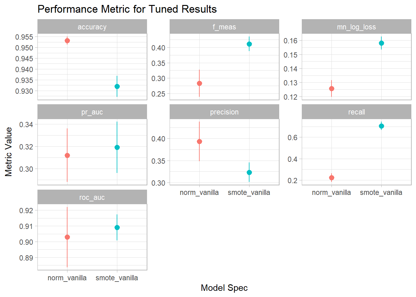
Since I do care about the positive class more than the negative class but I don’t have a strong preference to false positive vs. false negative being more costly I’m going to use F1-Score as the performance metric I care most about. As expected the plain vanilla specification had a higher accuracy than the version using SMOTE to correct for imbalance. But it had lower values for F1, PR AUC and ROC AUC. I can also use rank_results() to show the top models for the F1 measure across the different specifications:
rank_results(tuned_results, rank_metric = 'f_meas') %>%
  select(wflow_id, .config, .metric, mean, std_err) %>%
  filter(.metric == 'f_meas') %>%
kable()| wflow_id | .config | .metric | mean | std_err |
|---|---|---|---|---|
| smote_vanilla | Preprocessor1_Model050 | f_meas | 0.4113826 | 0.0122165 |
| smote_vanilla | Preprocessor1_Model049 | f_meas | 0.4096641 | 0.0135101 |
| smote_vanilla | Preprocessor1_Model045 | f_meas | 0.4092579 | 0.0123975 |
| smote_vanilla | Preprocessor1_Model076 | f_meas | 0.4075923 | 0.0094581 |
| smote_vanilla | Preprocessor1_Model097 | f_meas | 0.4049903 | 0.0089085 |
| smote_vanilla | Preprocessor1_Model063 | f_meas | 0.4047996 | 0.0101844 |
| smote_vanilla | Preprocessor1_Model030 | f_meas | 0.4033350 | 0.0105798 |
| norm_vanilla | Preprocessor1_Model040 | f_meas | 0.2830217 | 0.0225049 |
The top 7 models by F1 are all various configurations of the SMOTE recipe. The best model specification had an average F1 of 0.411 across the five folds. To get a better understanding of what this model’s specification actually was I extract the model configuration that has the best F1-score by using extract_workflow_set_result() with the workflow id and then select_best() with the metric I care about:
##Get Best Model
best_set <- tuned_results %>%
  extract_workflow_set_result('smote_vanilla') %>%
  select_best(metric = 'f_meas')

kable(best_set)| mtry | trees | min_n | tree_depth | learn_rate | loss_reduction | sample_size | stop_iter | .config |
|---|---|---|---|---|---|---|---|---|
| 5 | 1641 | 19 | 8 | 0.007419 | 9.425834 | 0.9830687 | 21 | Preprocessor1_Model050 |
The best model in this case had 5 random predictors, 1641 trees, and so on.
Now that I know which model configuration is the best one, the last step is to final the model using the full training data and predict on the test set. The next block of code extracts the workflow, sets the parameters to be those from the best_set defined above using finalize_workflow, and then last_fit() does the final fitting using the full training set and prediction on the testing data when we pass it the workflow and the split object.
final_fit <- tuned_results %>%
  extract_workflow('smote_vanilla') %>%
  finalize_workflow(best_set) %>%
  last_fit(ice_split, metrics=metric_set(accuracy, roc_auc, mn_log_loss,
                                         pr_auc, f_meas, precision, recall))
Then with collect_metrics() I can see the final results when the model was applied to the test set that had been unused thus far.
collect_metrics(final_fit) %>%
kable()| .metric | .estimator | .estimate | .config |
|---|---|---|---|
| accuracy | binary | 0.9341443 | Preprocessor1_Model1 |
| f_meas | binary | 0.4332130 | Preprocessor1_Model1 |
| precision | binary | 0.3438395 | Preprocessor1_Model1 |
| recall | binary | 0.5853659 | Preprocessor1_Model1 |
| roc_auc | binary | 0.9101661 | Preprocessor1_Model1 |
| mn_log_loss | binary | 0.1546972 | Preprocessor1_Model1 |
| pr_auc | binary | 0.3505282 | Preprocessor1_Model1 |
The F1 score is actually higher than in the training at 0.43% with a precision of 34%, a recall of 59%, and a ROC AUC of 0.91%.
Tidymodels also makes it very easy to display ROC curves using collect_predictions to get the predictions from the final model and test set and roc_curve to calculate the sensitivity and specificity.
collect_predictions(final_fit) %>%
  roc_curve(is_iced, .pred_iced) %>%
  ggplot(aes(1 - specificity, sensitivity)) +
  geom_abline(lty = 2, color = "gray80", size = 1.5) +
  geom_path(alpha = 0.8, size = 1) +
  coord_equal() +
  labs(color = NULL)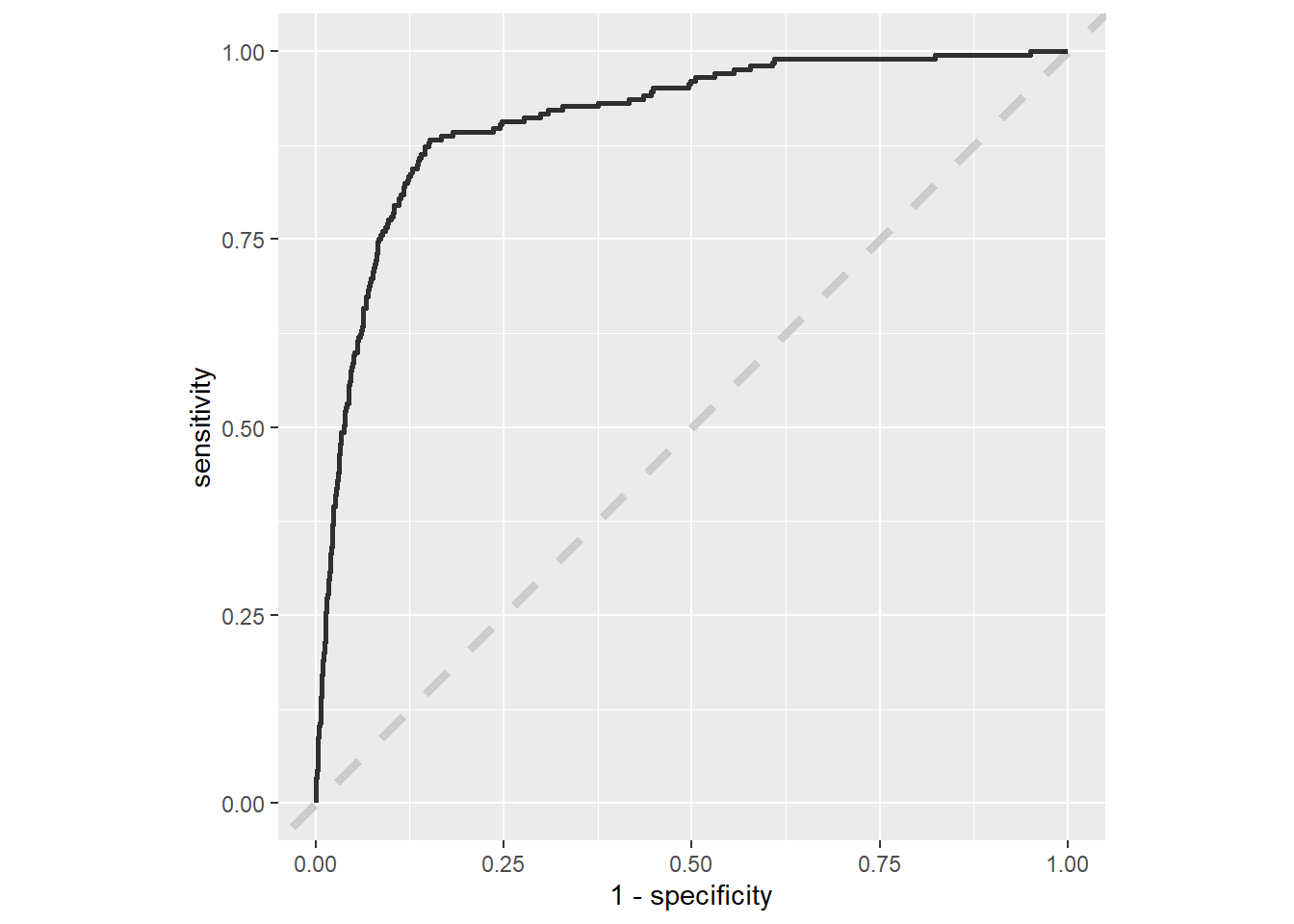
As well as calculate the confusion matrix with collect_predictions and conf_mat.
collect_predictions(final_fit) %>%
  conf_mat(is_iced, .pred_class) %>%
  autoplot(type = 'heatmap')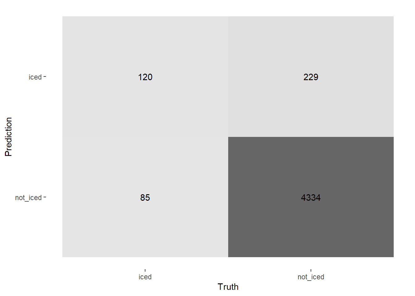
Part 3: Interpreting the model
So now the model has been built can be used for predicting whether or not a field goal attempt will get iced given certain parameters. But XGBoost is in the class of “black-box” models where it might be difficult to know what’s going on under the hood. In this third part, I’ll explore:
- Variable Importance
- Partial Dependency Plots
- SHAP Values
All of which will help to provide some interpretability to the model fit in part 2.
Variable Importance
Variable Importance plots are one way of understanding which predictor has the largest effect on the model outcomes. There are many ways to measure variable importance but the one I’m using is the default in the {vip} package for XGBoost which is “gain”. Variable importance using gain measures the fractional contribution of each feature to the model based on the total gain of the feature’s splits where gain is the improvement to accuracy brought by a feature to its branches.
The {vip} package provides variable importance when given a model object as an input. To get that I use extract_fit_parsnip() to get the parsnip version of the model object. Then the vip() function does the rest.
library(vip)

extract_fit_parsnip(final_fit) %>%
  vip(geom = "point", include_type = T) +
  geom_text(aes(label = scales::percent(Importance, accuracy = 1)),
            nudge_y = 0.023) +
  theme_light()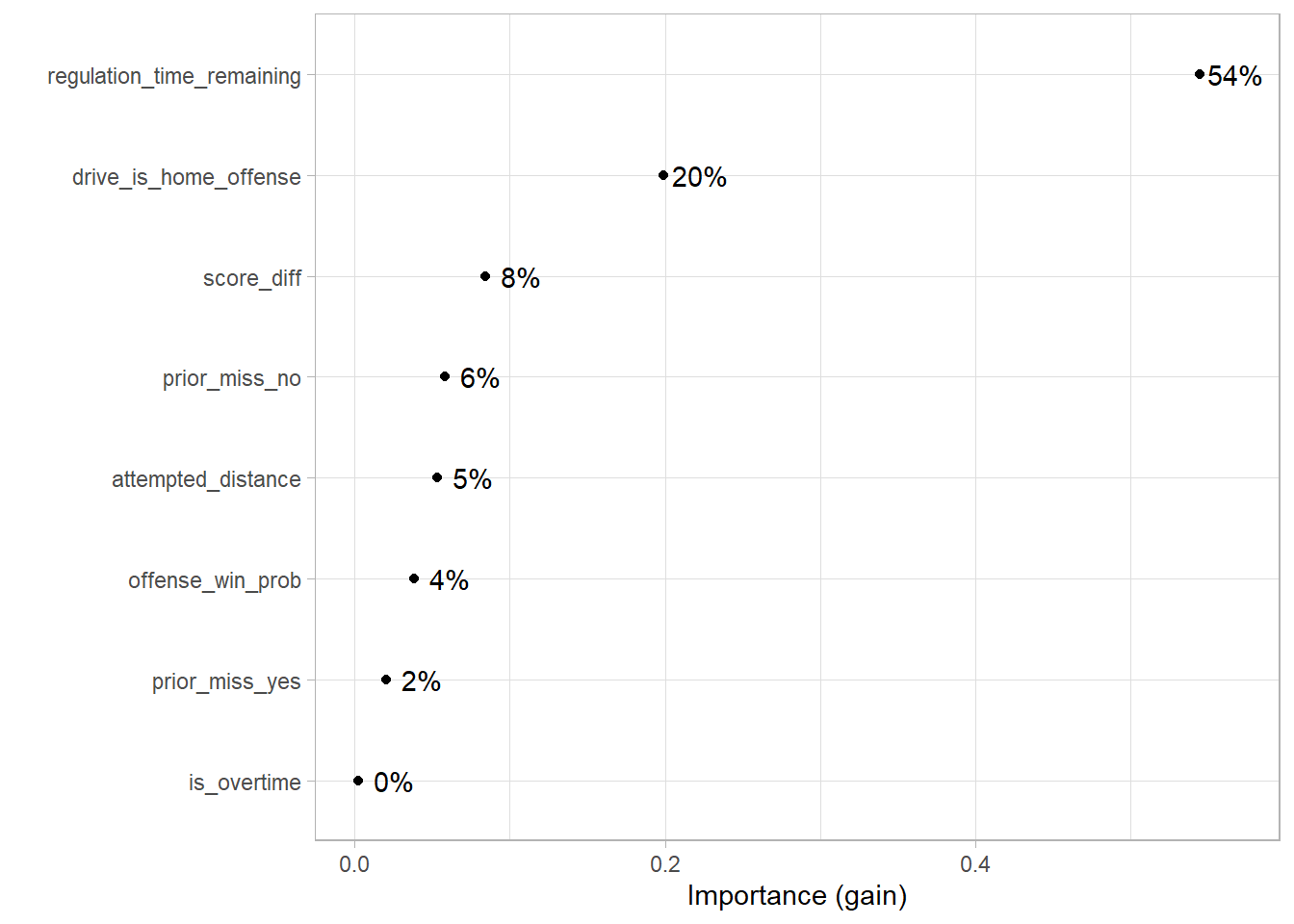
Unsurprisingly, the regulation time remaining is the most important feature which makes sense because the amount of time remaining dictates whether using the timeout on a kick is worthwhile. Although whether the kicking team is the home team being the 2nd most important feature is a bit more surprising as I would have thought game situation would apply more than home or away team. I thought score difference would be higher.
Partial Dependency
Variable importance tells us “what variables matters” but it doesn’t tell us “how they matter”. Are the relationships between the predictors and predictions linear or non-linear. Is there some magic number where a step function occurs. Variable Importance cannot answer these questions, but partial dependency plots can!
A partial dependency plot shows the effect of a predictor on the model outcome holding everything else constant. The {pdp} package can be used to generate these plots. The {pdp} package is a little less friendly with {tidymodels} since you need to provide the native model object rather than the parsnip version (which is still easily accessible using extract_fit_engine()). Also, the data passed into the partial() function needs to be the same as the data that actually goes into the model object. So I create fitted_data by prep()ing the recipe and then bake()’ing which applies the recipe to the original data set.
The partial function can also take a while to run, so I’m using {furrr} which allows for {purrr} functions to be run in parallel on the {future} backend. In the future_map_dfr function, I’m running partial on every predictor in the data and stacking the results on top of each other so that I can plot them in the final step. The use of prob=T converts the model output to a probability but since XGBoost probabilities are uncalibrated best not to read too much into the values.
library(pdp)

##Get Processed Training Data
model_object <- extract_fit_engine(final_fit)

fitted_data <- rec_smote %>%
  prep() %>%
  bake(new_data = model_data) %>%
  select(-is_iced)

library(furrr)
plan(multisession, workers = 4)

all_partial <- future_map_dfr(
  names(fitted_data), ~as_tibble(partial(
    model_object,
    train = fitted_data,
    pred.var = .x,
    type = 'classification',
    plot = F,
    prob = T, #Converts model output to probability scale
    trim.outliers = T
  )) %>%
    mutate(var = .x) %>%
    rename(value = all_of(.x)),
  .progress = T,
  .options = furrr_options(seed = 20220109)
)

all_partial %>%
  #Remove Prior Miss since its one-hot encoded
  filter(!str_detect(var, 'prior_miss|overtime')) %>%
  ggplot(aes(x = value, y = yhat, color = var)) +
    geom_line() +
    geom_smooth(se = F, lty = 2, span = .5) +
    facet_wrap(~var, scales = "free") +
    #scale_y_continuous(labels = percent_format(accuracy = .1)) +
    scale_color_discrete(guide = 'none') +
    labs(title = "Partial Dependency Plots for Whether A Kick Gets Iced?",
         subtitle = "Looking at 19,072 NCAA Field Goal Attempts (2013-2021)",
         x = "Variable Value",
         y = "Prob. of Attempt Getting Iced") +
    theme_light()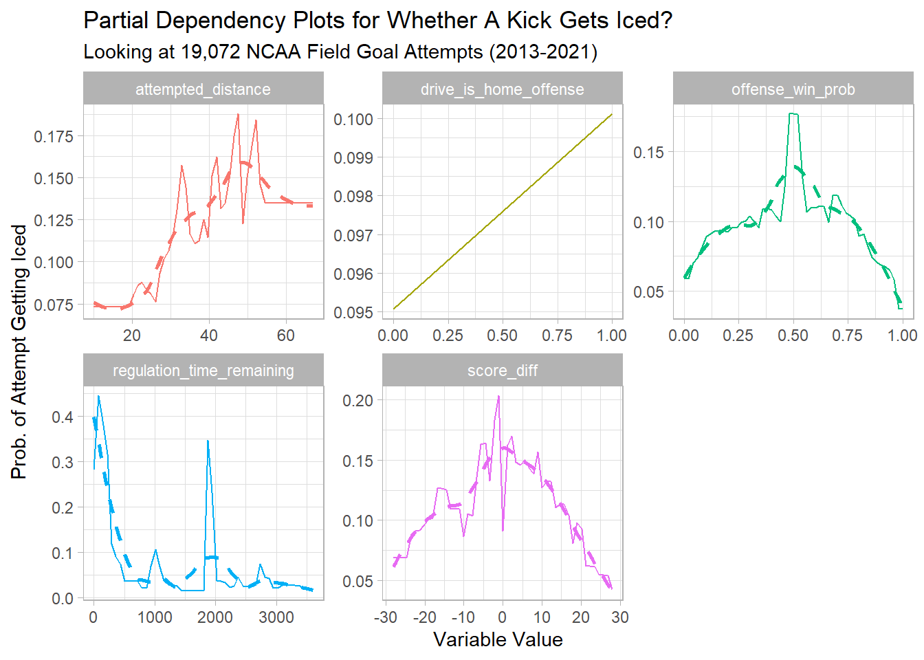
From these plots we can tell that the likelihood of getting iced increases when:
- The Attempted Distance is between 30-50 yards
- When two teams are expected to be somewhat evenly matched (based on pre-game win probabilities)
- When nearly the end of the game or the end of the half (that middle spike in regulation time remaining is halftime since timeouts reset at the beginning of each half)
- When the kicking team is losing by a very small margin (or when the game is within +/- 10 points)
While variable importance told us that Regulation Time Remaining was the most important variable, the partial dependency plot shows us how it affects the model in a non-linear way.
SHAP Values
The next measure of interpretability combines pieces of both variable importance and partial dependency plots. SHAP values are claimed to be the most advanced method to interpret results from tree-based models. They are based on Shaply values from game theory and measure feature importance based on the marginal contribution of each predictor for each observation to the model output.
The {SHAPforxgboost} package provides an interface to getting SHAP values. The plot that will give us overall variable importance is the SHAP summary plot which we’ll get using shap.plot.summary. However, first the data structure needs to be prepped using the model object and the training data in a matrix.
library(SHAPforxgboost)

shap_long <- shap.prep(xgb_model = extract_fit_engine(final_fit),
                        X_train = fitted_data %>% as.matrix())

shap.plot.summary(shap_long)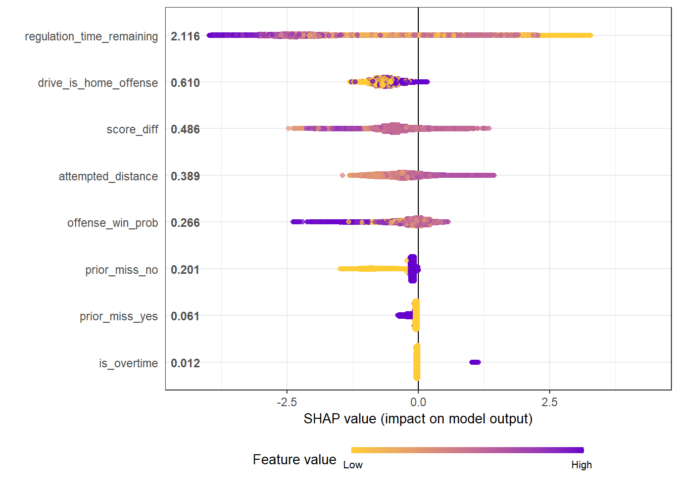
In the summary plot, the most important variables are ordered from top to bottom. Within any given variable each point represents an observation. The shading of the point represents which that observation has a higher or lower value for that features. For example, in regulation time remaining lower amounts of remaining time will be orange while higher amounts will be purple. The position on the left or right side of zero represents whether they decrease or increase the likelihood of getting iced. For regulation time remaining notice that the very purple is strongly negative (on the left side) and the very orange is strongly positive (on the right side).
Similar to the variable importance plot, regulation time remaining was the most important feature.
We can also get dependency plots similar to the partial dependency plots with SHAP values using shap.plot.dependence. We’ll look at the regulation time remaining on the x-axis and the SHAP values for regulation time remaining on the y-axis. Since this returns a ggplot object, I’ll add in vertical lines to represent the end of each quarter.
SHAPforxgboost::shap.plot.dependence(data_long = shap_long, x = 'regulation_time_remaining',
                                     y = 'regulation_time_remaining',
                                     color_feature = 'regulation_time_remaining') +
  ggtitle("Shap Values vs. Regulation Time Remaining") +
  geom_vline(xintercept = 0, lty = 2) +
    geom_vline(xintercept = 900, lty = 2) +
    geom_vline(xintercept = 1800, lty = 2) +
geom_vline(xintercept = 2700, lty = 2) 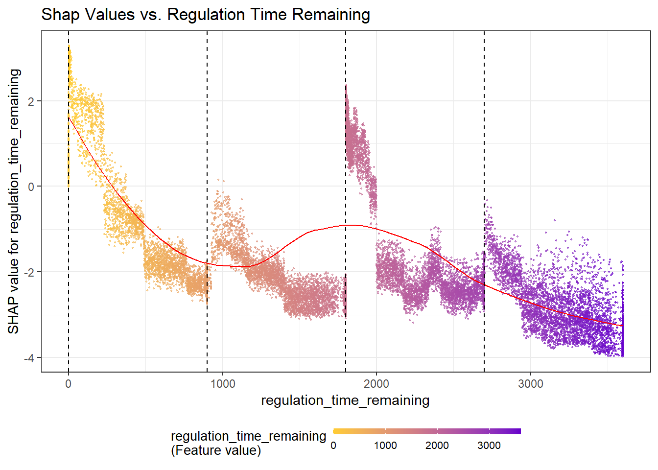
Similar to the summary plot, the less time remaining in the game the more orange the point and the more time remaining the more purple. Again, like in the partial dependency plot, we see a non-linear relationship with increases towards the end of each quarter and heavy spikes in the last 3 minutes of the 2nd and 4th quarters.
This is just an example of the things that can be done with SHAP values but hopefully its usefulness for understanding both what’s important and how its important has been illustrated.
Wrapping Up
This was quite long so a huge thanks if you made it to the end. This post took a tour through {tidymodels} and some interpretable ML tools to look at when field goal attempts are more likely to get iced. If you’re a football fan then the results shouldn’t be terribly surprising. It its good to know that the model outputs generally pass the domain expertise “sniff-test”. In the next post, I’ll use this same data to attempt to understand whether icing the kicker actually works in making the kicker more likely to miss the attempt.