Exploring NHL Stanley Cup Champion's Points Percentage In Four GGPlots

Motivation
While browsing Reddit’s r/DataIsBeautiful sub-reddit I came across a post from Fabio Votta showing a beeswarm plot of US County vote share in the 2020 Election. Having never seen a beeswarm plot before I wanted to come up with an excuse to try it out. As an NHL fan, I decided to look at the Points Percentage of NHL Stanley Cup champions. This analysis will use information from hockey-reference.com and ggplot to visualize the information.
Getting the Data
The data for this analysis will come from hockey-reference.com which provides statistics on the Stanley Cup Champion teams from 1918 through 2020 (with some exceptions). The points percentage is provided as a direct column in the table.
Setting Up Libraries
The libraries used in this analysis include stalwarts like tidyverse as well as ggplot extensions such as ggtext, ggbeeswarm, ggridges, ggimage to do different visualizations. The extrafont package enables the use of the fonts installed on my machine in ggplots. The loadfonts(device = "win") function loads the additional fonts (if running for the first time the font_import() function needs to be called to build the references).
library(tidyverse) # Data Manipulation and Visualizations
library(rvest) # Web Scraping the NHL Champion Data & Team Colors
library(ggbeeswarm) # Creating Beeswarm Plots
library(ggtext) # Enabling Use of Markdown in ggplots
library(ggridges) # Creating Ridge Density Plots
library(ggimage) # Creating Plots with Images as the Points
library(glue) # Package for String Manipulation
library(extrafont) # Package to enable use of additional fonts for plotting
loadfonts(device = "win") # Actually loads the fonts
Getting the Data on the Champions
The points data for the Stanley Cup Champions comes from hockey-reference.com. I’ll scrape the table from this website by using rvest and referencing the CSS class .stats_table. Since there’s only one table on the page I can use html_node vs. html_nodes. Eventually I’m planning on joining some additional data to this data frame so I’m doing a minimal amount of data cleaning such as changing the Chicago Blackhawks to 1 word so that it matches the second data set. Additionally I’m renaming the points percentage column to something more R friendly.
nhl_data <- read_html('https://www.hockey-reference.com/awards/stanley.html') %>%
  html_node(css = '.stats_table') %>%
  html_table() %>%
  mutate(Team = str_replace_all(Team, "Black Hawks", "Blackhawks")) %>%
  rename(pts_pct = `PTS%`)
Getting Data on Team Colors
For one of the future plots I want to use each team’s color to represent their data. This information comes from teamcolorcodes.com. Each team page has a formulaic URL where the team name is ‘-’ delimited. Since this page only has information on current teams, older teams like the Toronto Arenas or Montreal Maroons will not appear. Typically, these names might wind up breaking a loop when they throw an error. However, the use of the possibly() function from purrr will accommodate the error handling. The possibly() function wraps another function and has an otherwise parameter that allows the user to say what the function should provide in case of an error.
In this case, the possibly() function wraps an anonymous function that:
- Takes a string for a team name,
t, which is converted to lower-case and has the spaces replaced with dashes - Scrapes the first instance of the
.colorblockCSS class from the teamcolorcodes.com webpage for the specific team as text. - Performance a regular expression map for the HEX code for the color
- Since
str_matchreturns a list where the first element is the entire match and each additional element represents a capture group, pulls the 2nd element from the list. - Finally, the function returns a 1-row tibble with the team name,
t, and the HEX code, namedcolor. - In the case that there’s an error, the function will return a 1-row tibble with the team value set to ‘non-match’ and the color value set to
NA.
The map_dfr function from purrr is used to run the above function for all unique team names and appends the results into a data.frame.
get_color <-  possibly(
  function(t){
    tibble(
      team = t,
      color = glue("https://teamcolorcodes.com/{t}-color-codes/",
                   t = str_replace_all(
                     str_to_lower(t), ' ', '-')
                   ) %>%
              read_html() %>%
              html_node(css = ".colorblock") %>%
              html_text() %>%
              str_match("Hex Color: (#[0-9A-Za-z]{6})") %>%
              .[, 2]
    )
  },
  otherwise = tibble(team = "non-match", color = NA_character_))

nhl_colors <- map_dfr(unique(nhl_data$Team), get_color)
Combining the Data
Finally, the color data is joined to the Champions data. In the cases where there were not matches in the color data, I’m using black as a default color.
nhl_w_color <- nhl_data %>%
  left_join(nhl_colors, by = c("Team" = "team")) %>%
  mutate(
    color = if_else(is.na(color), "black", color)
  )
Visualizations
The Overall Distribution of Points Percentage for NHL Stanley Cup Champions
This code block is a doozy as I did a lot of annotations to add error bars, text labels, arrows, and theme formatting to change what at its heart is a standard density plot.
nhl_w_color %>%
  ggplot(aes(x = pts_pct)) +
    geom_density(fill = '#8394A1') +
    annotate("errorbarh",
            xmin = quantile(nhl_w_color$pts_pct, .10),
            xmax = quantile(nhl_w_color$pts_pct, .90),
            y = 6,
            color = "#e6e7eb") +
    annotate("linerange",
             x = median(nhl_w_color$pts_pct),
             ymin = 0,
             ymax = 5,
             color = "#e6e7eb",
             lty = 2
    ) +
    annotate("text",
             label = "Middle 80% and Median",
             y = 6.45,
             x = median(nhl_w_color$pts_pct),
             color = "#e6e7eb") +
    annotate("text",
             label = quantile(nhl_w_color$pts_pct, .10) %>%
               scales::percent(accuracy = 1),
             y = 5.2,
             x = quantile(nhl_w_color$pts_pct, .10),
             color = "#e6e7eb") +
    annotate("text",
             label = quantile(nhl_w_color$pts_pct, .90) %>%
               scales::percent(accuracy = 1),
             y = 5.2,
             x = quantile(nhl_w_color$pts_pct, .90),
             color = "#e6e7eb") +
    geom_curve(
      x = median(nhl_w_color$pts_pct),
      xend = median(nhl_w_color$pts_pct)-.005,
      y = 6,
      yend = 3,
      color = "#e6e7eb",
      arrow = arrow(length = unit(0.03, "npc")),
      size = 1
    ) +
    annotate("text", x = median(nhl_w_color$pts_pct)-.02, y = 3.3,
             label = median(nhl_w_color$pts_pct) %>%
               scales::percent(accuracy = 1),
             color =  "#e6e7eb") +
    labs(title = "Points Percentage of Stanley Cup Champions (1918 - 2020)",
         caption = "*Source: hockey-reference.com*",
         x = "Points %",
         y = ""
    ) +
    scale_x_continuous(labels = scales::percent_format(accuracy = 1)) +

    cowplot::theme_cowplot() +
    theme(
      text = element_text(color = "#e6e7eb", family = 'BentonSans Regular'),
      plot.background = element_rect(fill = "#1a1c2e"),
      axis.text = element_text(color = "#e6e7eb"),
      axis.ticks = element_line(color = "#e6e7eb"),
      axis.line = element_line(color = "#878890"),
      plot.caption = element_markdown(),
      axis.title.y = element_blank(),
      axis.text.y = element_blank(),
      axis.ticks.y = element_blank(),
      axis.line.y = element_blank(),
      plot.title = element_text(hjust = .5)
    )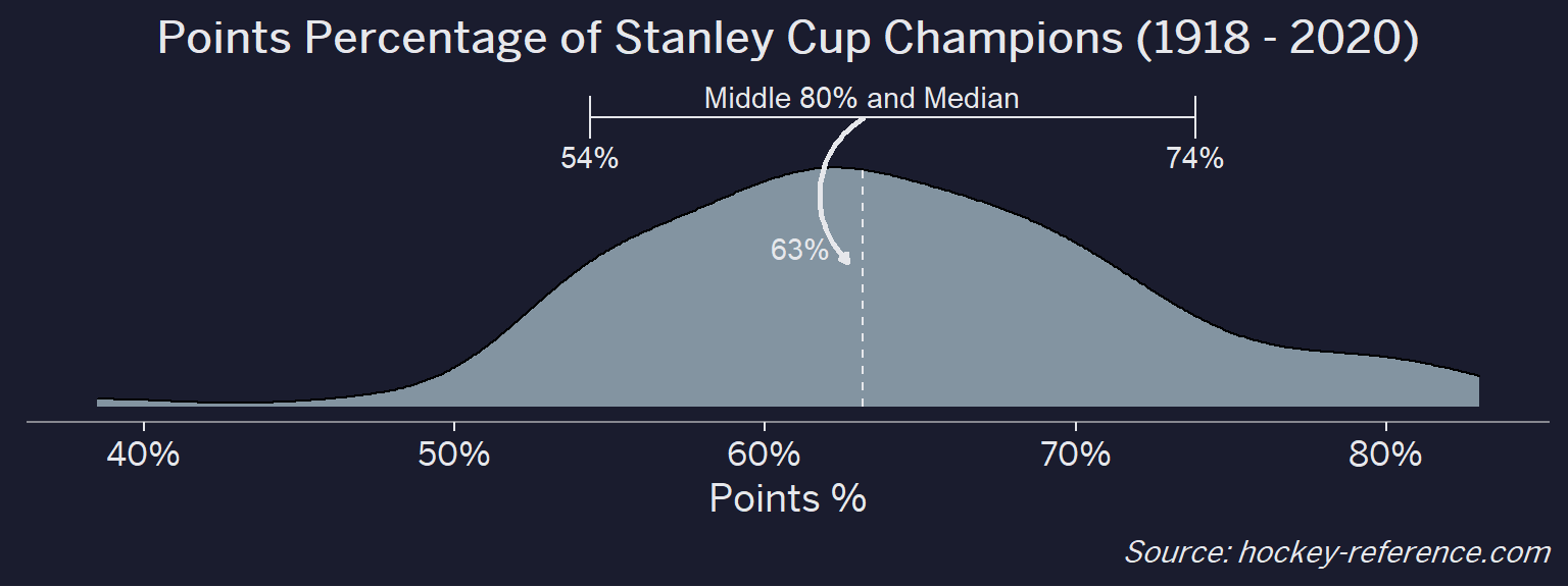
Of the 100 champions that there is data for, the median points percentage is 63% while the middle 80% spans 54% - 74%. Ultimately this makes sense since you’d expect a champion to do better than just 50%. However, there are some teams that are really great and have >80% points percentages and a few instances of unlikely champions with a points percentage in the 40s.
Has the Distribution of Champion’s Points Percentages Changed By Decade
To see the density curves over time one approach would be to facet by decade and show each decade in its own panel. Another approach is to use the ggridges package to make a ridge density plot to have each density curve on its own line. The package is very easy to use as its primarily adding a y value and then using geom_density_ridges vs. geom_density.
Sidebar: Computing Decades from Years
In order to create the decade variable I use a trick I learned from David Robinson’s TidyTuesday videos which is to divide the number by bucket width, take the floor of the result, and then multiply it back by the bucket width.
For example, 2016 divided by 10 is 201.6, which after taking the floor is 201, then multiplying back by 10 is 2010. So 2016 is in the 2010s decade.
nhl_w_color %>%
mutate(decade = str_sub(Season, 1, 4),
decade = as.integer(decade),
decade = floor(decade/10)*10
) %>%
ggplot(aes(x = pts_pct, y = factor(decade), fill = factor(decade))) +
geom_density_ridges() +
geom_vline(xintercept = median(nhl_w_color$pts_pct), lty = 2, color = 'white') +
scale_x_continuous(labels = scales::percent_format(accuracy = 1)) +
scale_fill_viridis_d(option = "C", guide = F) +
labs(
x = "Points %",
y = "Decade",
title = "Points Percentage of Stanley Cup Champions (1918 - 2020)",
subtitle = "*By Decade*",
caption = "*Source: hockey-reference.com*"
) +
cowplot::theme_cowplot() +
theme(
plot.caption = element_markdown(),
plot.subtitle = element_markdown(),
text = element_text(color = "#e6e7eb", family = 'BentonSans Regular'),
plot.background = element_rect(fill = "#1a1c2e"),
axis.text = element_text(color = "#e6e7eb"),
axis.ticks = element_line(color = "#e6e7eb"),
axis.line = element_line(color = "#878890")
)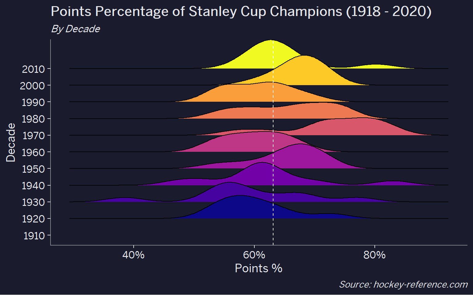 I would have expected there to be a trend of some sort but there’s not a very common story from this chart. The main takeaways are:
- The 1970s seems to have had the most dominant teams from a points percentage standpoint
- There appears to be a large shift from the 1990s to the 2000s which might be due to the introduction of the shootout and the overtime loss concept which meant that three points could be awarded in a (2 for the winner, 1 for the loser) vs. always being two.
Looking the Points Percentage for Each Team
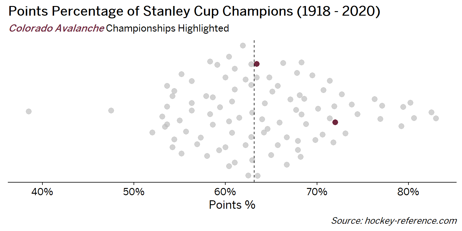
At the beginning of the post I mentioned that seeing a beeswarm plot provided the motivation for this post. Now I’ll actually create it. The following plot will have one point for each champion which will be highlighted by the team’s colors when that team’s tab is selected.
The two things to note in this code block is:
- The tabset is dynamically generated by the markdown by setting the chunk setting to
results='asis'and then usingcat()to add the HTML for the tabs through a for-loop. - In vanilla RMarkdown, the tabset effect is really easy to do with
{.tabset}but in Blogdown/Hugo its a bit trickier to nail the formatting. But its doable by referencing the bootstrap.js documentation To make things look decent, I’m omitting the code chunk but will include it at the bottom.
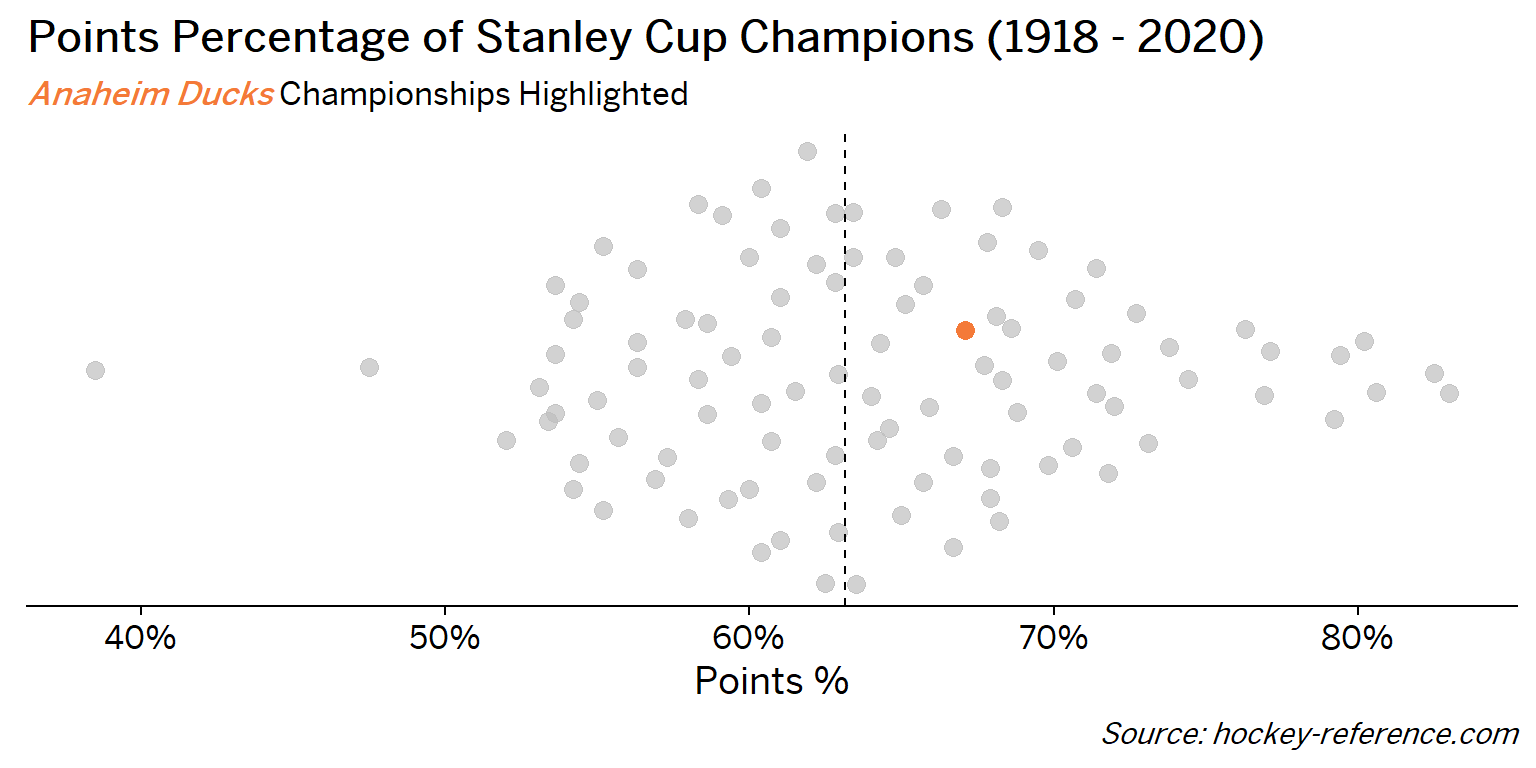
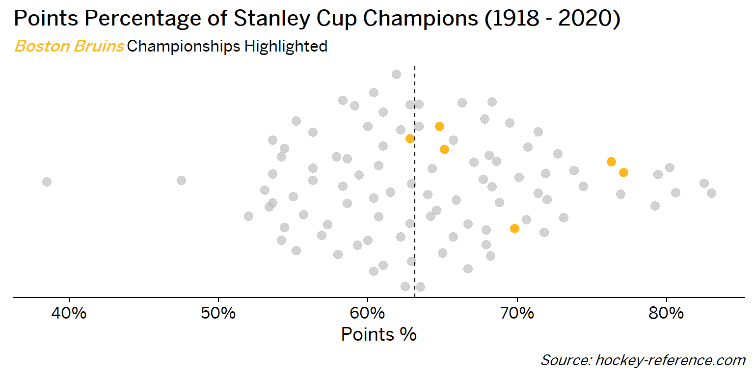
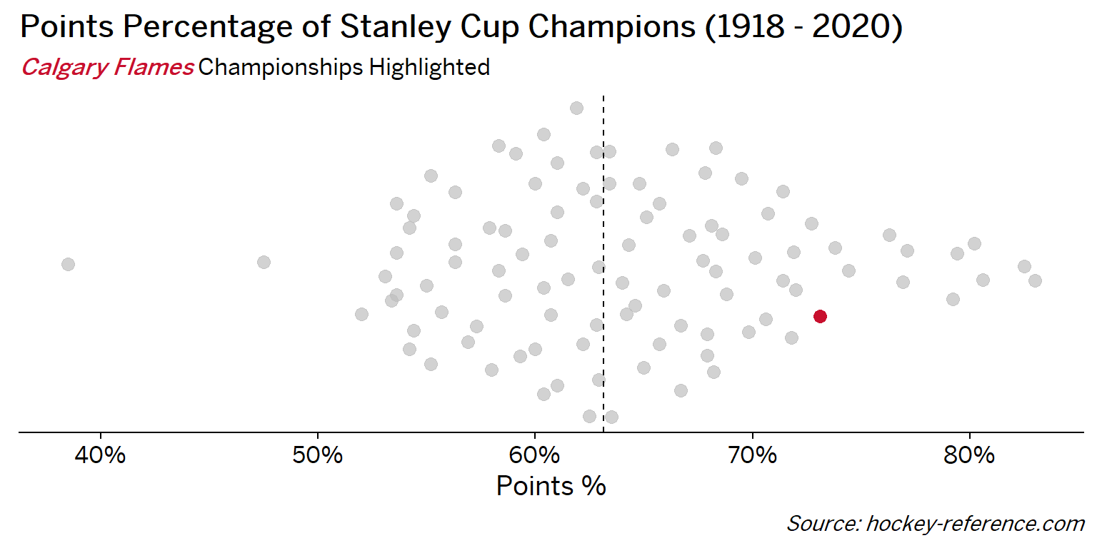
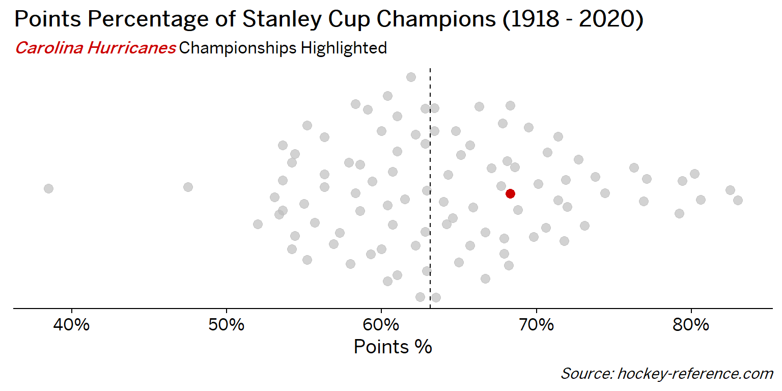
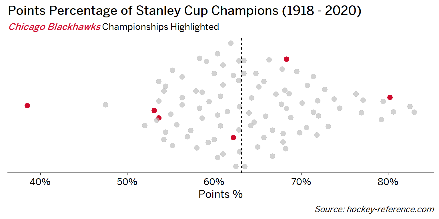
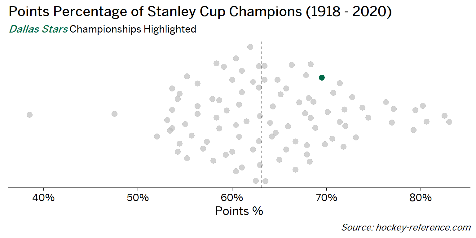
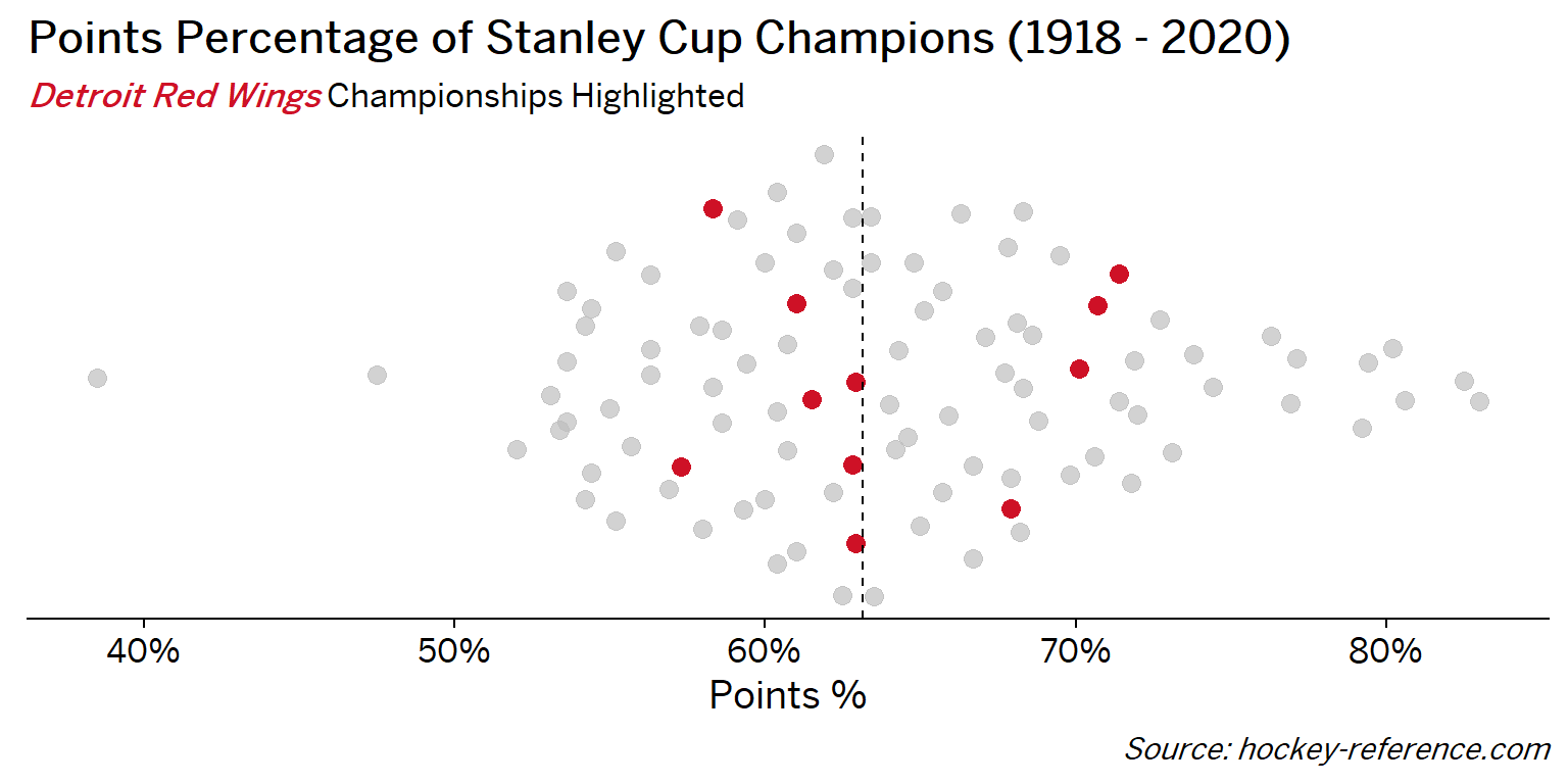
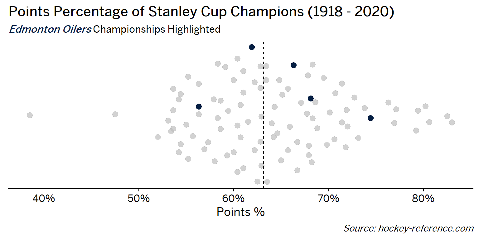

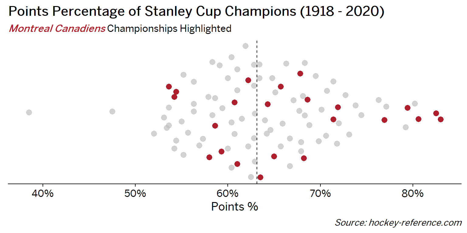

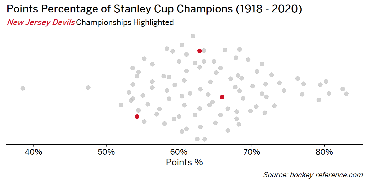
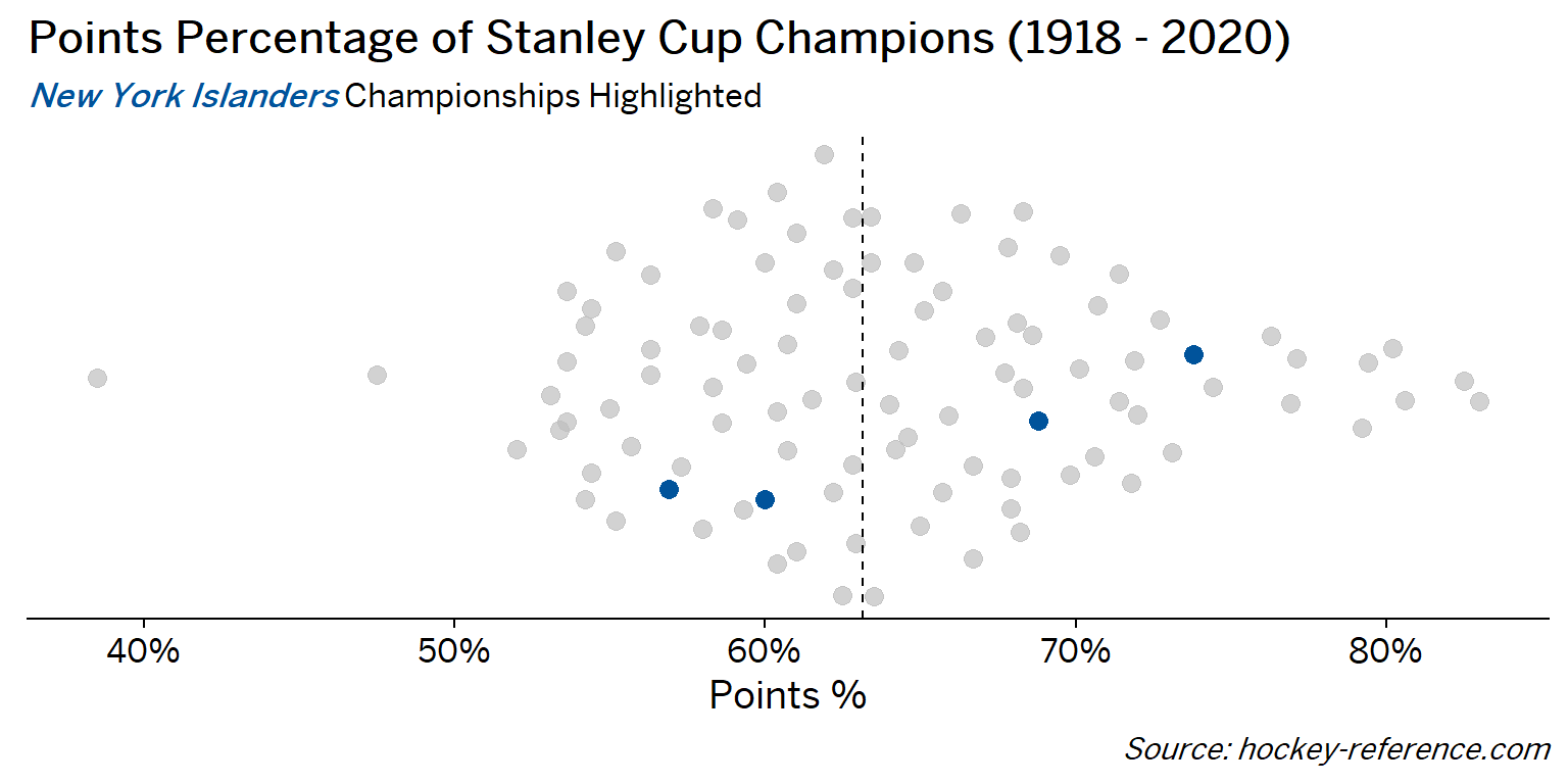
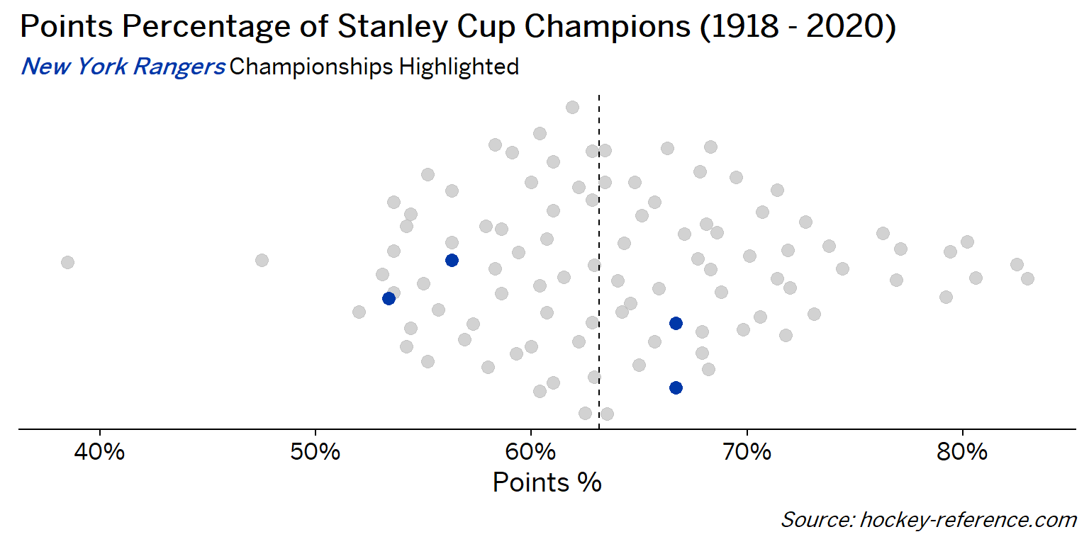
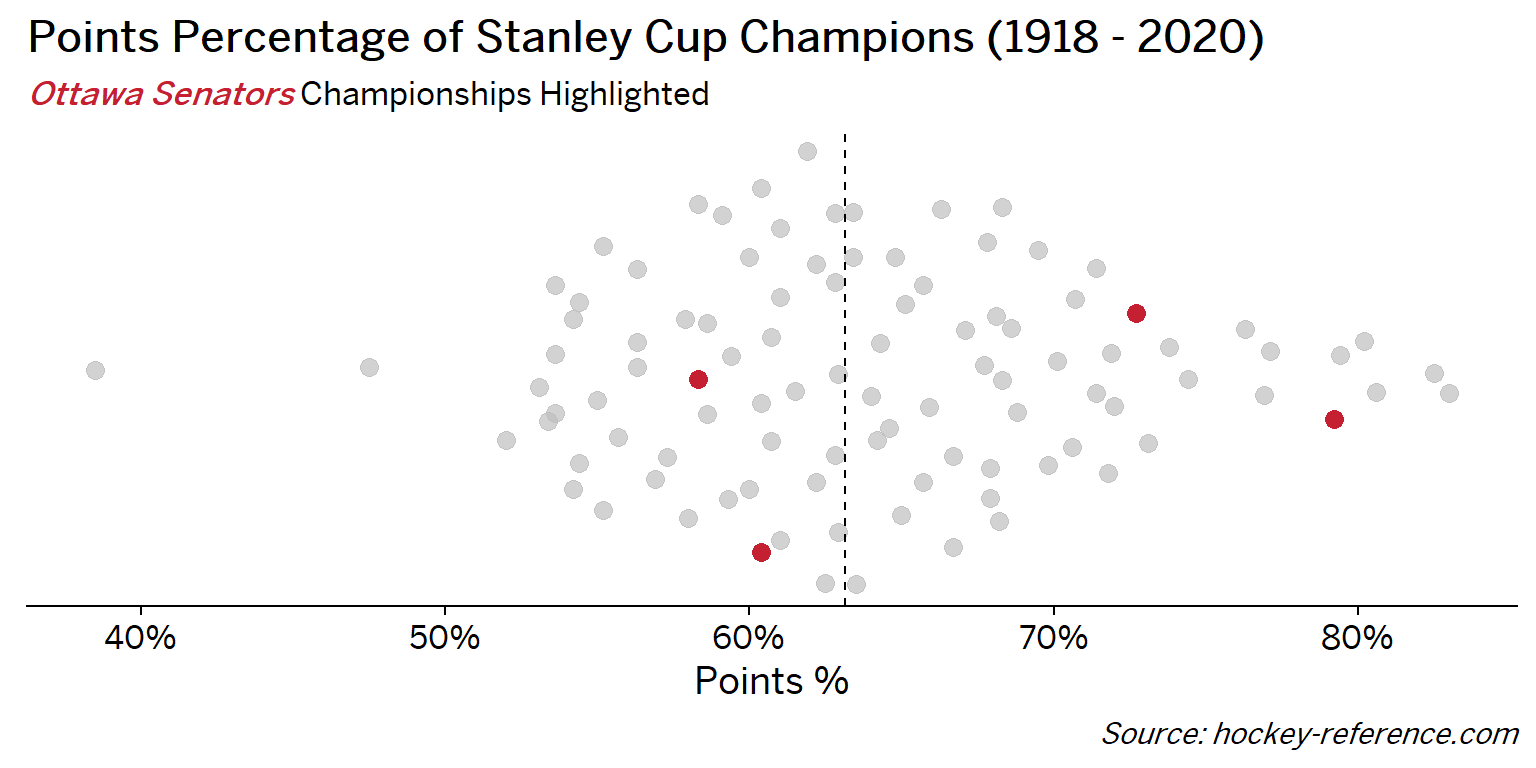
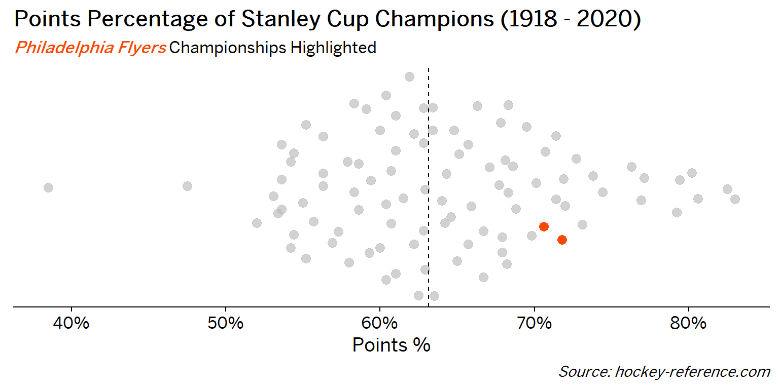
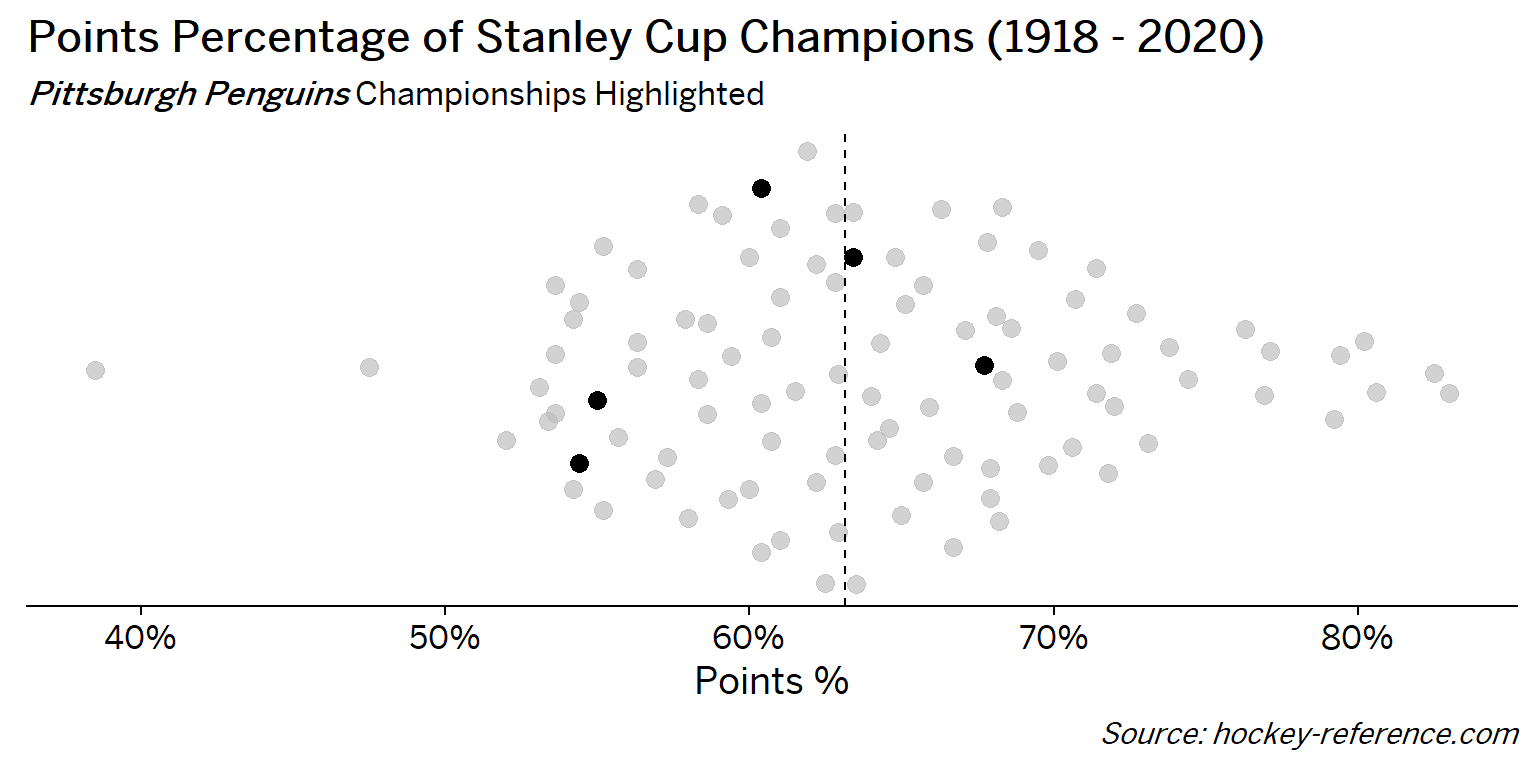
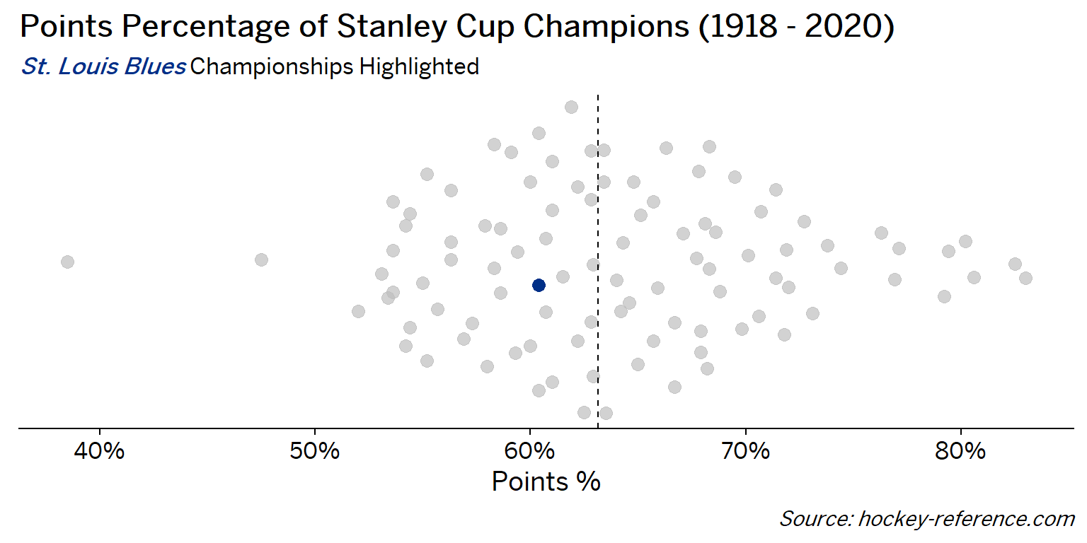
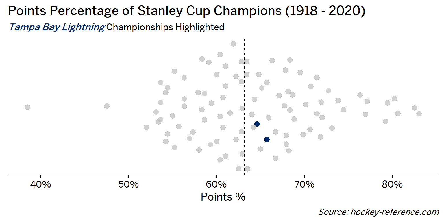
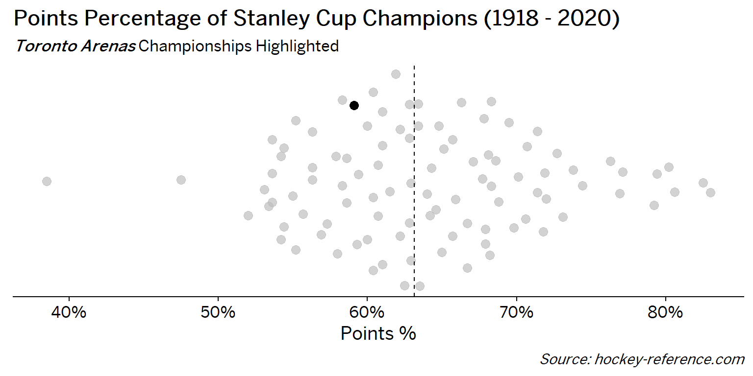
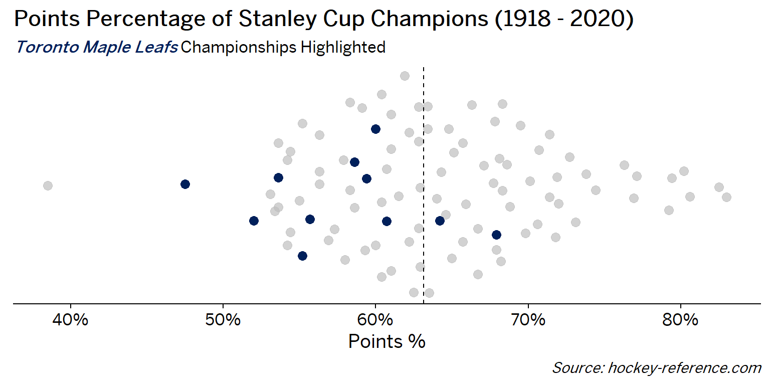
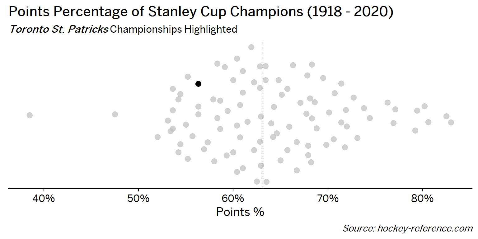
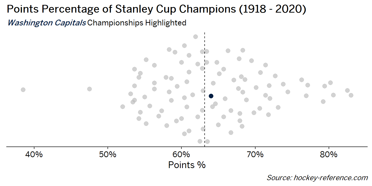
Looking at the results of this plot we see that the Montreal Canadiens have been the most frequent winner as well as the team that makes up most of those 80%+ seasons. On the other hand, the Chicago Blackhawks have the honor of being the overachieving team that won despite having a sub-40% points percentage.
Making a Histogram with Team Logos
An alternative view to the one above that doesn’t require highlighting would be to make a conventional histogram but using the team icons rather than points or bars. The ggimage package allows for a geom_image to be used by referencing a URL for an image. Fortunately the teamcolors package contains a dataset with links to logos for current NHL team. However, for some of the champion teams that no longer exist I needed to manually add their logos.
In this code block I manually create bin widths of 2.5% using the floor trick mentioned above and make use to a dummy variable to create the stacking effect for each of the logos. Then the geom_image references the URLs contained in the ‘logo’ column.
nhl_w_color %>%
  left_join(teamcolors::teamcolors %>% select(name, logo),
            by = c('Team' = 'name')) %>%
  mutate(
    logo = case_when(
      Team == 'Montreal Maroons' ~ 'https://content.sportslogos.net/logos/1/40/thumbs/4039161926.gif',
      Team == 'Toronto Arenas' ~ 'https://content.sportslogos.net/logos/1/996/thumbs/lgtkven0lgs74prrf26p6rmes.gif',
      Team == 'Toronto St. Patricks' ~ 'https://content.sportslogos.net/logos/1/997/thumbs/6438.gif',
      TRUE ~ logo
    ),
    point_pct_bckt = floor(pts_pct*100/2.5)*2.5/100
  ) %>%
  arrange(point_pct_bckt, desc(Team)) %>%
  group_by(point_pct_bckt) %>%
  mutate(
    dummy = 1,
    y_val = (cumsum(dummy)-1)*3
  ) %>%
  ggplot(aes(x = point_pct_bckt, y = y_val)) +
    geom_image(aes(image = logo),
               asp = 1.5,
               size = .05
               ) +
    geom_vline(xintercept = quantile(nhl_data$pts_pct, .5), lty = 2) +
    labs(x = "Points %", y = "",
         title = "Points Percentage of Stanley Cup Champions (1918 - 2020)",
         caption = "*Source: hockey-reference.com*") +
    scale_x_continuous(labels = scales::percent_format(accuracy =)) +
    cowplot::theme_cowplot() +
    theme(
      text = element_text( family = 'BentonSans Regular'),
      axis.title.y = element_blank(),
      axis.text.y = element_blank(),
      axis.ticks.y = element_blank(),
      axis.line.y = element_blank(),
      plot.caption = element_markdown(),
      plot.subtitle = element_markdown(),
      plot.margin = unit(rep(1.2, 4), "cm"),
      plot.title = element_text(hjust = .7)
  )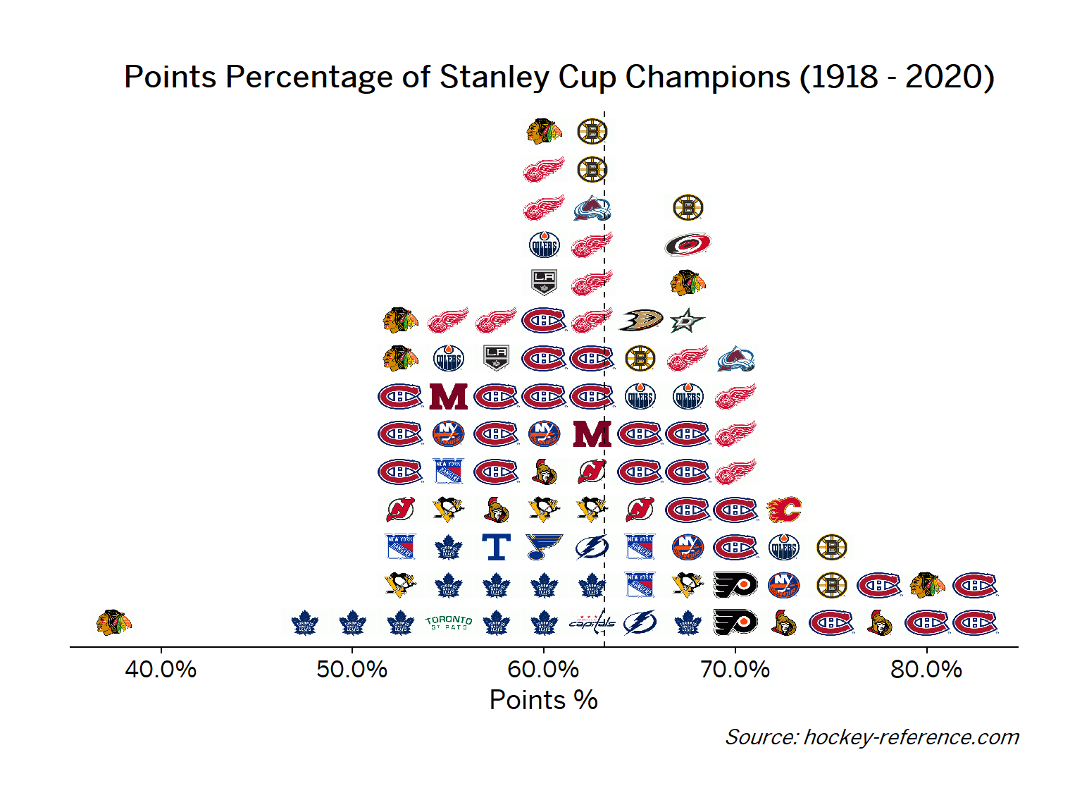
Now its much easier to see that Montreal makes up most of the dominant teams while Chicago has been both dominant and on the lower ends of the distribution.
Concluding Thoughts
The ggplot2 ecosystem is quite impressive and this post hardly scratches the surface of all the possible options. However, in this post I show 4 ways a single variable, points percentage of NHL Stanley Cup Champions, can be represented.
- First,
geom_densitycreates a baseline distribution geom_density_ridgefromggridgescan stratify that initial density plot over another variablegeom_quasirandomfromggbeeswarmwill make a ‘violin-type’ plot but with specific points that can then be operated on.- Finally,
ggimagecan change the geom to reference image URLs.
And as a bonus, I dynamically generated the tabsets for all the teams!
Appendix: Code for Dynamic Tab Generation in Blogdown
##Construct Tabs
cat('<ul class="nav nav-pills nav-fill"> \n')
for(t in sort(unique(nhl_data$Team))){
  tid = str_to_lower(str_remove_all(t, ' |\\.'))
  cat(glue('<li class="nav-item"><a class = "nav-link {active}" data-toggle="tab" href="#{tid}">{t}</a></li> \n',
      active = if_else(t == sort(unique(nhl_data$Team))[1], "active", "")))
}
cat('</ul> \n')

cat('<div class="tab-content"> \n')

for(t in sort(unique(nhl_data$Team))){
  tid = str_to_lower(str_remove_all(t, ' |\\.'))
  cat(glue('<div id="{tid}" class="tab-pane {active}"> \n',
           active = if_else(t == sort(unique(nhl_data$Team))[1], "show active", "")))
  set.seed(20201121)

  g <- nhl_w_color %>%
      mutate(color = if_else(Team == glue('{t}'),
                             color,
                             alpha("grey", 0.7))) %>%
    ggplot(aes(y = 1, x = pts_pct, color = color)) +
    geom_quasirandom(method = "tukeyDense", groupOnX=F, size = 3, width = 0.2) +
    geom_vline(xintercept = quantile(nhl_data$pts_pct, .5), lty = 2) +
    labs(x = "Points %", y = "",
         title = "Points Percentage of Stanley Cup Champions (1918 - 2020)",
         subtitle = glue("<span style='color:{col};'><b><i>{t}</i></b></span> Championships Highlighted",
                         col = nhl_w_color %>%
                           filter(Team == glue('{t}')) %>%
                           pull(color) %>%
                           unique
                         ),
         caption = "*Source: hockey-reference.com*") +
    scale_color_identity(guide = F) +
    scale_x_continuous(labels = scales::percent_format(accuracy = 1)) +
    cowplot::theme_cowplot() +
    theme(
      text = element_text( family = 'BentonSans Regular'),
      axis.title.y = element_blank(),
      axis.text.y = element_blank(),
      axis.ticks.y = element_blank(),
      axis.line.y = element_blank(),
      plot.caption = element_markdown(),
      plot.subtitle = element_markdown(),
      plot.margin = unit(rep(1.2, 4), "cm"),

    )

  print(g)

  cat("</div> \n")
}
cat("</div> \n")