How much has COVID cost the NYC Subway system in "lost fares"?
With things in NYC beginning to return to normal after two years of COVID I found myself thinking about how much money was lost in Subway fares in the 2+ years where people were working from home. Seeing an opportunity to mess around with some forecasting packages, I set out to determine *how much money in lost rides has COVID cost the MTA?“.
For this post, I’ll be using the modeltime package from Business-Science.io which is a time-series integration into tidymodels to run multiple time series candidates and choose the best one.
Libraries
### Data Manipulation Packages
library(timetk)
library(tidyverse)
library(scales)
library(lubridate)

# Modeling Ecosystem
library(modeltime)
library(tidymodels)
library(treesnip)

### Model Packages
library(catboost)
library(prophet)
Data
For this project, I’ll be using the MTA’s weekly fare data which contains the number swipes for each fare type, for each station. I’d previously scraped data from this website in a prior blog post so I won’t go through the methodology again.
Since for this project I don’t need station level or fare type granularity, I’m going to aggregate the data set to the date level.
dt <- readRDS('data/mta_data.RDS') %>%
  group_by(week_start) %>%
  summarize(fares = sum(fares))
Methodology
The dataset contains the weekly number of subway swipes from May 2010 through June 2022. To determine the number of “lost fares”, I’m going to build a forecast of the number of swipes from 2020 onwards and use the residuals between the forecast and the actual data to determine the number of “lost swipes”. Since I don’t reasonably expect a model to accurately predict 2020 onwards but I want to ensure I will have a reasonable model, I will train the model on data from 2010 through 2018 and then validate based on the 2019 data which should be similar to 2018.
Based on the validation set I will choose the best model and then using that model I will forecast 2020, 2021, and 2022.
Ultimately this test plan looks as follows:
dt %>%
  mutate(lbl = case_when(
    week_start < ymd(20190101) ~ "a) Train",
    year(week_start) == 2019 ~ 'b) Validate',
    year(week_start) >= 2020 ~ 'c) Test'
  ),
  total_fares = fares) %>%
  ggplot(aes(x = week_start)) +
  geom_line(data = dt, aes(y = fares), color = 'grey60') +
  geom_line(aes(y = fares, color = lbl)) +
  labs(title = 'Testing Plan for Forecasting',
       x = "Date", y = "# of Metrocard Swipes",
       color = "") +
  scale_y_continuous(labels = comma) +
  facet_wrap(~lbl, nrow = 3) +
  cowplot::theme_cowplot()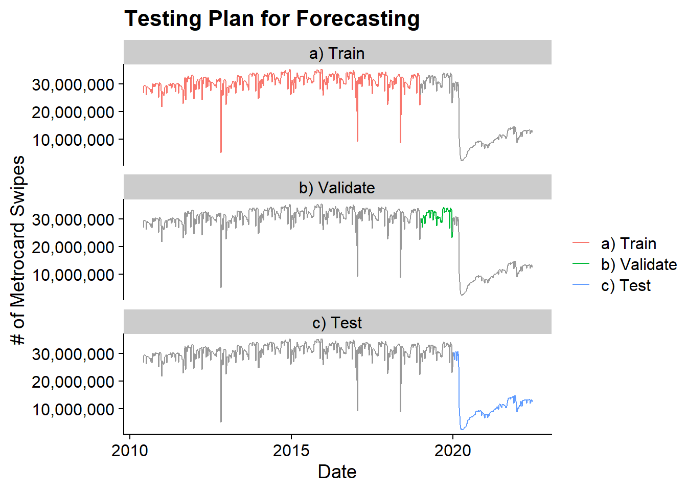
In order to split the data, I’m going to first chop off the 2020+ data into a test dataframe:
test <- dt %>% filter(year(week_start) >= 2020)And then use timetk’s time_series_split to create the sets that will be used for model development and validation:
splits <- time_series_split(
  dt %>% filter(year(week_start) < 2020) %>% arrange(week_start),
  assess = 52, cumulative = T)
The assess options tells the function to split the last 52 weeks of data into the validation set and the cumulative option tells the function to use all the other data in the training set.
The training data runs from 2010-05-29 to 2018-12-29 and the validation data runs from 2019-01-05 to 2019-12-28.
Modeling
The modeling process will use the recipe / workflow process that is used in the tidymodels ecosystem. However, add-on packages like modeltime and treesnip will allow for extensions to time series and other ML algorithms. For a more detailed look at Tidymodels check out my post on icing the kicker.
Pre-Preprocessing
The first step with tidymodels is to set up a recipe for pre-processing and featuring engineering. It tells the ecosystem the model formula and what new features to create or remove. In the below recipe, I’m setting the week_start fields to be an “id” as opposed to a predictor because some of the models we’ll try (CatBoost, XGBoost) can’t handle dates. The “id” role means that the data remains but isn’t used in the model.
The step_timeseries_signature() creates a large number of features based on the date field such as fields for year, day, half, quarter, month, day of the year, day of week, etc. It also includes a number of time based fields which won’t be necessarily since this data is at a weekly grain. These unnecessary fields are removed in the step_rm() function. Finally, all categorical variables are one-hot-encoded to turn them into indicator variables using step_dummy().
rec <- recipe(fares ~ ., data = training(splits)) %>%
  update_role(week_start, new_role = 'id') %>%
  step_timeseries_signature(week_start) %>%
  step_rm(matches("(.iso$)|(am.pm$)|(.xts$)|(hour)|(minute)|(second)|(wday)")) %>%
  step_dummy(all_nominal(), one_hot = TRUE)
Model Fitting
To determine the best model for the forecasting portion I’m going to look at 6 different modeling workflows:
- CatBoost
- XGBoost
- Auto Arima with XGBoosted Errors
- Exponential Smoothing
- Prophet
- Prophet with XGBoosted Errors
For each of these models, I will set up a workflow, add the proper model using the parsnip interface, add the recipe, and fit the model. For the last 4 models, I re-update the role of the week_start field back to a predictor from an id since those models can use the date field directly.
catboost_wf <- workflow() %>%
  add_model(
    boost_tree(mode = 'regression') %>%
      set_engine('catboost')
  ) %>%
  add_recipe(rec) %>%
  fit(training(splits))

xgboost_wf <- workflow() %>%
  add_model(
    boost_tree(mode = 'regression') %>%
      set_engine('xgboost')
  ) %>%
  add_recipe(rec) %>%
  fit(training(splits))

arima_boosted_wf <- workflow() %>%
  add_model(
    arima_boost() %>%
      set_engine(engine = "auto_arima_xgboost")
  ) %>%
  add_recipe(rec %>% update_role(week_start, new_role = "predictor")) %>%
  fit(training(splits))


ets_wf <- workflow() %>%
  add_model(
    exp_smoothing() %>%
      set_engine(engine = "ets")
  ) %>%
  add_recipe(rec %>% update_role(week_start, new_role = "predictor")) %>%
  fit(training(splits))

prophet_wf <- workflow() %>%
  add_model(
    prophet_reg(seasonality_yearly = TRUE) %>%
      set_engine(engine = 'prophet')
  ) %>%
  add_recipe(rec %>% update_role(week_start, new_role = "predictor")) %>%
  fit(training(splits))

prophet_boost_wf <- workflow() %>%
  add_model(
    prophet_boost(seasonality_yearly = TRUE) %>%
      set_engine('prophet_xgboost')
  ) %>%
  add_recipe(rec %>% update_role(week_start, new_role = "predictor")) %>%
  fit(training(splits))
Validating
To apply these models to the validation set and calculate accuracy I use the modeltime package’s modeltime_table() and modeltime_calibrate() functions. The first organizes the various workflows into a single object and the later will compute the accurate based on the validation set of 2019 data.
calibration_table <- modeltime_table(
  catboost_wf,
  xgboost_wf,
  arima_boosted_wf,
  ets_wf,
  prophet_wf,
  prophet_boost_wf
) %>%
  modeltime_calibrate(testing(splits))
I can then assess the accuracy measures for the time series using table_modeltime_accuracy() after sorting by the root mean squared error which will be the accuracy metric I use to determine the best model.
calibration_table %>%
  modeltime_accuracy() %>%
  arrange(rmse) %>%
  select(.model_desc, where(is.double)) %>%
  mutate(across(where(is.double),
                ~if_else(.x < 10, round(.x, 2), round(.x, 0)))) %>%
kable()| .model_desc | mae | mape | mase | smape | rmse | rsq |
|---|---|---|---|---|---|---|
| PROPHET W/ XGBOOST ERRORS | 947892 | 3.00 | 0.59 | 3.04 | 1271929 | 0.76 |
| PROPHET W/ REGRESSORS | 1150569 | 3.75 | 0.71 | 3.76 | 1515907 | 0.63 |
| XGBOOST | 1292654 | 4.08 | 0.80 | 4.25 | 1888753 | 0.59 |
| ARIMA(0,1,2) W/ XGBOOST ERRORS | 1515049 | 4.81 | 0.94 | 4.96 | 1946304 | 0.55 |
| CATBOOST | 1900626 | 6.31 | 1.17 | 6.20 | 2362239 | 0.62 |
| ETS(A,N,A) | 1930427 | 6.25 | 1.19 | 6.31 | 2436219 | 0.08 |
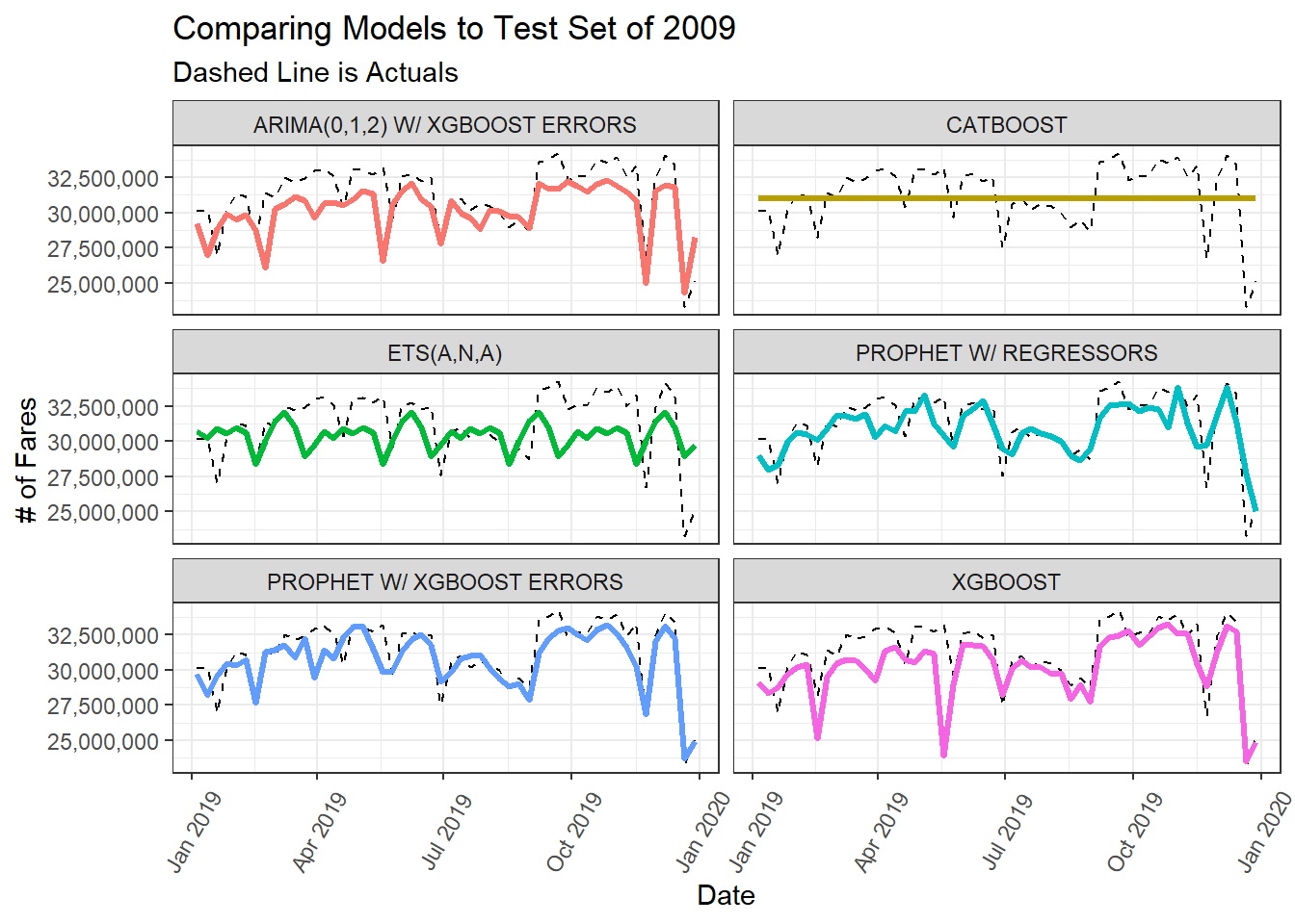
From the accuracy table, the best model was the Prophet w/ XGBoosted Errors.
The calibration table data contains a column called .calibration_data which contains the validation set predictions which I can use to visualize the the forecasted fit vs. the actuals in for the 2019 data.
calibration_table %>%
    select(.model_desc, .calibration_data) %>%
    unnest(cols = c(.calibration_data)) %>%
    filter(year(week_start)==2019, .model_desc != 'ACTUAL') %>%
    ggplot(aes(x = week_start)) +
      geom_line(aes(y = .actual), color = 'black', lty = 2) +
      geom_line(aes(y = .prediction, color = .model_desc), lwd = 1.2) +
      facet_wrap(~.model_desc, ncol = 2) +
      scale_color_discrete(guide = "none") +
      scale_y_continuous(label = comma) +
      labs(title = "Comparing Models to Test Set of 2009",
           subtitle = "Dashed Line is Actuals",
           y = "# of Fares",
           x = "Date") +
      theme_bw() +
      theme(
        axis.text.x = element_text(angle = 60, hjust = .5, vjust = .5)
      )
Forecasting the COVID Time Period
Now that I’ve identified the Prophet w/ XGBoosted errors model as the best model, its time to retrain it one final time on both the training and validation data before using it to forecast the COVID time period. The refiting on all data is handled by modeltime_refit().
refit_tbl <- calibration_table %>%
    filter(.model_desc =='PROPHET W/ XGBOOST ERRORS' ) %>%
    modeltime_refit(data = bind_rows(training(splits), testing(splits)))
Finally, the forecasting onto the test set is handled by modeltime_forecast(). The test data and actuals are passed into the function so that the actuals and forecast can be directly compared.
final_fcst <- refit_tbl %>%
  modeltime_forecast(
    new_data = test,
    actual_data = dt,
    keep_data = TRUE
  )
The forecast vs. the actuals can be visualized with plot_modeltime_forecast():
final_fcst %>%
  plot_modeltime_forecast(.conf_interval_show = T, .interactive = F) +
  scale_y_continuous(labels = comma)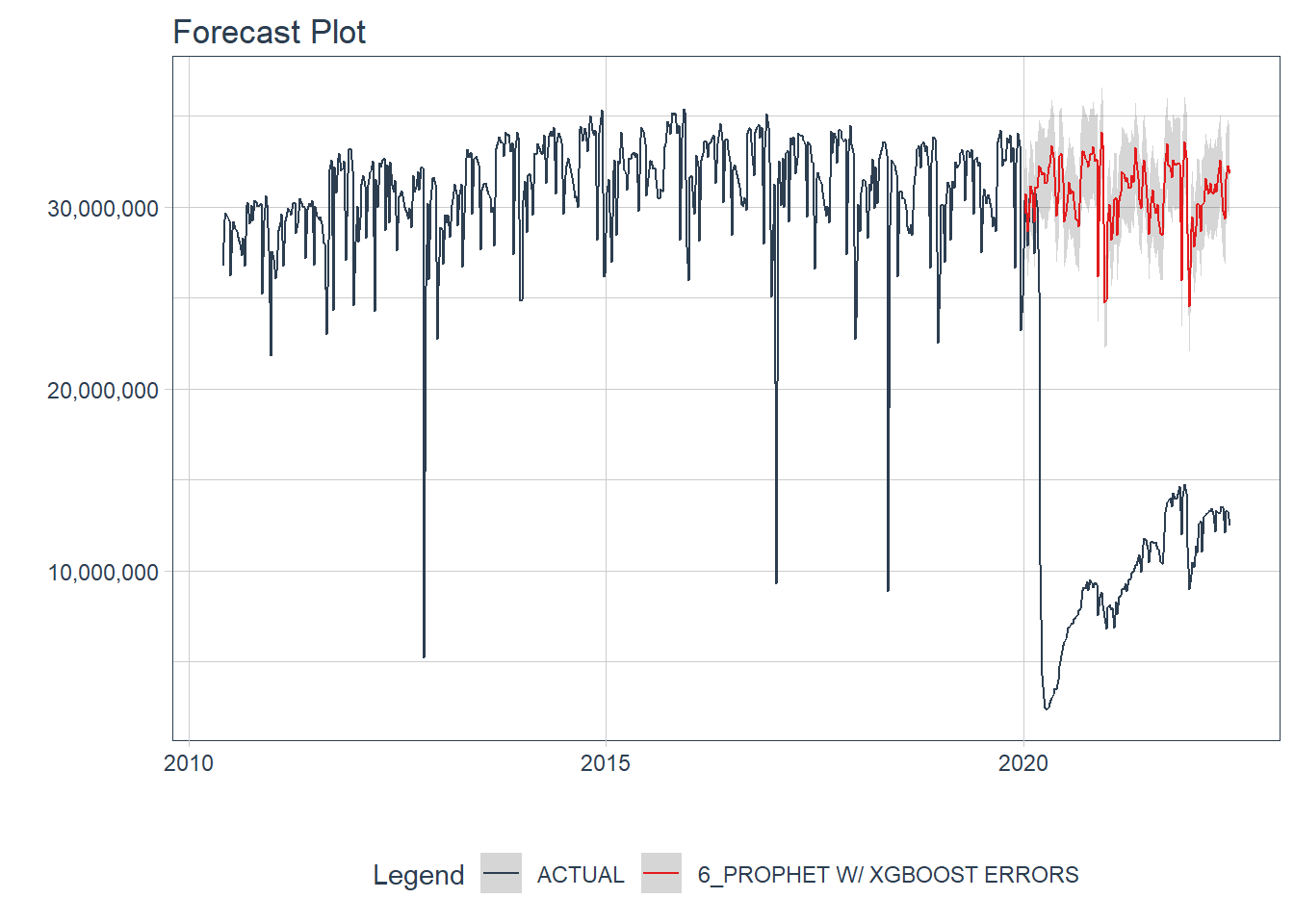
Calculating the “Lost Fare” Amount
Now with forecast computed I can determine the number of lost fares by comparing the forecast number of fares to the actual number of fares. Then to convert that to an amount of money, I’m using a simplistic assumption that each fare would have cost about 2 dollars. This is a heuristic since there are many different kinds of fares in the NYC Subway system which have different costs. A full-fare cost $2.75, a monthly unlimited card costs $127, for Seniors and other reduced fare populations the cost is half-price as $1.35.
loss_amt <- final_fcst %>%
  filter(.model_desc == 'PROPHET W/ XGBOOST ERRORS',
         .index >= min(test$week_start)) %>%
  mutate(diff = fares-.value,
         diff_lo = fares - .conf_lo,
         diff_hi = fares - .conf_hi,
         fare = diff * 2.00,
         fare_lo = diff_lo * 2.00,
         fare_high = diff_hi* 2.00) %>%
  arrange(.index) %>%
  mutate(fares_lost = cumsum(fare),
         fares_lost_lo = cumsum(fare_lo),
         fares_lost_high = cumsum(fare_high))
Using the confidence intervals of the predictions I can form a range of how much in “lost fares” the MTA suffered since 2020.
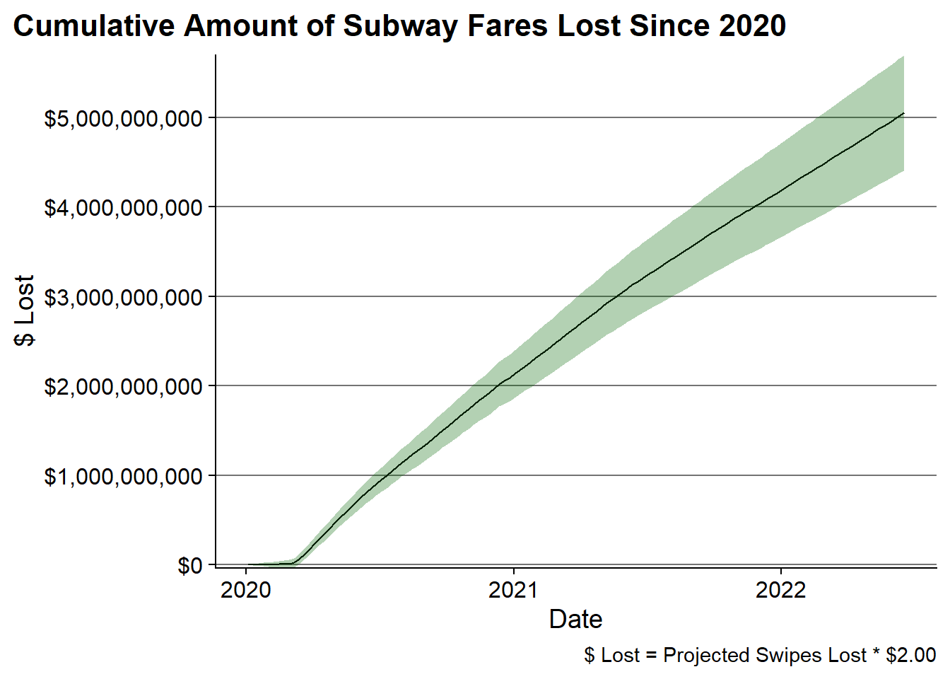
Ultimately, this analysis shows that the MTA has likely lost $5B in lost fares since 2020, but it would be as low as $4.4B or as high as $5.7B.
The cumulative loss can be visualized as follows:
loss_amt %>%
  filter(.index >= ymd(20200101)) %>%
  ggplot(aes(x = .index, y = fares_lost*-1)) +
    geom_line() +
    geom_ribbon(aes(ymin = fares_lost_lo*-1, ymax = fares_lost_high*-1), alpha = .3,
                fill = 'darkgreen') +
    scale_y_continuous(labels = dollar, breaks = seq(0, 6e9, 1e9), expand = c(0 ,0)) +
    labs(title = "Cumulative Amount of Subway Fares Lost Since 2020",
         x = "Date", y = "$ Lost", caption = "$ Lost = Projected Swipes Lost * $2.00") +
    cowplot::theme_cowplot() +
    theme(
      plot.title.position = 'plot',
      panel.grid.major.y = element_line(color = 'grey45')
    )
Concluding Thoughts
While things are starting to return to more “normalcy” on the NYC subway its still far from what is was in the pre-COVID times. Based on this forecasting exercise, its estimated that the MTA has already lost around $5B in “lost fares” and that number is continuing to grow. Because while things are recovering, there’s still a long way to go.