COVID-19s Impact on the NYC Subway System

At 8pm on March 22nd, 2020, the “New York State on PAUSE” executive order became effective and New York City went on lockdown until June 8th, when the Phase 1 reopening began. During this time usage of the public transit systems had a sudden drop as all non-essential services needed to close. In this analysis, I look at MTA Subway Fare data to understand the effect of the PAUSE order on New York City Subway Ridership.
The goals here are to:
- See the overall effect of the PAUSE order on ridership
- See if regional differences around the city differ by type of Metrocard (Full Fare, Unlimited, etc.)
- Create an interactive map to understand the regional differences in usage declines
Packages Used
library(tidyverse) #For Data Manipulation and Plotting
library(janitor) #For cleaning up the variable names in the CSV Files
library(lubridate) #For date processing
library(patchwork) # For combining multiple ggplots together
library(ggmap) # For producing a static map
library(ggtext) # For adding some flair to ggplot
library(leaflet) # For Making Interactive Plots
library(rvest) # For Web Scraping Links to Download
Gathering the Data
The Metropolitan Transit Authority (MTA), which runs the New York City Subway system, publishes the number of Metrocard swipes that occur in the system on a weekly basis by Fare type (Full-Fare, 30-day Unlimited, Student Discount, Senior Discount, etc).
Fortunately, since each weekly file exists as a .csv. with a roughly similar format it can be easily scraped using the rvest package. For this initial scrape, I will be getting any file with a filename from 2019 or 2020. According to the MTA website, the data is uploaded on a two-week delay so a file titled fares_200905.csv (9/5/20) will actually contain the data from two-weeks earlier.
The process for obtaining all of the data will be:
- Use
rvestto extract the paths to all files in a vector by identifying all the anchor tags on the page (html_nodes("a")) and then extracting thehrefattribute (html_attr("href")) - Use
purrr’skeepandstringr’sstr_detectto keep only the elements of the initial vector that match a certain pattern (have titles for 2019 or 2020) - Use
purrr’smap_dfrfunction to apply a function to each.csvfile where the function:- Read’s the
.csvfile the MTA’s website (usingreadr::read_csv) - Cleans the column names to a more R friend format (using
janitor::clean_names) - Removes any columns where all values are
NA - Creates some meta-data around the actual time periods the data reflects
- Turns character formatted numbers into actual numbers (using
readr::parse_number) - Cast to a long-format (using
tidyr::pivot_longer)
- Read’s the
all_weeks <- read_html("http://web.mta.info/developers/fare.html") %>%
  html_nodes("a") %>%
  html_attr("href") %>%
  keep(str_detect(., 'fares_(20)|(19)\\d{4}\\.csv')) %>%
  map_dfr(., function(x){
    return(
      read_csv(paste0("http://web.mta.info/developers/", x), skip = 2) %>%
        clean_names %>%
        #Drop Dead Columns
        select_if(~!all(is.na(.x))) %>%
        mutate(
          key = str_extract(x, '\\d+'),

          #The data in the files covers seven-day periods beginning on the Saturday
          #two weeks prior to the posting date and ending on the following Friday.
          #Thus, as an example, the file labeled Saturday, January 15, 2011, has data
          #covering the period from Saturday, January 1, 2011, through Friday, January 7.
          #The file labeled January 22 has data covering the period from
          #Saturday, January 8, through Friday, January 14. And so on and so forth
          week_start = ymd(paste0('20',key)) - days(14),
          week_end = ymd(paste0('20',key)) - days(8)
        ) %>%
        mutate(across(c(-remote, -station, -week_start, -week_end, -key), parse_number)) %>%
        pivot_longer(
          cols = c(-remote, -station, -week_start, -week_end, -key),
          names_to = "fare_type",
          values_to = "fares"
        )
    )
  }
)
Time-Series of Subway Usage by Week
A first glance at understanding to effect of COVID on the NYC Subway system is to look at a weekly time-series of total subway usage. In this chart and in the future, when looking at the amount of ridership decline I will be comparing points one months prior to the start of the PAUSE act (week of February 22nd) and one month after the PAUSE act (week of April 18th).
From a coding perspective, this step is aggregating all the individual fare data by week and plotting it using ggplot2. The only non-vanilla ggplot portion is the use of ggtext’s geom_textbox to add to flair to the annotations.
The red dots on the chart represent the comparison points used for the rest of this analysis and the dashed black line is March 22nd, when the PAUSE act went into effect.
all_weeks %>%
group_by(key, week_start, week_end) %>%
summarize(fares = sum(fares, na.rm = T), .groups = 'drop') %>%
ggplot(aes(x = week_start, y = fares/1e6)) +
geom_line(color = '#0039A6') +
geom_vline(xintercept = ymd(20200322), lty = 2) +
geom_point(data = tibble(
week_start = c(ymd(20200222), ymd(20200418)),
fares = c(30768135, 2548002)
), color = 'red', size =3
) +
geom_textbox(
x = ymd(20191001),
y = 15,
label = "A ***<span style = 'color:red'>92% Decrease</span>*** \n in Subway Ridership \n 1 month before \n vs. 1 month after \n PAUSE order",
fill = 'cornsilk',
halign = 0.5,
) +
labs(x = "Week Beginning", y = "# of MTA Subway Fares (millions)",
title = "<span style='color:#0039A6'>MTA</span> Ridership (Jan 2019 - Aug 2020)",
subtitle = "PAUSE Order Begins on 3/22/2020") +
scale_y_continuous(labels = scales::comma) +
cowplot::theme_cowplot() +
theme(
plot.title = element_markdown()
)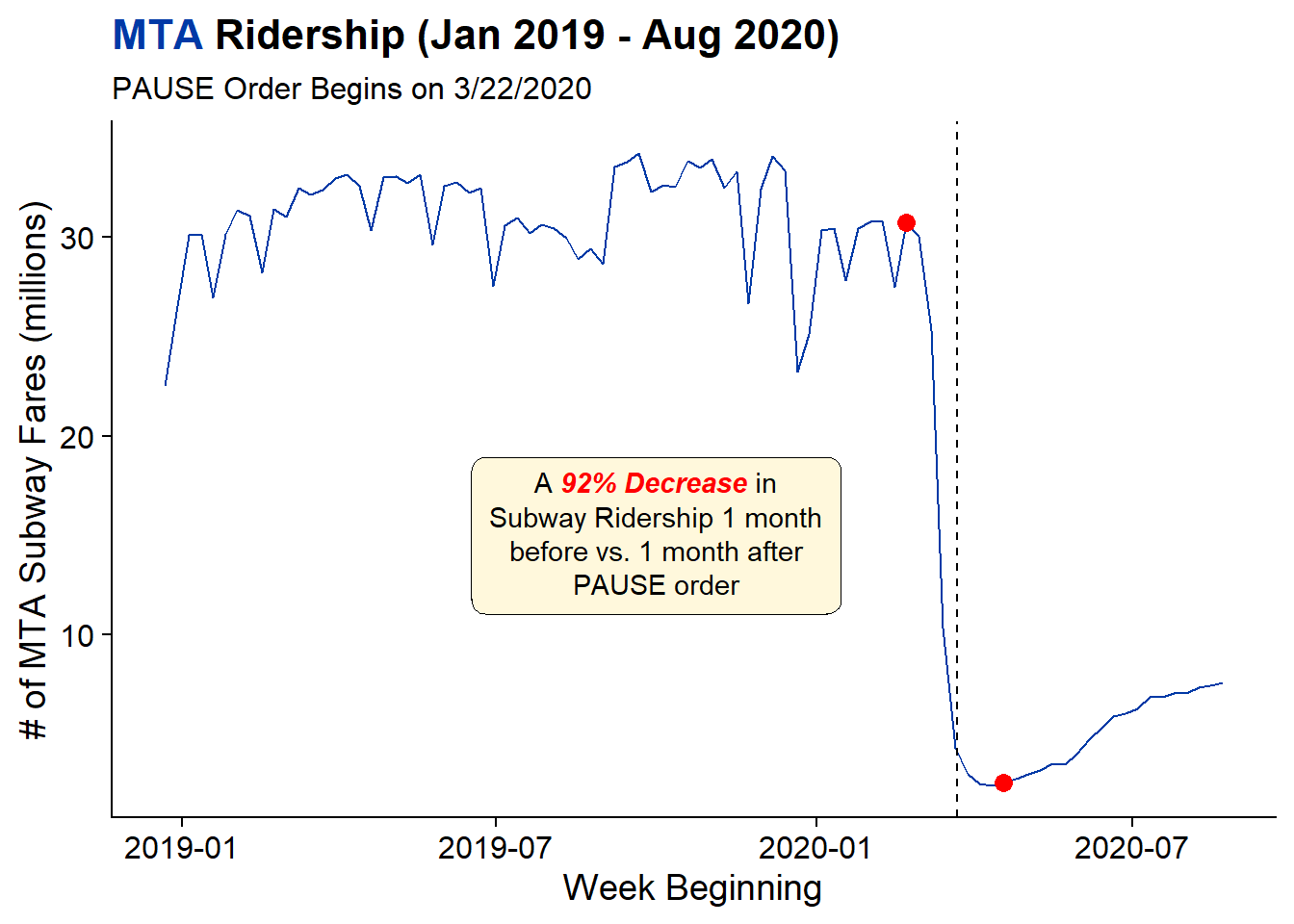 From this chart its clear to see that COVID had a strong effect on Subway ridership as there was a 92% decline between a month prior and a month post. While the ridership is beginning to trend upwards again, the overall numbers are still drastically smaller than in the pre-COVID time.
Exploring the Overall Distribution of Fares
The NYC Subway uses Metrocards in order to gain access to the system. There are also a number of different types of Metrocards. Since ~94% of rides occur on the 7 most common card types, I’ll be focusing on those and bucketing the rest into an “other” group. The 7 most common are:
- Full Fare - A person loads money on their Metrocard and pays per trip
- Annual Unlimited - A person pays a fixed amount for a year of unlimited rides (typically offered through a person’s workplace)
- 30 Day Unlimited - A person pays a fixed amount for 30 days of unlimited rides
- 7 Day Unlimited - A person pays a fixed amount for 7 days of unlimited rides
- Student - Assigned by schools to students for a certain number of trips per day
- Senior Citizen - A reduced-fare Metrocard used by those Age 65 and over or with a disability
- EasyPayXpress - A person sets up an account that automatically reloads the card when the balance gets low
There needs to be some data cleaning to make our data more human readable as well as only focus on the weeks we want to compare vs. all weeks since 2019. This code step will keep only the weeks we care about, cast each time period to a column, given those time periods a nicer name, and give the fare_types a nicer name, and finally filter out some stations that are part of the MTA system but aren’t actually subway stations. These include the Airtrain at JFK Airport and the PATH trains between New York and New Jersey.
combined <- all_weeks %>%
  filter(week_start %in% c(ymd(20200222), ymd(20200418))) %>%
  pivot_wider(
    id_cols = c('remote', 'station', 'fare_type'),
    names_from = week_start,
    values_from = fares,
    values_fill = list(fares = 0)
  ) %>%
  rename(apr=`2020-04-18`, feb=`2020-02-22`) %>%
  mutate(
    fare_type = case_when(
      fare_type == 'ff' ~ 'Full Fare',
      fare_type == 'x30_d_unl' ~ '30-Day Unlimited',
      fare_type == 'x7_d_unl' ~ '7-Day Unlimited',
      fare_type == 'students' ~ 'Student',
      fare_type == 'sen_dis' ~ 'Senior Citizen/Disabled',
      fare_type == 'tcmc_annual_mc' ~ 'Annual Metrocard',
      fare_type == 'mr_ezpay_exp' ~ 'EasyPayXpress',
      TRUE ~ fare_type
    )
  ) %>%
  #Remove SBS Bus Stations and PATH
  filter(!str_detect(station, "SBS-|PA-|AIRTRAIN"))
After cleaning, our data covers 443 different subway stations and 26 different fare_types.
In order to recode the fare types outside of the top 7 I first need to identify what the Top 7 fare types are. In the below code, I create a vector of the Top 7 Fare Types based on the February data.
top_7 <- combined %>%
  count(fare_type, wt = feb, sort = T) %>%
  head(7) %>%
  pull(fare_type)
Then the final step is to aggregate the data over the various stations. In this step, there is also the use of fct_other from forcats to keep only the top 7 fares and create an “Other Fares” label for everything else. Also, the use of other forcats functions such as fct_reorder and fct_relevel are used to order the Fare Types by most common to least common (fct_reorder) but the ensure the the “Other Fares” group is last (fct_relevel).
agg_data <- combined %>%
  pivot_longer(
    cols = c('feb', 'apr'),
    names_to = "month",
    values_to = 'fares'
  ) %>%
  # Collapse Non-Top 7 Fares to "Other" Group
  mutate(
    fare_type = fct_other(fare_type, keep = top_7, other_level = "Other Fares")
  ) %>%
  #Order with Month First So Summarize Will Return a Grouped DF by Month
  group_by(month, fare_type) %>%
  summarize(fares = sum(fares)) %>%
  #Create % Variable
  mutate(pct = fares / sum(fares),
         period = if_else(month == 'feb', '2/22 - 2/28', '4/18 - 4/24')
  ) %>%
  ungroup() %>%
  #Refactor Fare Type for Charts
  mutate(
    fare_type = fct_reorder(fare_type, fares, .fun = max) %>% fct_relevel(., "Other Fares", after = 0L)
  )
The following plots leverage the patchwork package to combine multiple ggplots together to show both the share of Fare Types Pre/Post COVID as well as the actual number of fares. This code is somewhat cumbersome and could probably be done more easily with facets, but I wanted to play with plot_annotation and plot_layout from patchwork in order to add titles to the combined image rather than each plot individually. If you haven’t used patchwork to combine multiple plots, I highly recommend it.
(agg_data %>%
  ggplot(aes(x = fare_type,
             y = pct,
             fill = fct_rev(period))) +
    geom_col(position = 'dodge') +
    geom_text(aes(label = pct %>% scales::percent(accuracy = .1)),
              position = position_dodge(width = .9),
              hjust = 0,
              size = 3) +
    labs(x = "Fare Type", y = "Share of Fares",
         title = "Share of Subway Rides",
         fill = "Period") +
    guides(fill = guide_legend(reverse = T)) +
    coord_flip(ylim = c(0, .6)) +
    cowplot::theme_cowplot() +
    theme(
      axis.text.x = element_blank(),
      axis.ticks.x = element_blank(),
      plot.title = element_text(size = 12)
    )
) +
(agg_data %>%
  ggplot(aes(x = fare_type,
             y = fares,
             fill = fct_rev(period))) +
  geom_col(position = 'dodge') +
  geom_text(aes(label = fares %>% scales::comma()),
            position = position_dodge(width = .9),
            hjust = 0,
            size = 3) +
  labs(x = "", y = "Number of Fares",
       title = "# of Subway Rides",
       fill = "Period") +
  scale_fill_discrete(guide = F) +
  coord_flip(ylim = c(0, 15e6)) +
  cowplot::theme_cowplot() +
  theme(
    axis.text = element_blank(),
    axis.ticks = element_blank(),
    plot.title = element_text(size = 12)
  )
) + plot_annotation(
  title = 'Changes in NYC Subway Ridership Pre/Post PAUSE',
  caption = 'NYC PAUSE Began March 22nd'
) + plot_layout(guides = "collect") & theme(legend.position = "bottom")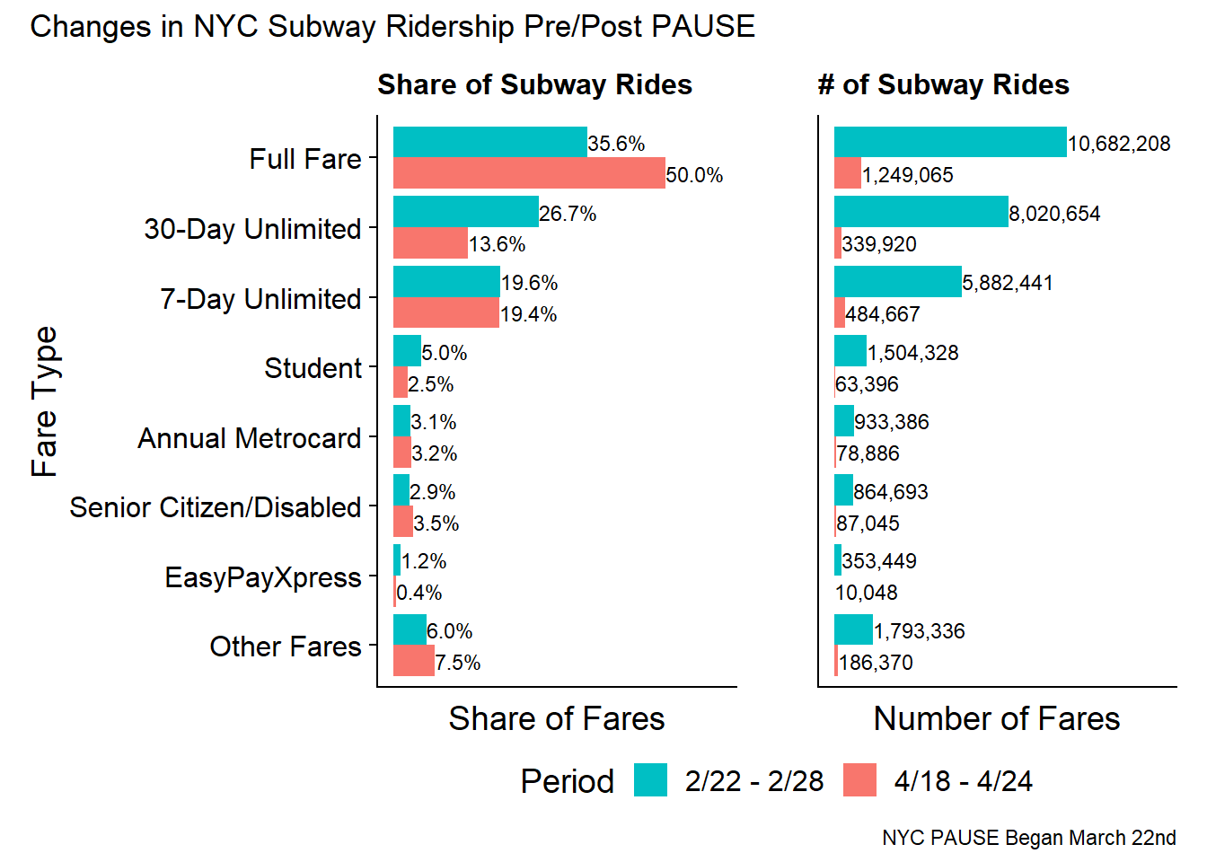
The panel on the right (number of fares) makes it very clear that the number of subway rides have plummeted in the month following the PAUSE act with Full Fare rides dropping from 10M to 1.2M. But more interesting is the specialty types of cards (Unlimited and Student) have very severe declines with the 30-day unlimited dropping 96% from 8M to 350k.
In terms of a share of swipes. The Full Fare Metrocard actually increases in share from 36% to 50%. However, this is likely because Students are learning virtually and those who are able to work from home doing so. Additionally, if subway travel is becoming more infrequent its no longer cost effective to use 30-day unlimited cards, so there is also an effect from people who WOULD have used specialty cards switching to Full Fare.
Does the decline by Fare Type depend on the area of NYC?
From the first two charts its clear that there is an overall decline in Subway ridership and that decline is occurring across all Fare types. Another question is “do these declines change by area of the city?” To do this, I’ll be using ggmap to create maps of NYC Subway Stations by the various Fare types.
The first step is to create data at the station and fare type level, geocode the MTA station data (Huge thanks to Chris Whong who had done the work of mapping Lat/Longs to the Station Names). Since Chris’ work was from 2013, the newer stations such as Hudson Yards and the 2nd Avenue Subway do not appear.
In order to clean up the map, in cases where there were multiple geocodes for a single station the max Lat and max Long were used and stations with less than 1000 pre-COVID swipes of a given fare type were removed.
station_level <- combined %>%
  mutate(
    fare_type = fct_other(fare_type, keep = top_7, other_level = "Other Fares")
  ) %>%
  group_by(remote, station, fare_type) %>%
  summarize(feb = sum(feb),
            apr = sum(apr)
  ) %>%
  mutate(
    abs_change = apr-feb,
    rel_change = apr/feb - 1
  )

geocodes <- read_csv('https://raw.githubusercontent.com/chriswhong/nycturnstiles/master/geocoded.csv',
                     col_names = c('remote', 'zuh', 'station', 'line', 'system', 'lat', 'long'),
)

comb_geo <- station_level %>%
  inner_join(geocodes %>% group_by(remote) %>% summarize(lat = max(lat), long = max(long)), by = "remote") %>%
  filter(feb > 1000) %>%
  ungroup()
Creating the Maps with ggmap
Since the overall trends seem like there is a large decline in ridership across the entire city, I wanted to create new breakpoints to understand where were larger declines vs. smaller declines. To do this I used the classInt::classIntervals() function with the fisher style to algorithmically find the breakpoints in the data. The cut_format function will format the break labels are percentages rather than decimals.
brks <- classInt::classIntervals(comb_geo$rel_change, n = 5, style = 'fisher')

comb_geo$grp_val = kimisc::cut_format(comb_geo$rel_change,
                                      brks$brks,
                                      include.lowest = T,
                                      format_fun = scales::percent)
To create the static map using ggmap I first need to create the base layer that the data will be plotted on. There a many ways to do this but I chose to define a boundary box using Lats and Longs from NYC.gov. The zoom option controls how many tiles should be used in the boundary box. The larger the number the more tiles / more zoomed in your are.
nyc <-get_map(c(
  left = -74.1,
  right = -73.699215,
  top = 40.915568,
  bottom = 40.55
),  zoom = 11, source = 'osm')
Since there are 7 different Fare Types to look at I’m breaking apart the maps into two sets of Fare Types, the unlimited cards, and everything else. The element_markdown() in the theme() block is from ggtext and allows for certain HTML tags to format text in ggplots.
ggmap(nyc,
base_layer = ggplot(comb_geo %>%
filter(str_detect(fare_type, "Unlimited|Annual")),
aes(x = long, y = lat, color = grp_val))) +
geom_point() +
labs(
title = "NYC Ridership Decline by <b><i style='color:#0039A6'>Unlimited Fare Types</i></b>",
color = "% Ridership Decline (Feb vs. Apr)",
x = "", y = "") +
facet_wrap(~fare_type, nrow = 1) +
guides(color=guide_legend(nrow=2,byrow=TRUE)) +
theme(legend.position = 'bottom',
axis.text = element_blank(),
axis.ticks = element_blank(),
plot.title = element_markdown())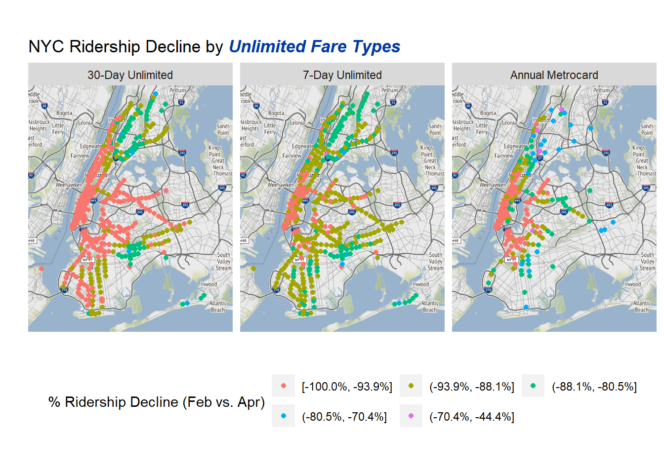 Based on the unlimited cards decline by Subway station its clear that there ARE regional difference in how much COVID has affected usage. The 30-day unlimited card has the highest amount of decline in Manhattan and the parts of Brooklyn and Queens nearest to Manhattan. Meanwhile, the outer parts of Brooklyn, the Bronx, and Spanish Harlem have lower levels of decline. This is consistent with areas of lower socioeconomic status still needing to take the subway due to a higher likelihood of jobs that cannot be done from home.
On the whole the different types of unlimited cards have similar patterns. Although the 7-day Unlimited has more areas not in the largest decline bucket.
ggmap(nyc,
base_layer = ggplot(comb_geo %>%
filter(!str_detect(fare_type, "Unlimited|Annual|Other")),
aes(x = long, y = lat,
color = grp_val))) +
geom_point() +
labs(
title = "NYC Ridership Decline by <b><i style='color:#0039A6'>Other Fare Types</i></b>",
color = "% Ridership Decline (Feb vs. Apr)",
x = "", y = "") +
facet_wrap(~fct_reorder(fare_type, -feb), nrow = 1) +
guides(color=guide_legend(nrow=2,byrow=TRUE)) +
theme(legend.position = 'bottom',
axis.text = element_blank(),
axis.ticks = element_blank(),
plot.title = element_markdown()
)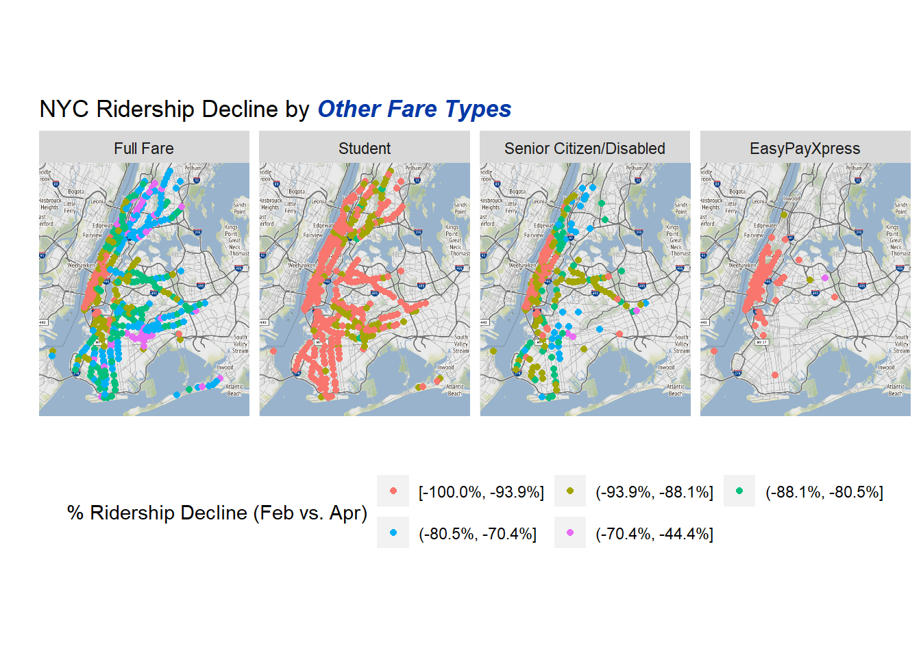 The two largest contrasts in the non-unlimited groups are that Student cards are almost entirely in the largest decline bucket, which makes sense, as Students were engaged in distance learning. Similarly the EasyPayXpress is almost entirely in the largest decline bucket and almost entirely in Manhattan. This also makes sense as its potentially made up of commuters who don’t want to normally deal with refilling a card constantly but wouldn’t use it enough to justify an unlimited card. The closing of non-essential businesses and rise of Work-From-Home is the likely cause.
For the full-fare cards the only area with the most severe declines are in “Core Manhattan” but other areas have smaller declines, potentially due to shifting from one Fare Type to the full fare due to less need to use the Subway System.
Creating an Interactive Map with Leaflet
while the above ggmaps are useful, its difficult to know exactly where the neighborhoods are with the largest/smaller declines. The above maps are useful for a general idea but having an interactive map that would allow the user to pan and zoom would yield greater insights. In order to create one I will use the leaflet package which serves as an API to the javascript library of the same name.
Since for this map I will only be looking at the overall declines as opposed to the declines by Fare Type I need to re-summarize the data and create new breaks based on the overalls. The creation of the msg variable is to provide a pop-up to leaflet.
map_prep <- comb_geo %>%
  group_by(remote, station, lat, long) %>%
  summarize(feb = sum(feb),
            apr = sum(apr),
            .groups = 'drop'
  ) %>%
  mutate(rel_change = apr/feb - 1,
         msg = paste(station, "has decreased", scales::percent(rel_change, accuracy = .1),
                "pre-PAUSE to post-PAUSE from", feb %>% scales::comma(), "to",
                apr %>% scales::comma(), "fares.")
  )

map_prep_breaks <- classInt::classIntervals(map_prep$rel_change,
                                            n = 5,
                                            style = 'fisher')

##Add in the Breaks
map_prep$grp_val = kimisc::cut_format(map_prep$rel_change,
                                      map_prep_breaks$brks,
                                      include.lowest = T,
                                      format_fun = scales::percent
                                      )
One of the things that I found difficult about leaflet was that creating a color palette to go with my breaks required a function that mapped the values to the colors. The factpal in leaflet associates a factor variable with a palette. In this case it takes the factors for the grp_val created above and maps them to colors from the “Set1” palette.
factpal <- colorFactor("Set1", map_prep$grp_val)Creating a basic map with leaflet is fairly straight-forward and the syntax is pretty user friendly. The main things to know when interpreting the code is that the “~” character means that its referring to a variable name within the passed in data (similar to how aes() does the same for ggplot).
This function call while long does the following:
- Passes in my dataset
map_prepto theleaflet()function - Adds the background tiles from the CartoDB.Positron theme
- Adds circle markers for each observation in my data set using the lats/longs with a fixed radius of 250, no border (stroke), and using a fill color from our pre-defined palette with 100% opacity. The hover labels will be the station names and when clicked the msg variable will be the pop-up.
- Finally add a legend in the top-right corner with the pre-defined colors and breakpoints.
The use of the widgetframe::frameWidget() was to get the map to load on the blog and was not necessary for use in RStudio.
library(widgetframe)

ll_map <- leaflet(map_prep) %>%
  addProviderTiles(providers$CartoDB.Positron) %>%
  addCircles(
    lng = ~long,
    lat = ~lat,
    radius = 250,
    #radius = 4,
    stroke = F,
    fill = T,
    color = ~factpal(grp_val),
    fillOpacity = 1,
    label = ~station,
    group = 'stations',
    popup = ~msg
    ) %>%
    addLegend(
      title = "% Change in Rides",
      pal = factpal,
      values = ~grp_val,
      position = 'topright'
    )

frameWidget(ll_map)The two callouts are the prevalence of the purple dots in the Bronx and orange “X” pattern in eastern Brooklyn (Brownsville, New Lots, East New York). According to New York City Government Poverty Measures, Bronx Community Districts 1-6 have the largest percent of population below the poverty line followed by Brownsville and East New York which matches the narrative of areas of lower Socioeconomic status being less likely to be able to avoid the Subway during the pandemic and having less severe declines in ridership than areas of Lower and Midtown Manhattan.
Conclusions
COVID-19 and the New York State PAUSE act have had a dramatic impact on the ridership of the NYC Subway System. Overall ridership was down 92% between February and April as New York became the “COVID capital of the world” during those months. The MTA’s detailed data on types of fares at each station allows for a more granular look into how the pandemic is altering rider behavior leading to decreased usage of Unlimited Cards and Student cards as people are more constrained to their homes as well as areas of lower socioeconomic status having less severe changes in ridership comparable to more affluent areas of the city.