The Most Unexpectedly Good and Bad TV Episodes
Why the Fresh Prince of Bel-Air has the Most Unexpectedly Good Episode of TV

The 9th episode of the 2nd Season of Ted Lasso is an episode called “Beard After Hours” which I found to be a pretty bad episode on a pretty good show. I wondered whether others found this to be an unexpectedly bad episode of TV or if it was just me. The website RatinGraph confirmed that while it wasn’t the worst episode of the series, its in the bottom 3.
Further Googling had shown that this episode (along with one other) were the results of the series getting an extension from 10 episodes to 12 episodes for Season 2. Thus, “Beard After Hours” was a filler episode intended to not affect the main plot line.
This got me thinking about other unexpectedly bad episodes of TV. And since doing unexpectedly bad and unexpectedly good are similar I figured why not both. So in this post, I find the 10 most unexpectedly good and unexpectedly bad episodes of television.
Data
IMDB provides datasets for personal and non-commercial use which contains information on TV Series, their episodes, and the ratings of those episodes. More specifically I will be using the title.basics.tsv.gz file for basic info on TV Series (and episode names), title.episode.tsv.gz to get all of the episode IDs for the TV Series, and title.ratings.tsv.gz to get the ratings and number votes for each episode.
For this analysis, there are no fancy packages being used. Just tidyverse, glue, and broom for data manipulation and ggtext and ggrepel for enhancements to the visualizations.
First step is loading libraries,
library(tidyverse)
library(broom)
library(ggrepel)
library(glue)
library(ggtext)
setting some global settings for visualization,
theme_set(theme_light(base_size = 14, base_family = "Asap SemiCondensed"))

theme_update(
  panel.grid.minor = element_blank(),
  plot.title = element_text(face = "bold"),
  plot.title.position = "plot"
)
and reading in the 3 IMDB data files. The raw files are tab-delimited and use the \N character for a missing value, the na parameter in read_delim tells R to set these to NA rather than keep them as a string.
basics <- read_delim(file = 'data/title.basics.tsv', delim = '\t', na = '\\N')
ratings <- read_delim(file = 'data/title.ratings.tsv', delim = '\t')
episodes <- read_delim(file = 'data/title.episode.tsv', delim = '\t', na ='\\N')
The basics file contains nearly 250k TV Series which is way more than I want to deal with so I’ll keep shows that meet a certain criteria:
- IMDB categorizes it as a TV Series
- The show started in 1990 or later (because I wanted things I’d be familiar with)
- IMDB classifies it as either a Comedy or a Drama
- IMDB does not classify it as a Talk Show, Reality Show, News, Game Show, or Short
- Genres on IMDB can have multiple categories for example Jimmy Kimmel Live! is classified as Comedy, Music, and Talk-Show
- There are at least 20 episodes in the Series (need a track record for how a show is rated)
- Each episode has on average 250 votes (want to have enough stability in the ratings and for the show to be somewhat popular)
These exclusions are handled with the following code:
basics_agg <- basics %>%
  # Limit to TV Series
  filter(titleType == 'tvSeries') %>%
  # Keep Only Shows Starting In or After 1990
  filter(startYear >= 1990) %>%
  # Join all the Episodes to the TV Series data
  inner_join(episodes, by = join_by(tconst==parentTconst)) %>%
  # Join the ratings to the episode data
  inner_join(ratings, by = join_by(tconst.y == tconst)) %>%
  # Calculate summary statistics for each show
  group_by(tconst, titleType, primaryTitle, originalTitle,
           isAdult, startYear, endYear, runtimeMinutes, genres) %>%
  summarize(
    total_episodes = n(),
    avg_votes = mean(numVotes),
    overall_average = sum(numVotes * averageRating) / sum(numVotes),
    .groups = 'drop'
  ) %>%
  # Keep Comedies and Dramas
  filter(str_detect(genres, 'Comedy|Drama')) %>%
  # Exclude Other Genres
  filter(!str_detect(genres, 'Talk-Show|Reality-TV|News|Game-Show|Short')) %>%
  # Keep Only if 20+ Episodes on Series
  filter(total_episodes >= 20) %>%
  # Keep Only if Episodes Average 250 Votes or More
  filter(avg_votes > 250)
Now there are only 700 shows remaining in the data which is much more manageable!
Creating an episode level data set
So far the basics_agg data set is just a list of 700 TV Series and their information. To build a model to predict episode ratings I’ll have to build a data set where each row is an episode. This will replicate some the logic from above that merges the 3 data-sets together:
all_tv_details <- basics_agg %>%
  ## Join in Episode Data
  inner_join(episodes, by = join_by(tconst==parentTconst)) %>%
  ## Join in Ratings Data
  inner_join(ratings, by = join_by(tconst.y == tconst)) %>%
  # Bring in Episode Titles
  left_join(basics %>% filter(titleType == 'tvEpisode') %>%
              transmute(tconst, episodeTitle = primaryTitle),
            by = join_by(tconst.y == tconst)) %>%
  arrange(tconst, seasonNumber, episodeNumber) %>%
  group_by(tconst) %>%
  # Create variables for total number episodes
  mutate(episodeOverall = row_number(tconst),
         seasonNumber = factor(seasonNumber)
  ) %>%
  # Filter Out Missing Data
  filter(!is.na(seasonNumber) & !is.na(episodeNumber)) %>%
  ungroup()
Now the dataset is all prepared to find our unexpected episodes.
Methodology
The methodology I’m using for what’s an unexpectedly good or bad episode of TV is similar to the methodology used in the tsoutliers() function in the forecast package. Although since this isn’t really a time-series, I’ll be modifying it slightly to not account for “seasonal components”. My method is:
For each TV Series create a prediction of what the expected IMDB rating would be.
- Using a linear model with the Overall Episode number to capture a global trend (does the series get better or worse over time) as well as Season Number and Episode Number (and their interaction) to capture more local effects (is a certain season as a whole just bad).
- For example, in the show Scrubs (which I love), the 9th season is rated much lower than Seasons 1-8. Therefore episodes in Season 9 aren’t unexpectedly bad since the whole season is bad.
- Using a linear model with the Overall Episode number to capture a global trend (does the series get better or worse over time) as well as Season Number and Episode Number (and their interaction) to capture more local effects (is a certain season as a whole just bad).
Calculate the difference between the Predicted Ratings from the model in Step #1 and the Actual Rating from IMDB.
Look at the distribution of the differences from Step #2. Episodes will be labeled as unexpectedly good or bad if the difference calculated in step #2 is large enough.
- For “large enough” I look at the interquartile range (IQR) of the differences (the 75th percentile minus the 25th percentile) and label an episode as unexpectedly bad if that episode’s difference is less than the 25th Percentile - 3 times the IQR and unexpectedly good if that episode’s difference is greater than the 75th Percentile + 3 times the IQR.
The amount of unexpectedness is based on the difference between the lower/upper bound and the actual value.
- This is different than just using the difference between the predicted and the actual values.
- The reason being that if a show has a very wide expected range, for example from 4 to 9. Then if the predicted value is 6.5 and the actual value is 9.1 then there’s a difference of 2.8 from the predicted value but only 0.1 outside the expected range. I want to focus on the greatest gap from expected so I want to take larger variability into account.
- This is different than just using the difference between the predicted and the actual values.
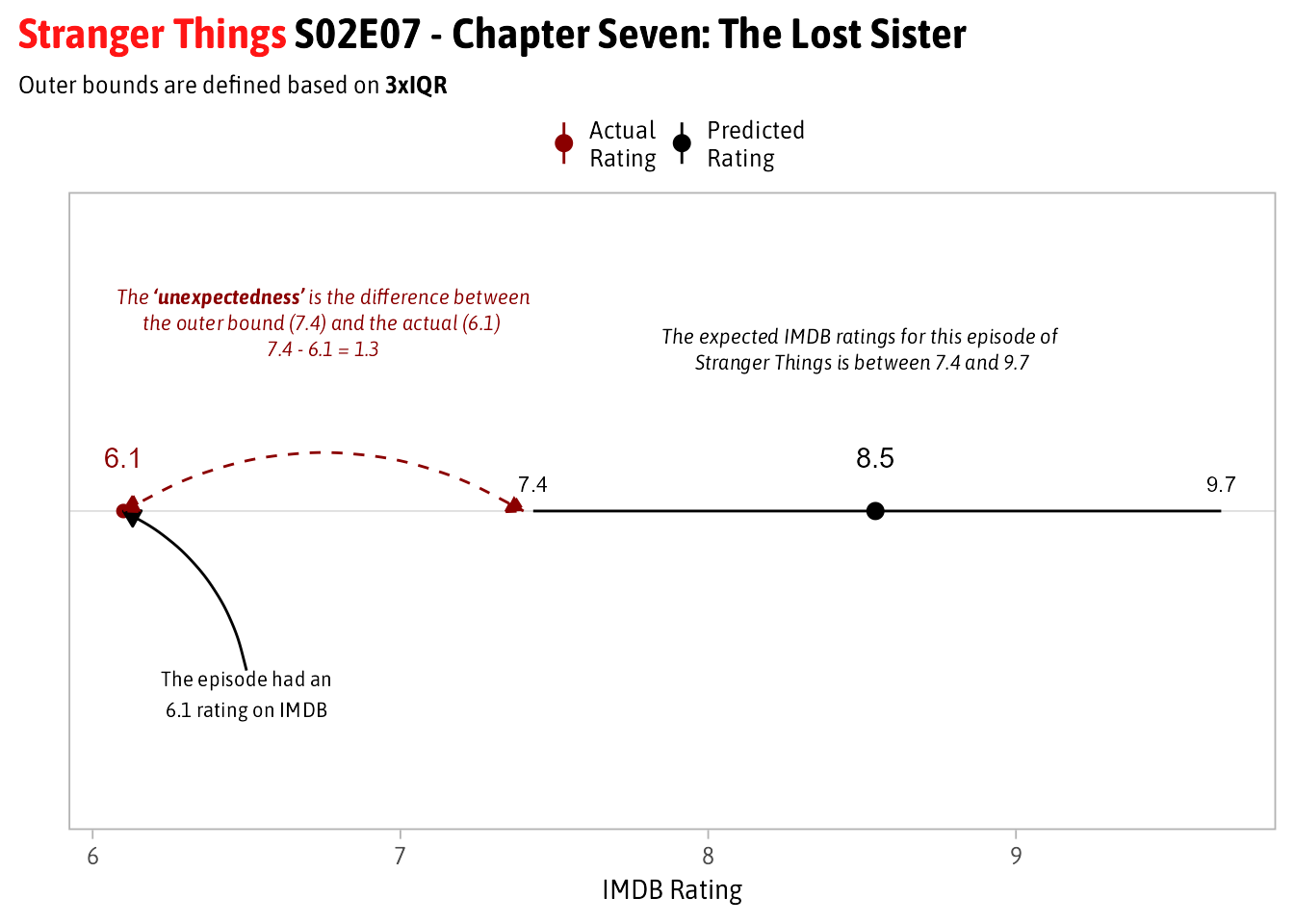
A visual explanation using an episode of Stranger Things as an example is shown below. I want to focus more on the difference between the 7.4 and 6.1 vs. the 8.5 and 6.1:

Function to find the Unexpected Episodes
The steps above have been built into a function called get_anomalies() which runs the four steps described above. The parameter onlyAnomalies determines whether to return only unexpected episodes or to return all episodes. The differences described in step 2 are added using the augment function from broom :
get_anomalies <- function(dt, onlyAnomalies = T){

  ## STEP 1: Run Linear Model on IMDB Ratings vs. Episode Number + Season Info
  #if multiple seasons for show use both global and local trend
  if(n_distinct(dt$seasonNumber) > 1){
    model <- lm(averageRating ~ episodeOverall + seasonNumber*episodeNumber,
                data = dt)
  }
  # if only one season then global trend = local trend
  else{
    model <- lm(averageRating ~ episodeOverall, data = dt)
  }

  ### Step 2 - Add in Residuals from model to initial data set
  results <- augment(model, dt) %>%
  ### Step 3 - Calculate the 3*IQR Range for each episode
    mutate(
      ## Determine the IQR of the Residuals (P75 - P25)
      iqr = (quantile(.resid, .75)-quantile(.resid, .25)),
      ## Set Lower Bound for expected range of residuals
      lci = quantile(.resid, .25)-(3*iqr),
      ## Set Upper Bound for expected range of residuals
      uci = quantile(.resid, .75)+(3*iqr),
      ## Tag an episode as an anomaly if its actual rating is outside the bounds
      anomaly = if_else(.resid > uci | .resid < lci, T, F),

      ## Set expected range back in the scale of the 0-10 prediction.
      lower = .fitted + lci,
      upper = .fitted + uci,

      # Step 4 - Calculate the difference between the bounds and the actual
      # value to use for measure of unexpectedness
      remainder = if_else(.resid < 0, averageRating-lower, averageRating-upper)
    ) %>%
    # Subset columns
    select(episodeOverall, seasonNumber, episodeNumber, episodeTitle,
           averageRating, .fitted, .resid,
           anomaly, lower, upper, remainder)

  # Determine whether to return all episodes or just the unexpected episodes
  if(onlyAnomalies == T){
    return(results %>% filter(anomaly == T))
  }
  else{
    return(results)
  }
}
Results
The function above needs to be run individually on the 700 TV Series in the data. To run all 700 models in a simple way I use the Many Models framework by nesting data into list-columns and using map to run the function on each subset of data.
results <- all_tv_details %>%
  # Create a dataset with 1 row per TV Series with all data in a list-column
  group_by(primaryTitle) %>%
  nest() %>%
  # Run the function to get the unexpected episodes as a new list-column
  mutate(results = map(data, get_anomalies)) %>%
  # Break the new list-column back into individual rows
  unnest(results) %>%
  # Drop the original list columns and ungroup the data set
  select(-data) %>%
  ungroup() %>%
  # Use Glue package to make a pretty label
  mutate(
    lbl = glue("**{primaryTitle}** S{s}E{e} - {episodeTitle}",
               s = if_else(as.numeric(seasonNumber) < 10,
                           glue("0{seasonNumber}"), glue("{seasonNumber}")),
               e = if_else(as.numeric(episodeNumber) < 10,
                           glue("0{episodeNumber}"), glue("{episodeNumber}"))
    )
  )
And now without further ado… the RESULTS!
The TV Shows with the Most Unexpected Episodes
Overall, 143 episodes were identified as being unexpectedly good or bad. Of this bunch 64% are unexpectedly bad showing that its more common for a good show to miss then it is for a show to hit an unexpected home run.
The first thing I want to look at are the 10 TV Series that have the most unexpected episodes both good and bad.
results %>%
  # Group by Show
  group_by(primaryTitle) %>%
  # Count the number of unexpected episodes in total as well as good and bad
  summarize(
    total = n(),
    `unexpectedly bad` = sum(.resid < 0)*-1,
    `unexpectedly good` = sum(.resid > 0)
  ) %>%
  # Get the Top 10 by Total
  slice_max(order_by = total, n = 10, with_ties = F) %>%
  pivot_longer(
    cols = c(`unexpectedly bad`, `unexpectedly good`),
    names_to = "type",
    values_to = "episodes"
  ) %>%
  ggplot(aes(x = episodes, y=fct_reorder(primaryTitle, total), fill = type)) +
    geom_col() +
    geom_text(aes(label = if_else(episodes != 0, abs(episodes), NA)),
              hjust = "inward", color = 'grey90') +
    labs(x = "# of Unexpected Episodes",
         y = "TV Series",
         title = "TV Series with Most <i style = 'color:#ba2a22'>Unexpected</i> Episodes",
         fill = "") +
    scale_fill_viridis_d(option = "cividis", begin = .2, end = .8,
                         labels = str_to_title) +

    theme(
      legend.position = 'top',
      plot.title = element_markdown(),
      axis.text.x = element_blank(),
      axis.ticks.x = element_blank(),
      axis.title = element_text(size = 12),
      axis.text.y = element_text(size = 10),
      legend.margin = margin(0, 0, -5, 0)
    )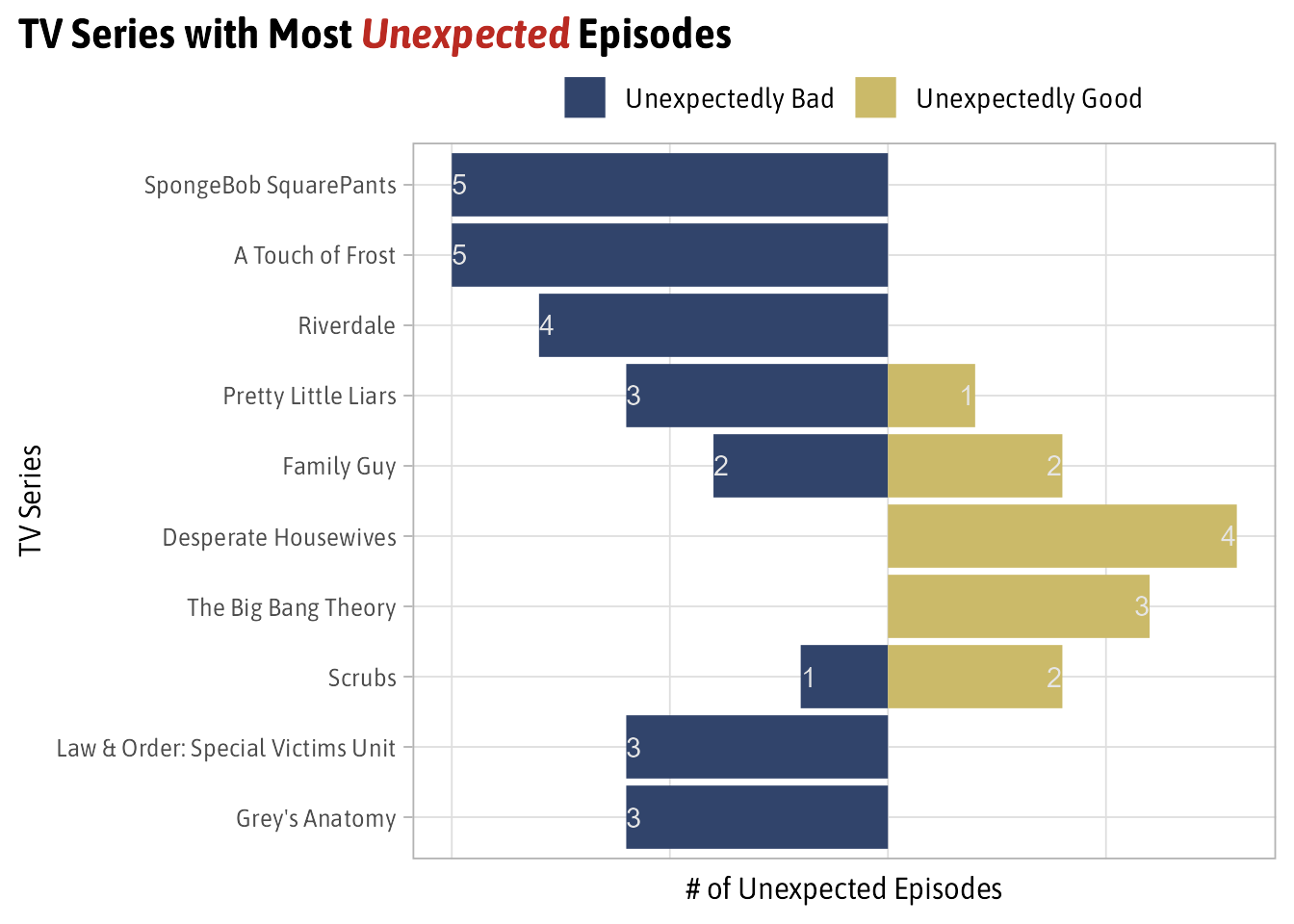
Surprisingly, at least to me, SpongeBob Squarepants has the most unexpected episodes with 5 and they’re all unexpectedly bad. This is in contrast with Desperate Housewives and Big Bang Theory which have all unexpectedly good episodes.
The 10 Most Unexpectedly Good Episodes
The Top 10 Unexpectedly Good episodes are:
# Define Elements for Manual Label
color = c("Actual\nRating" = "darkred",
          "Predicted\nRating" = 'black',
          "Series\nAverage" = "darkblue")
shape = c("Actual\nRating" = 19,
          "Predicted\nRating" = 19,
          "Series\nAverage" = 1)

# Subset to only the Unexpectedly Good Results
good_results <- results %>%
  filter(.resid > 0)  %>%
  slice_max(order_by = remainder, n = 10, with_ties = F)

# Plot
good_results %>%
  select(lbl, .resid, Predicted = .fitted, Actual = averageRating,
         lower, upper, remainder) %>%
  ggplot(aes(x = fct_reorder(lbl, remainder))) +
  geom_pointrange(aes(y = Predicted, ymin = lower, ymax = upper,
                      color = 'Predicted\nRating')) +
  geom_point(aes(y = Actual, color = "Actual\nRating"), size = 2) +
  geom_text(aes(label = Actual, y = Actual), color = 'darkred', nudge_x = .3) +
  geom_text(aes(label = round(lower, 1), y = lower),  nudge_x = .3, size = 3) +
  geom_text(aes(label = round(upper, 1), y = upper),  nudge_x = .3, size = 3) +
  geom_text(aes(label = round(Predicted, 1), y = Predicted),  nudge_x = .3) +
  scale_color_manual(values = color, name = '') +
  labs(x = "", y = "IMDB Rating",
       title = "Top 10 Unexpectedly <i style = 'color:#2E8B57'>Good Episodes </i>",
       subtitle = "*As measured by the difference between Prediction Interval and Actual IMDB Episode Rating*") +
  coord_flip() +
  theme(
    plot.title = element_markdown(),
    plot.title.position = 'plot',
    plot.subtitle = element_markdown(size = 10),
    panel.grid.major.x = element_blank(),
    axis.text.x = element_markdown(size = 10),
    axis.title.x = element_text(size = 11),
    axis.text.y = element_markdown(size = 9),
    legend.position = 'top',
    legend.margin = margin(0, 0, -5, 0),
    legend.text = element_text(size = 9),
    legend.key.size = unit(0.2, "cm")
  )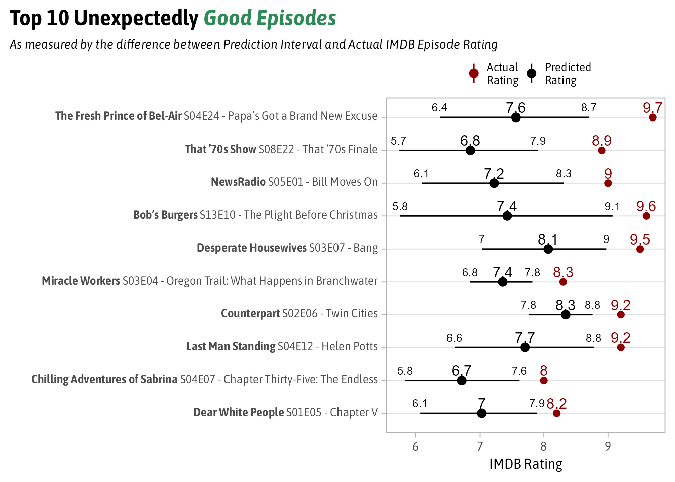
According to this method the most unexpectedly good episode of TV since 1990 is from The Fresh Prince of Bel-Air’s 4th Season entitled “Papa’s Got a Brand New Excuse. Its a pretty entertaining show in general but this episode contains quite possible the most iconic scene from the show. Inquirer.com called the end of this episode “among the most tear-jerking in sitcom history”.
I’m not really familiar with many of the other episodes from this list, but at least from number 1 it seems like the method works well. Remember this isn’t looking for the best TV episodes but the best ones from a show you wouldn’t expect.
The 10 Most Unexpectedly Bad Episodes
The Top 10 Unexpectedly Bad episodes are:
# Subset Data to only Unexpectedly Bad Results
bad_results <- results %>%
  filter(.resid < 0) %>%
  slice_min(order_by = remainder, n = 10, with_ties = F)

# Plot
bad_results %>%
  select(lbl, .resid, Predicted = .fitted,
         Actual = averageRating, lower, upper, remainder) %>%
  ggplot(aes(x = fct_reorder(lbl, -remainder))) +
    geom_pointrange(aes(y = Predicted, ymin = lower,
                        ymax = upper, color = 'Predicted\nRating')) +
    geom_point(aes(y = Actual, color = "Actual\nRating"), size = 2) +
    geom_text(aes(label = Actual, y = Actual),
              color = 'darkred', nudge_x = .3) +
    geom_text(aes(label = round(lower, 1), y = lower),
              nudge_x = .3, size = 3) +
    geom_text(aes(label = round(upper, 1), y = upper),
              nudge_x = .3, size = 3) +
    geom_text(aes(label = round(Predicted, 1), y = Predicted),
              nudge_x = .3) +
    scale_color_manual(values = color, name = '') +
    labs(x = "", y = "IMDB Rating",
         title = "Top 10 Unexpectedly <i style = 'color:#b22222'>Bad Episodes </i>",
         subtitle = "*As measured by the difference between Prediction Interval and Actual IMDB Episode Rating*") +
    coord_flip() +
    theme(
      plot.title = element_markdown(),
      plot.title.position = 'plot',
      plot.subtitle = element_markdown(size = 10),
      panel.grid.major.x = element_blank(),
      axis.text.x = element_markdown(size = 10),
      axis.title.x = element_text(size = 11),
      axis.text.y = element_markdown(size = 9),
      legend.position = 'top',
      legend.margin = margin(0, 0, -5, 0),
      legend.text = element_text(size = 9),
      legend.key.size = unit(0.2, "cm")
    )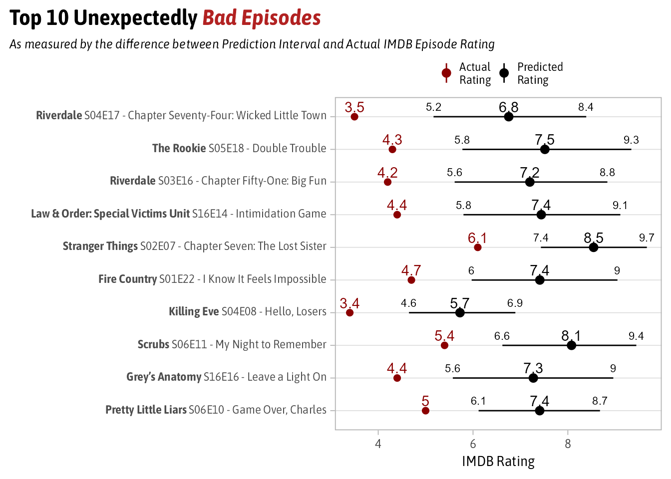
I have seen more of the bad list than I did the good list. While I don’t know much about later seasons of Riverdale, I can speak more about #5 which comes from Stranger Things’ 2nd Season. This episode involved a side-quest of one of the main characters meeting a family member that hasn’t appeared in any episode since.
Also, the Scrubs episode that appears “My Night to Remember” is the only clip show from the series.
In both of these examples, they’re unexpectedly bad because the shows in general are good (they have the two highest upper bounds of the Top 10) but these two episodes did nothing to advance the plot and were ultimately filler. Much like the Ted Lasso episode that motivated this analysis.
Moral of the story is that people don’t like filler episodes.
Drilling into a Few Shows
Just for fun I wrote a general purpose function inspired by the RatinGraph charts that will show any TV Series’s trend-lines and expected range as well as highlight any unexpected episodes.
plot_shows <- function(title){
  # Run the anomaly function on a single show and return all the episodes
  get_anomalies(
    all_tv_details %>%
      filter(primaryTitle == title),
    onlyAnomalies = F
  ) %>%
    mutate(primaryTitle = title) %>%
    ggplot(aes(x = episodeOverall, y = averageRating, color = seasonNumber)) +
    # Plot the expected value range
    geom_ribbon(aes(ymin = lower, ymax = upper), fill = 'lightblue',
                color = NA, alpha = .3) +
    # Plot the overall trend line across the entire Series
    geom_smooth( se = F, method = 'lm', lty = 2, color = 'grey60') +
    # Plot the trendlines for each season
    geom_smooth(aes(group = seasonNumber), se = F, method = 'lm',
                lty = 2, show.legend = F) +
    # Plot the actuals for each episode
    geom_point(alpha = .5) +
    # Add annotations for any outliers
    geom_label_repel(data = . %>% filter(anomaly == T), size = 3,
                     min.segment.length = 0,
                     aes(label = glue("Season {seasonNumber} Episode {episodeNumber}
                                    {episodeTitle}
                                    Rating: {averageRating}")),
                     show.legend = F) +
    guides(color = guide_legend(nrow = 1)) +
    labs(x = 'Episodes', y = 'IMDB Rating', title = title, color = 'Season:') +
    theme(
      plot.title = element_text(family = 'Roboto'),
      legend.position = 'bottom',
    )

}
First let’s look at the show with the most unexpectedly good episode, The Fresh Prince of Bel-Air.
plot_shows('The Fresh Prince of Bel-Air')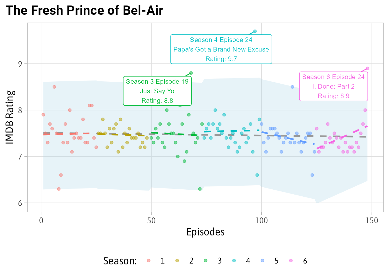 For most of its episodes the IMDB ratings are a solid 7.5. There are some ups and some downs but nothing like the 9.7 rating that “Papa’s Got a Brand New Excuse” received.
On the negative side, let’s look at Scrubs:
plot_shows('Scrubs')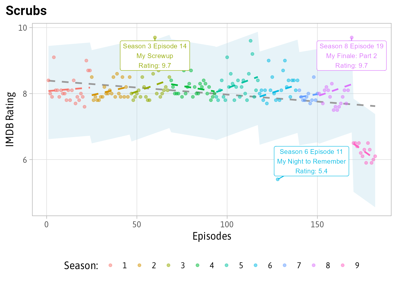
You can see that the model accounts for Season 9 being rated worse than 1-8 although not being unexpected since the whole season is poorly rating. Also, the clip episode “My Night To Remember” being far worse at 5.4 then the 8 rating that Seasons 1-8 usually had.
Finally, let’s look at Ted Lasso since it was the inspiration for this post:
plot_shows('Ted Lasso')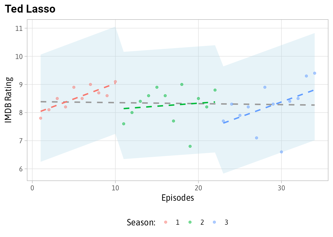 No major outliers. And the episode “Beard After Hours” (the lowest green dot) while lower than expected doesn’t meet the extreme criteria to be included here.
Special Thanks
A special thanks to Cédric Scherer. His posit::conf(2023) presentation on Engaging and Beautiful Data Visualizations with ggplot2 taught me a TON.
Appendix: Code for the example Plot for Stranger Things
examples <- results %>% filter(primaryTitle == 'Stranger Things')

examples %>%
  select(lbl, .resid, Predicted = .fitted, Actual = averageRating, lower, upper, remainder) %>%
  ggplot(aes(x = fct_reorder(lbl, -remainder))) +
  geom_pointrange(aes(y = Predicted, ymin = lower, ymax = upper, color = 'Predicted\nRating')) +
  geom_point(aes(y = Actual, color = "Actual\nRating"), size = 2) +
  geom_text(aes(label = Actual, y = Actual), color = 'darkred', nudge_x = .1) +
  geom_text(aes(label = round(lower, 1), y = lower),  nudge_x = .05, size = 3) +
  geom_text(aes(label = round(upper, 1), y = upper),  nudge_x = .05, size = 3) +
  geom_text(aes(label = round(Predicted, 1), y = Predicted),  nudge_x = .1) +
  annotate(
    "richtext",
    y = 8.5,
    x = 1.3,
    size = 3,
    label = "*The expected IMDB ratings for this episode of <br> Stranger Things is between 7.4 and 9.7*",
    family = "Asap SemiCondensed",
    label.color = NA
  ) +
  annotate(
    'curve',
    xend = 1,
    x = .7,
    yend = 6.1,
    y = 6.5,
    curvature = .25,
    arrow = arrow(
      length = unit(7, "pt"),
      type = "closed"
    )
  ) +
  annotate(
    'text',
    x = .7,
    y = 6.5,
    label = "The episode had an\n6.1 rating on IMDB",
    family = "Asap SemiCondensed",
    size = 3,
    vjust = 1
  ) +
  annotate(
    'curve',
    x = 1,
    xend = 1,
    y = 6.1,
    yend = 7.4,
    color = 'darkred',
    lty = 2,
    curvature = -.3,
    arrow = arrow(
      length = unit(7, "pt"),
      type = "closed",
      ends = 'both'
    )
  ) +
  annotate(
    'richtext',
    x = 1.35,
    y = 6.75,
    size = 3,
    color = 'darkred',
    family = "Asap SemiCondensed",
    label = "<i>The <b>'unexpectedness'</b> is the difference between<br>the outer bound (7.4) and the actual (6.1)
    <br>7.4 - 6.1 = 1.3",
    label.color = NA,
    fill = NA
  ) +
  scale_color_manual(values = color, name = '') +
  labs(x = "", y = "IMDB Rating",
       title = "<span style = 'color:#ff1515'>Stranger Things</span> S02E07 - Chapter Seven: The Lost Sister",
       subtitle = "Outer bounds are defined based on **3xIQR**") +
  coord_flip() +
  theme(
    plot.title = element_markdown(),
    plot.title.position = 'plot',
    plot.subtitle = element_markdown(size = 10),
    panel.grid.major.x = element_blank(),
    axis.text.x = element_text(size = 10),
    axis.title.x = element_text(size = 11),
    axis.text.y = element_blank(),
    axis.ticks.y = element_blank(),
    legend.position = 'top',
    legend.margin = margin(0, 0, -5, 0),
    legend.text = element_text(size = 10),
    legend.key.size = unit(0.2, "cm")
  )