Looking for Media Bias in Coverage of Trump's COVID Diagnosis
Within the United States, especially these last few years, there has been an increased focus on “fake news” or “bias in the media”. Fox News typically is the poster-child for right-wing bias and everything else seems to be the poster child for left-wing bias. While this is just a humble R blog (and NOT a political blog) I thought it could be an interesting question to look at how a single event is covered from different media sources.
I don’t know much about assessing Media Bias, but fortunately websites like Allsides.com have done the research for me and produced the following chart breaking Media outlets based on direction of bias:
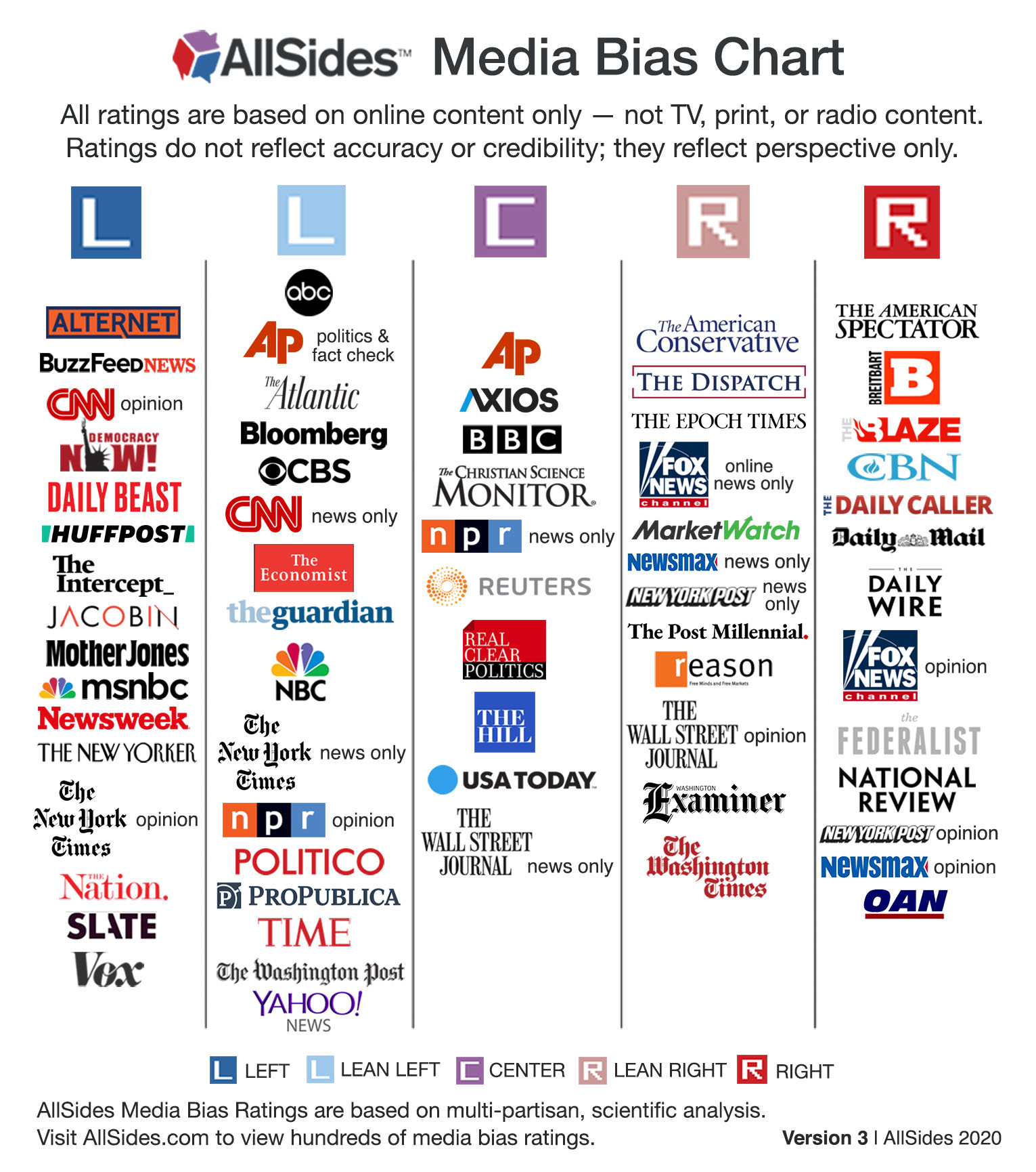
I don’t have a perspective on the accuracy of this chart. But it provides enough information to work with.
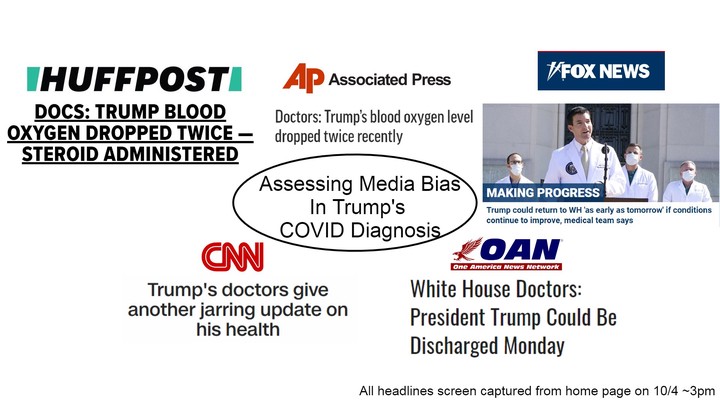
Originally, I was planning on using the first Presidential Debate in late September, but with President Trump’s positive COVID-19 diagnosis on Friday 10/2, I’ve decided to use that event instead.
The rules for this analysis are:
- Pick one media outlet from each column of the Media Bias Chart above and find an article about Trump’s COVID diagnosis.
- No opinion pieces or editorials. The articles should be intended to be reporting on the facts of an event.
The Data
All data was collected on Friday, October 2 (some articles have since changed). The five articles are listed below from most left-leaning to most right-leaning:
I manually copy-pasted the titles, subtitles, and articles text in .txt files ensuring that inserted links to other articles were not accidentally picked up.
Analysis Plan
The main objectives for this analysis are to look at:
- Sentiment Analysis of the five different articles
- Looking for the most representative words for each article
to see if we can learn anything about Media Bias from these five sources.
The libraries that will be used for this analysis are:
library(tidyverse) #Our Workhorse Data Manipulation / Plotting Functions
library(tidytext) #Tidyverse Friend Package for Text-Mining
library(scales) #For easier value formatting
library(ggtext) # To Be Able to Use Images On Plots
library(ggupset) # For Creating an Upset Chart
library(UpSetR) # For Creating an Upset Chart
Reading in the data
As mentioned above, the text of the five articles are contained in five text files. The following code block will look into the working directory and use purrr's map_dfr function to execute the readr::read_table function and create a column to mark which source the text came from:
articles <- dir() %>%
  keep(str_detect(., '\\.txt')) %>%
  map_dfr(
    ~read_table(.x, col_names = F) %>%
      mutate(source = str_remove_all(.x, '\\.txt'))
    )
One of my earlier blog posts on creating work embeddings to compare TikTok and Instagram describes the basic pieces of tidytext. But the first step of the text analysis is to ‘tokenize’ (split the data into one word per row) using tidytext::unnest_tokens() which will break apart the X1 column containing sentences into a new column called word. Then the next step is removing stop words, which are common words like “the”, “and”, and “a” which don’t add much meaning to analysis. These words are contained in the stop_words data set and using anti_join() will remove them from our wordlist.
words <- articles %>%
  unnest_tokens(word, X1) %>%
  anti_join(stop_words)
How long are each of the articles?
The first analysis that we can do is look at the word count of the five articles:
count(words, source, name = "article length", sort = T) %>%
knitr::kable()| source | article length |
|---|---|
| ap | 603 |
| cnn | 494 |
| foxnews | 394 |
| huffpo | 271 |
| theblaze | 135 |
What’s potentially interesting about the word counts is that the Associated Press articles which is supposed to be the most non-biased has the largest word count. Then the slightly biased sources (CNN and Fox News) are the next longest. Finally, the articles that were representing the most biased sources (Huffington Post and The Blaze) were the shortest.
What Are The Most Common Words From Each Source?
Another quick analysis can be to look at the most frequent words from each of the five sources. The following code block takes advantage of the ggtext package to use logos for the axis-labels. ggtext is able to render html tags on ggplots using the element_markdown() function and the icons_strip object contains those tags.
The following code block gets the word counts for each word in each source and then uses dplyr’s slice_max() to only keep the Top 10 words for each source. In the ggplot command, the reorder_within() and scale_x_reordered() allows for separate sorting within each facet on the resulting chart.
icons_strip <- c(
  huffpo = "<img src='huffpost.jpg' width = 90 />",
  cnn = "<img src='CNN.png' width='40' />",
  ap = "<img src='ap.png' width='80' />",
  foxnews = "<img src='foxnews.jpg' width='70' />",
  theblaze = "<img src='theblaze.jpeg' width='50' />"
  )

words %>%
  group_by(source, word) %>%
  summarize(cnt = n()) %>%
  slice_max(order_by = cnt, n = 10, with_ties = F) %>%
  mutate(icon = unname(icons_strip[source]),
         icon = factor(icon,
                       levels = c(icons_strip['huffpo'], icons_strip['cnn'],
                                  icons_strip['ap'], icons_strip['foxnews'],
                                  icons_strip['theblaze']))
         ) %>%
  ggplot(aes(x = reorder_within(word, cnt, source), y = cnt, fill = icon)) +
    geom_col() +
    scale_x_reordered() +
    scale_fill_discrete(guide = F) +
    labs(x = "Words",
         y = "# of Occurances",
         title = "Most Common Words in Articles about Trump's Positive COVID Test") +
    facet_wrap(~icon, nrow = 2, scales = "free") +
    coord_flip() +
    theme(
      strip.text.x = element_markdown(),
      strip.background.x = element_blank()
    )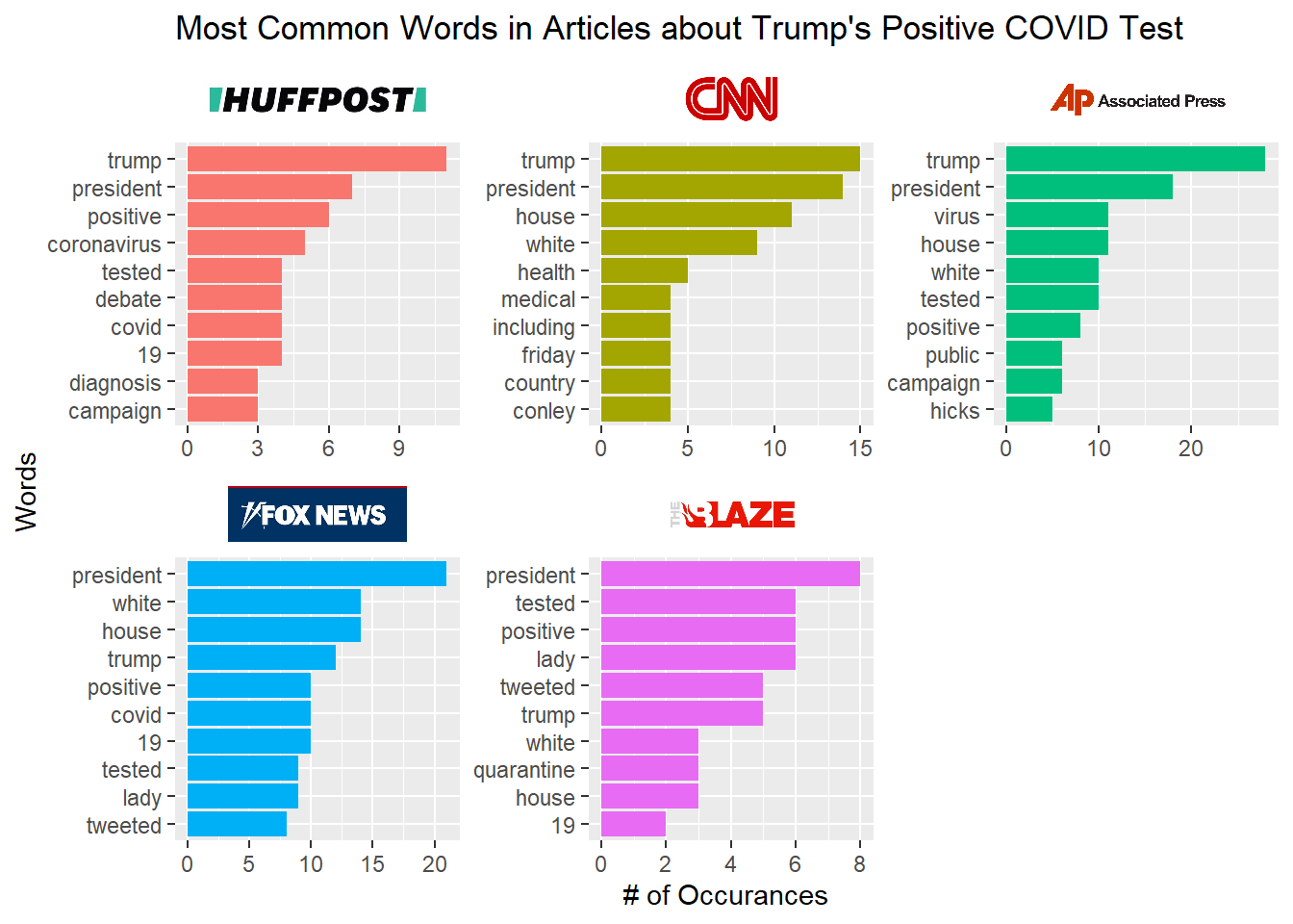
Unsurprisingly, the words “President” or “Trump” were the most common words in all five articles.
Looking into the sentiment of each article
A common type of text analysis is sentiment analysis and a simple version of sentiment analysis is to lookup each word of text in a dictionary that labels it as either positive sentiment or negative sentiment. The tidytext package contains a number of different sentiment lexicons and in this analysis I’ll be using the Bing Liu lexicon.
In the following code block I am appending the sentiment labels to our existing data set. Since most of the words will not appear in the sentiment lexicon I’m setting the NA values to a label of “neutral”. Additionally, I’m creating numeric codes for positive words (+1), negative words (-1) and neutral words (0).
words_with_sentiment <- words %>%
  left_join(get_sentiments('bing')) %>%
  mutate(
    sentiment = if_else(is.na(sentiment), 'neutral', sentiment),
    sentiment_numeric  = case_when(
                sentiment == 'positive' ~ 1,
                sentiment == 'negative' ~ -1,
                sentiment == 'neutral' ~ 0)
  )
The first look at sentiment across the five articles is to look at an average sentiment score using the numeric coding above. Everything in this code block is either vanilla dplyr or ggplot or has been covered in other blog posts. New to this block is scale_x_discrete(labels = icons) which uses the named vector of <img> tags to apply the logos to the y-axis after the coordinate flip:
icons <- c(
  huffpo = "<img src='huffpost.jpg' width = 130 />",
  cnn = "<img src='CNN.png' width='50' />",
  ap = "<img src='ap.png' width='130' />",
  foxnews = "<img src='foxnews.jpg' width='75' />",
  theblaze = "<img src='theblaze.jpeg' width='75' />"
  )

words_with_sentiment %>%
  group_by(source) %>%
  summarise(
    avg_sentiment = sum(sentiment_numeric, na.rm = T) / n()
  ) %>%
  ggplot(aes(
    x = factor(source,
               levels = c('theblaze', 'foxnews', 'ap', 'cnn', 'huffpo')),
    y = avg_sentiment
  )) +
  geom_linerange(ymin = 0, aes(ymax = avg_sentiment)) +
  geom_point(size = 4, aes(color = ifelse(avg_sentiment < 0, 'red', 'green'))) +
  geom_text(aes(label = avg_sentiment %>% round(2)), vjust = -1) +
  geom_hline(yintercept = 0) +
  labs(x = "",
       y = expression(paste("Avg. Sentiment Scores (",
                            Sigma," Positive - ",
                            Sigma," Negative) / # Words")),
       title = "Total Sentiment of Articles About Trump's Positve COVID Test") +
  scale_x_discrete(labels = icons) +
  scale_y_continuous(labels = scales::percent) +
  scale_color_identity(guide = F) +
  coord_flip() +
  cowplot::theme_cowplot() +
  theme(
    axis.line = element_blank(),
    axis.ticks = element_blank(),
    axis.text.y = element_markdown(color = "black", size = 11),
    axis.text.x = element_blank(),
    axis.title.x = element_text(size = 10),
    plot.title.position = 'plot'
  )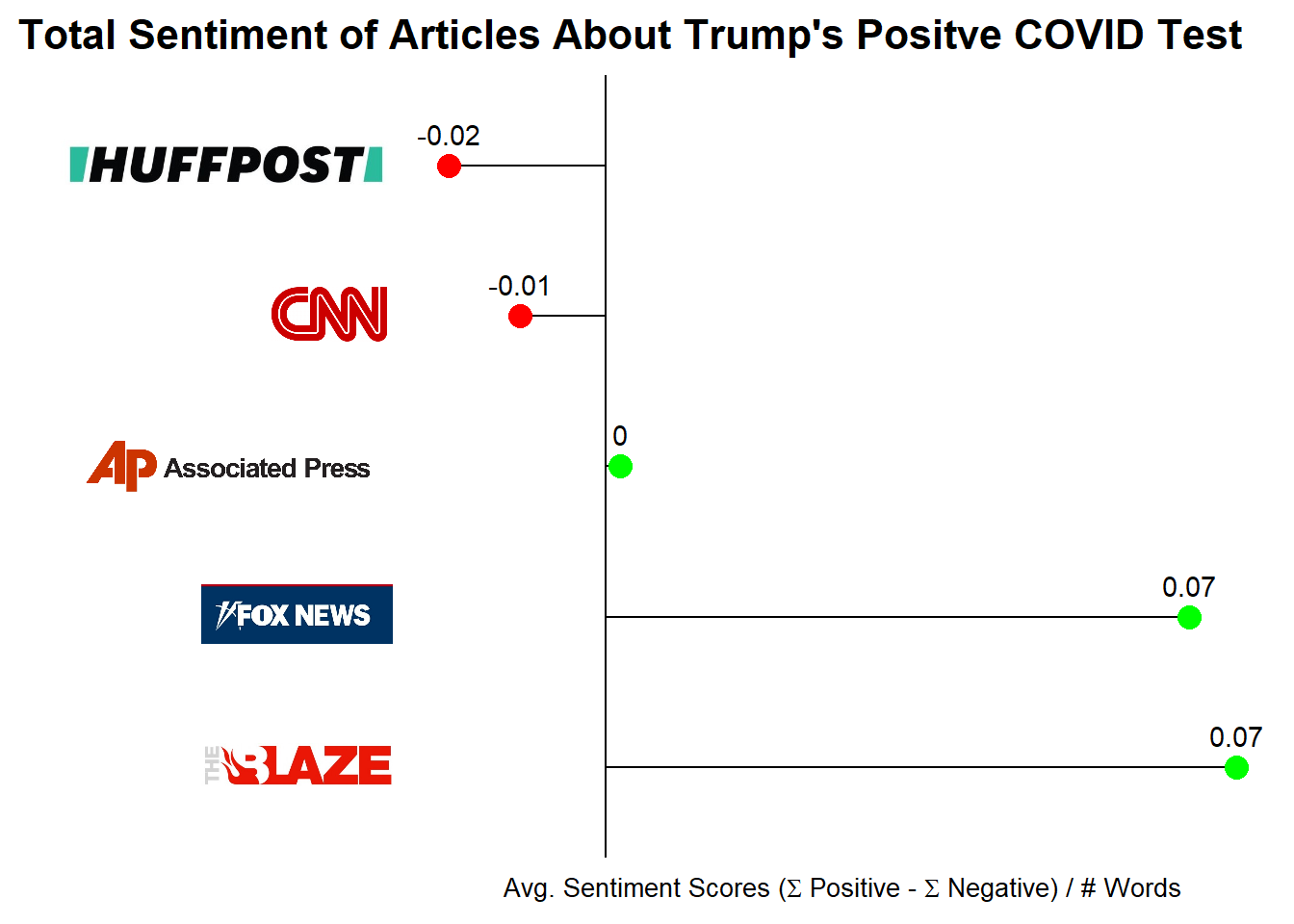
Most interesting about these results is that there is a rank ordering ranging from the most left-leaning article is the most negative and the most right-leaning is the most positive. Other interesting items of note is that the right-leaning articles have higher absolute sentiment scores than the left-leaning articles and that the Associated Press articles has an average sentiment score of nearly zero.
While I went into this with no prior hypothesis, I’m guessing that the left-leaning articles are taking a more dire view of Trump’s COVID diagnosis while the right-leaning are focusing more on the hopeful recovery.
An alternative lens is rather than looking at average sentiment scores, I can look at the distribution of Positive/Negative/Neutral words within each source.
words_with_sentiment %>%
  count(source, sentiment) %>%
  group_by(source) %>%
  mutate(pct = n / sum(n)) %>%
  ungroup() %>%
  ggplot(aes(x = factor(source,
                        levels = c('theblaze', 'foxnews', 'ap', 'cnn', 'huffpo')),
             y = pct,
             fill = factor(sentiment,
                           levels = c('negative', 'neutral', 'positive'))
             )
         ) +
    geom_col() +
    geom_text(aes(label = pct %>% scales::percent(accuracy = 1)),
              position = position_stack(vjust = .5)) +
    labs(x = "",
         y = "% of Words",
         title = "What is the Sentiment of Different Articles on Trump's Positive COVID Test?",
         fill = "Sentiment") +
  scale_x_discrete(labels = icons) +
  guides(fill = guide_legend(reverse = T)) +
  coord_flip() +
  cowplot::theme_cowplot() +
  theme(
    plot.title.position = 'plot',
    legend.position = 'bottom',
    axis.text.x = element_blank(),
    axis.ticks.x = element_blank(),
    axis.text.y = element_markdown(),
    plot.title = element_text(size = 12)
  )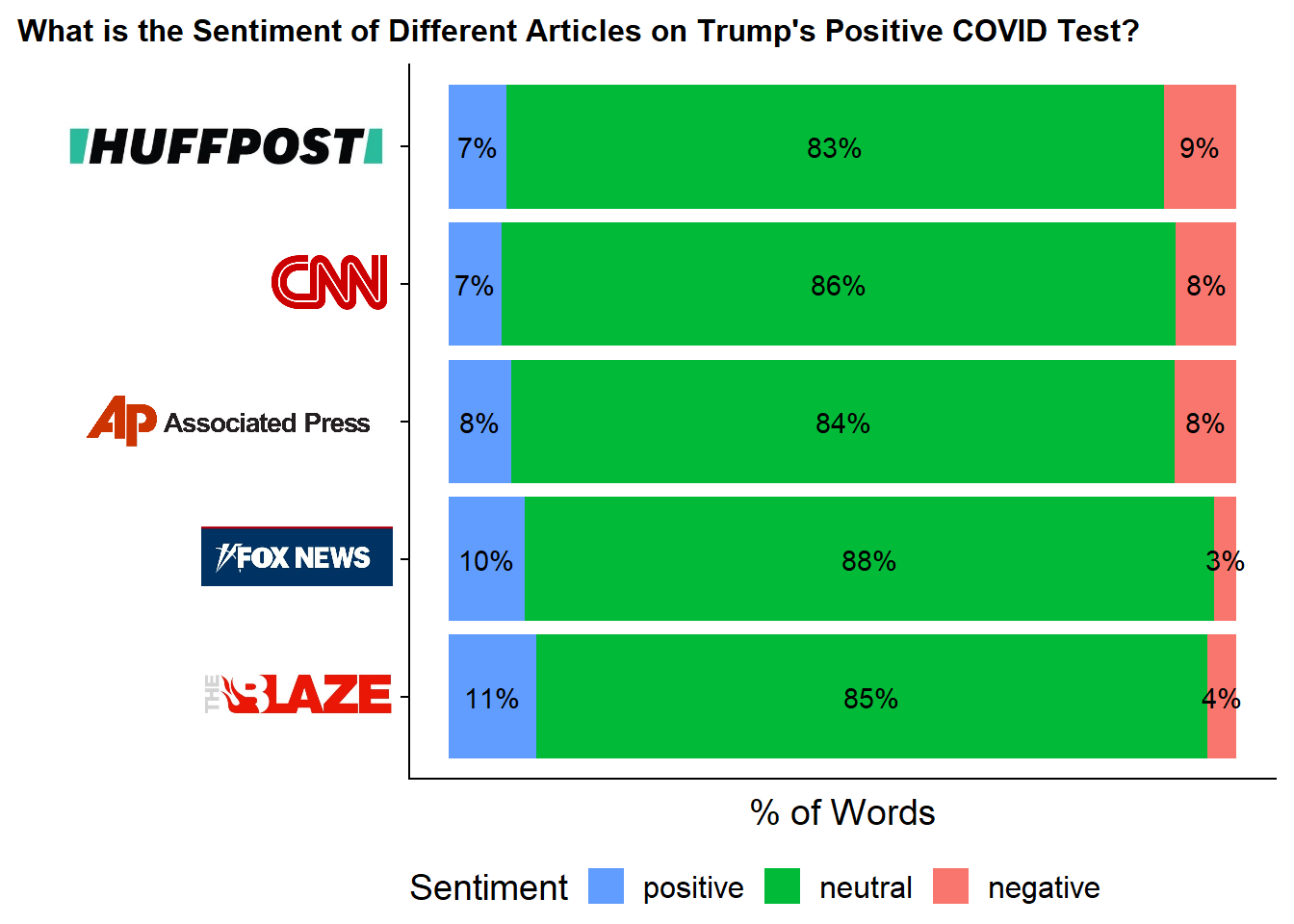
While most words in all five articles are neutral this views lets us see the Positive vs. Negative Distribution in more detail. The left-leaning sources skew slightly towards negative sentiment with close to equal percentages of positive and negative while the right-leaning articles have a higher occurrence of positive terms and a decently lower occurrence of negative terms.
Determing the Most Representitive Words with TF-IDF
TF-IDF or Term Frequency-Inverse Document Frequency produces a numeric value to represent “how important a word is to a document in a collection of documents”. Earlier in this post we looked at the most common words in each source. A problem with using most frequent word as a measure of importance is that if a word is very common everywhere then it can’t be really important. For example, the word “President” is likely not descriptive to any one document since all five are about President Trump’s COVID diagnosis. However, we should still consider frequency as part of the measure of importance. However, we can solve the common in all documents problem by weighting the metric by the inverse of the number of documents a word appears in. This is the IDF (inverse document frequency) portion of TF-IDF. In TF-IDF, the result is the product of the:
- Term Frequency (TF) - Within each document what % of words is word X?
- Inverse Document Frequency (IDF) - How many documents does word X appear in?
- This is defined as Log(Total # of Documents / # of Documents with Word X)
Calculating TF-IDF is easy with tidytext::bind_tfidf() which takes as parameters, the word column (word), the document column (source), and a counts column (n). The function appends the tf, idf, and tf_idf columns to the data set.
words %>%
  add_count(word, name = 'total_count') %>%
  filter(total_count >= 5) %>%
  count(source, word) %>%
  bind_tf_idf(word, source, n) %>%
  mutate(icon = unname(icons_strip[source]),
         icon = factor(icon,
                       levels = c(icons_strip['huffpo'], icons_strip['cnn'],
                                  icons_strip['ap'], icons_strip['foxnews'],
                                  icons_strip['theblaze']))
         ) %>%
  group_by(icon) %>%
  slice_max(order_by = tf_idf, n = 10, with_ties = F) %>%
  ggplot(aes(x = reorder_within(word, tf_idf, icon),
             y = tf_idf,
             fill = icon)) +
    geom_col() +
    scale_x_reordered() +
    scale_fill_discrete(guide = F) +
    labs(x = "Words",
         y = "TF-IDF",
         title = "Most Characteristic Words For Each Source",
         subtitle = "Based on TF-IDF") +
    facet_wrap(~icon, nrow = 2, scales = "free_y") +
    coord_flip() +
    theme(
      strip.text.x = element_markdown(),
      strip.background.x = element_blank()
    )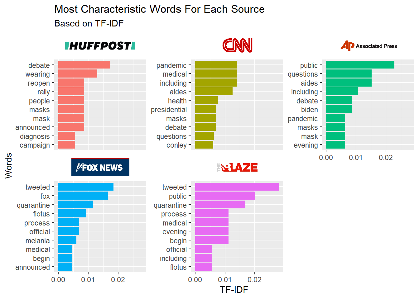
For the Huffington post article the most important word is “debate”, followed by “wearing”. Within the other documents the word "debate: does not appear at all in the right-leaning articles.
In the Fox News article it shouldn’t be a surprise than the word “fox” has a higher importance to Fox News than to any other article.
What was interesting was that the two right leaning articles’ most representative words were “tweeted”. In actually reading the articles, they both primarily were quoting the tweets from the President, Vice President, First Lady and various other White House spokespeople.
Overall, the TF-IDF results weren’t particularly interesting besides the Huffington Post’s referencing the debates and the right-leaning articles relying on Twitter for much of the information.
Content aside, I was a little confused how “tweeted” could be the most representative word for two different articles since importance is partially determined by the word NOT appearing in other articles. However, after thinking about this more it could be possible if one of the articles had a lot of word overlap with other articles. The Blaze article was already the shortest with only 135 words and perhaps it doesn’t add much new information.
What is the Overlap of Words Across All Sources?
In order to determine whether The Blaze just doesn’t have many unique words we’ll need to construct a way to see what sources contain each word. While with fewer numbers of sources tools like Venn Diagrams would be useful to determine overlaps, with 5 different sources there could be 32 different overlap combinations.
A useful tool for viewing overlap of many groups in a simpler way is an “Upset” chart. In an upset chart the number of words occurring in each overlap group is displayed as a bar and what the group represents is shown in the box beneath the chart where a circle is filled in if the source is part of the group and not filled in otherwise. Shout out to Joel Soroos, whose blog post helped me implement Upset charts in R.
There are a couple of packages that can make these charts but I’ll use ggupset since it works well with the tidy data format. In order to get the data in the proper format I’ll need to structure the data so that each row is a word and then there is a list-column containing all of the sources that contain that word. This can be done using group_by and summarize with list() as the aggregate function.
Then a ggplot can be turned into an Upset chart through the use of scale_x_upset(). Another piece of this code that’s pretty new to me is geom_text(stat='count', aes(label=after_stat(count)), nudge_y = 10). Since the data is structured as a list of words, I don’t have a column that represents the number of words in each group to pass into geom_text(). Therefore the line after_stat will tell geom_text() that we’re going to use the count statistic but also to set the label value after doing the stat calculation. Admittedly I’m not great with the stat_* aspects of ggplot and the after_* functions. But this is nice that I don’t have to do all the calculations before passing into ggplot.
words %>%
  count(source, word) %>%
  group_by(word) %>%
  summarize(sources = list(source)) %>%
  ggplot(aes(x = sources)) +
    geom_bar() +
    geom_text(stat='count', aes(label=after_stat(count)), nudge_y = 10) +
    scale_x_upset() +
    labs(x = "Set of Sources",
         y = "# of Unique Words",
         title = "How Many Sources Does Each Word Appear In?",
         caption = "Each column represents a unique combination of sources") +
cowplot::theme_cowplot() 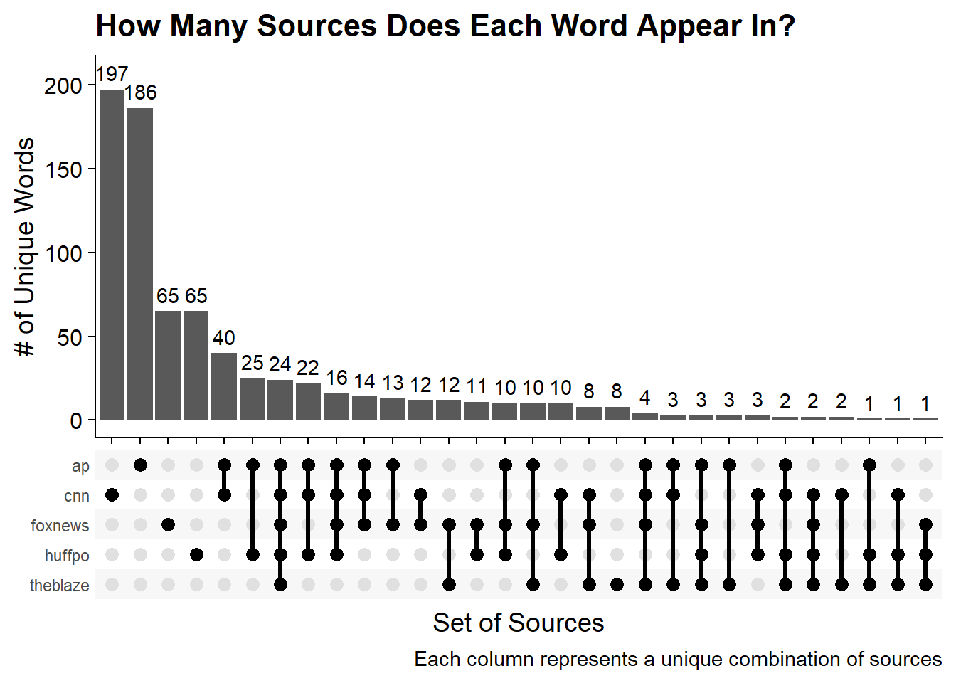
To read the Upset chart, the first bar shows that the largest group is composed of 197 words and represents the words that are ONLY in the CNN article. The second bar is 186 words that ONLY appear in the Associated Press article. For an example of an overlap, the 5th bar represents the 40 words that appear in BOTH the AP and CNN article.
To answer the original question of whether The Blaze’s high TF-IDF score for ‘tweeted’ is due to a low number of unique words in The Blaze article we can look for the group that is ONLY the Blaze words. Finding the column that contains only the one filled in circle for the Blaze we can see that there are only eight words that are unique to the Blaze article. Granted some of this is due to The Blaze being the shortest article and the AP article having the most words.
Conclusion
This post looked at five articles about the event of President Trump’s COVID-19 diagnosis from different media sources to see how coverage might differ depending on each outlet’s bias. While I’m not an expert in bias and I don’t think any results here are so strong as to suggest obvious bias there were a few areas where the ordering does seem to indicate some amount of ‘slant’ in line with how AllSides.com rated the five outlets.
- The level of bias (both left and right) of a media outlet correlated with shorter articles.
- For this particular event, based on sentiment analysis the left-leaning outlets took a slight negative slant while the right-leaning outlets took a more positive slant.
- The right-leaning articles appeared to rely more on tweets for the text-content of the article
Appendix: Upset Charts with UpSetR
There is an alternative implementation for Upset charts using the UpSetR package that doesn’t run through ggplot. In order to use this package each source needs to become its own column with a value of 1 if the word appears in the source and zero otherwise. Additionally, the data can’t be in the tibble format which is why as.data.frame is used before calling the upset() function.
words %>%
  distinct(source, word) %>%
  mutate(val = 1) %>%
  pivot_wider(
    names_from = 'source',
    values_from = 'val',
    values_fill = 0
  ) %>%
  as.data.frame %>%
  upset(order.by = 'freq',
        empty.intersections = T,
        sets.x.label = 'Word Count',
        text.scale = 1.25)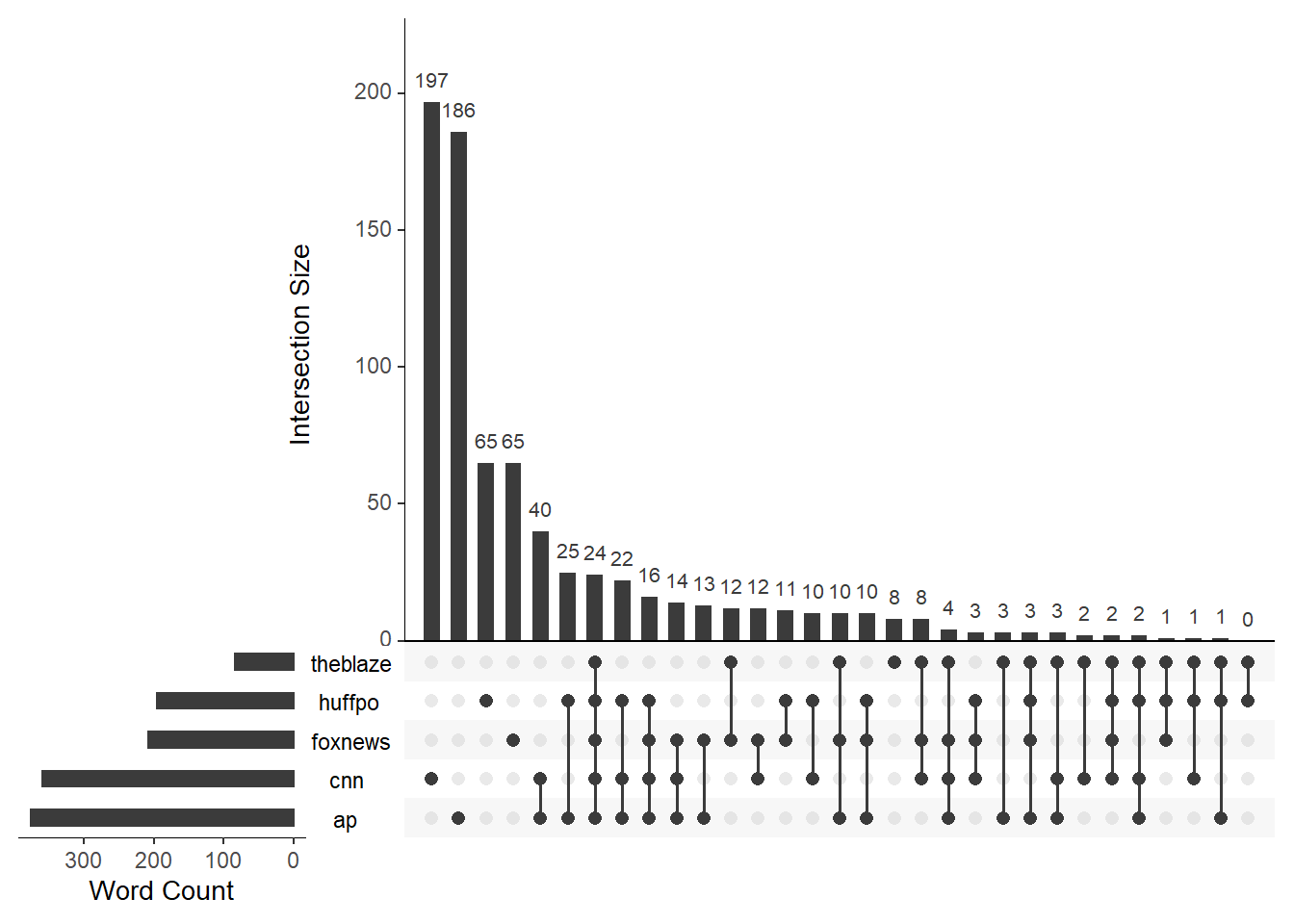
The two main advantages of UpSetR is the ability to show empty intersecting groups and the Word Count graph on the left. For example, with this version we can see that there are zero words that only appear in the Blaze and the Huffington Post article. Also, its clearer in this package that the AP and CNN have more words than the rest of the articles.