Does Icing the Kicker Really Work? A Causal Inference Exercise

In my prior post I looked at when coaches were most likly to ice a kicker where ‘icing a kicker’ means for a defense to call a timeout right before the offense is about to kick a field goal. In this post, I’ll be looking to apply causal inference techniques to see whether icing the kicker even matters.
In a perfect world we’d run an A/B test or some type of experiment where some games could be played with the ability to ice the kicker and some without. However, this is unfeasible because the fairness of sports requires that games are played with the same rules.
It would also be easy to just look at the field goal percentage when a kicker was iced vs. wasn’t. However, this would have a lot of selection bias as the situations where a kicker is likely to be iced is different than what might be the normal field goal attempt.
This analysis will follow a similar flow to the Causal Inference in R Workshop conducted by Lucy D’Agostino McGowan and Malcolm Barrett. For the data I’ll be reusing the data from my prior post which 19,072 Field Goal Attempts from College Football between 2013 and 2021. For details on that data and its construction please refer to the prior post.
What Have Other Analyses Shown?
This is not the first time this question has been asked:
- A Football Study Hall article found that “Looking at all field goal attempts in Q4 and OT, there were 1070 attempts. 761, or 71% of them were good. Given the condition of whether a kicker was iced or not does seem to make a difference. For kickers who were iced, the number of made field goals drops to 123/196, or 63%, while the kickers who were not iced was 638/874, or 73% were good.”
- An SB Nation article, which was actually more of a game recap, has the subtitle “Icing the kicker doesn’t work, but coaches keep on doing it anyway.”.
- Grantland found that icing the kicker doesn’t work
- ESPN found that “attempts to ice a kicker at the end of a game actually increased the kicker’s chances of success”
- Finally, Mixpanel found “it seems kickers that have been iced are a whole 0.1% less likely to make their kick successfully”
To generally, the consensus seems to be that the effect of icing the kicker is somewhere between not effective to potential harmful to the kicking team.
What Would a Naive Analysis Show?
I’ll start by doing a really naive analysis of just looking at data as-is comparing iced to non-iced kickers. To start I’ll load the libraries for this analysis and read in the field goal attempt data from my prior post.
library(tidyverse)
library(here)
library(gtsummary)
library(broom)
library(survey)
library(rsample)
library(smd)


fg_attempts <- readRDS(here('content/post/2022-01-17-predicting-when-kickers-get-iced-with-tidymodels/data/fg_attempts.RDS')) %>%
  transmute(
    regulation_time_remaining,
    attempted_distance,
    drive_is_home_offense = if_else(drive_is_home_offense, 1, 0),
    score_diff,
    prior_miss,
    offense_win_prob,
    is_iced = factor(is_iced, levels = c(0, 1), labels = c('Not Iced', 'Iced')),
    fg_made,
    id_play
  )
As a reminder the data contains 19,072 field goals attempts from College Football FBS Regular Season games between 2013 and 2021. For the very naive analysis I’ll just look at the data as-is.
fg_attempts %>%
  group_by(`Was Iced` = is_iced) %>%
  summarize(
    `FG Attempts` = n(),
    `FG Made` = sum(fg_made == T),
    `FG %` = mean(fg_made) %>% scales::percent(accuracy = .1)
  ) %>%
knitr::kable(align='c')| Was Iced | FG Attempts | FG Made | FG % |
|---|---|---|---|
| Not Iced | 18268 | 13882 | 76.0% |
| Iced | 804 | 544 | 67.7% |
From the very Naive data, 76% of non-iced kicks were converted vs. 67.7% of iced kicks for a difference of 8.3%!! This seems like decently large difference (and if we ran a test of proportions on this it would be statistically significant).
A more robust solution
But comparing iced kicks to non-iced kicks as-is doesn’t make much sense. As many of the articles referenced above state, icing the kicker is something done to increase in the pressure in high-pressure situations like when the kick would determine who wins the game. These types of situations are vastly different than the lower-pressure situations where the majority of field goals occur.
An easy way to determine whether there are differences in the factors that might lead to a field goal being iced is by looking at the standardized mean differences of the other features in the data set to see the extent of the difference between the iced and non-iced attempts.
I’ll be using the tbl_summary() function from {{gtsummary}} to create this table. In the below code, I split the data by is_iced, tell the function to show the mean and standard deviation for all continuous variables, show the percentage for binary variables and each value should be rounded to two digits. The standardized mean difference gets added through the add_difference() function.
tbl_summary(
  fg_attempts,
  by = 'is_iced',
  include = c(regulation_time_remaining, attempted_distance,
              drive_is_home_offense, score_diff, prior_miss, offense_win_prob,
              is_iced),
  statistic = list(all_continuous() ~ "{mean} ({sd})",
                   all_dichotomous() ~ "{p}%"),
  digits = list(everything() ~ 2)
) %>%
add_difference(everything() ~ "smd")| Characteristic | Not Iced, N = 18,2681 | Iced, N = 8041 | Difference2 | 95% CI2,3 |
|---|---|---|---|---|
| regulation_time_remaining | 1,936.02 (964.84) | 1,170.94 (898.40) | 0.82 | 0.75, 0.89 |
| attempted_distance | 35.25 (9.31) | 38.69 (9.85) | -0.36 | -0.43, -0.29 |
| drive_is_home_offense | 51.98% | 50.87% | 0.02 | -0.05, 0.09 |
| score_diff | 1.15 (13.57) | -0.25 (10.94) | 0.11 | 0.04, 0.18 |
| prior_miss | 13.74% | 17.66% | -0.11 | -0.18, -0.04 |
| offense_win_prob | 0.53 (0.28) | 0.49 (0.24) | 0.12 | 0.05, 0.19 |
|
1
Mean (SD); %
2
Standardized Mean Difference
3
CI = Confidence Interval
|
||||
When looking at standardized mean differences, generally values less than 0.1 mean there is a adequate balance between the two groups. Between 0.1 and 0.2 is not too alarming, but values greater than 0.2 would indicate a heavy imbalance. In this data, the time remaining, attempted distance show large differences between iced and non-iced attempts.
While there are many mechanisms to correct for the imbalances between the observed groups (Matching, Weighting, Stratification, etc.) I’m going to focus on weighting for this analysis. The process will be:
- Develop Propensity Scores based on other features to predict the probability that a field goal attempt will be iced with logistic regression.
- Use the weights to adjust the population of the non-iced group to reflect the iced group. Since I’m looking to determine whether icing the kicker actually matters I want to measure the difference in Field Goal Success Rates for situations when the kicker might be iced. This is called the Average Treatment Effect on the Treated (ATT). This is in contrast to the Average Treatment Effect (ATE), which would measure the causal effect of icing the kicker in general and not just in situations where icing would occur.
- Ensure that the post-weighted data are not imbalanced like the pre-weighted data.
- Calculate the ATT and bootstrap confidence intervals.
Step 1: Develop the Propensity Model
The first step in developing the weights to make the population more “even” is to develop a propensity score for the treatment. Here I’ll run a logistic regression using glm() to predict where the Field Goal attempt will be iced based on the covariates that were unbalanced from before.
p_iced <- glm(is_iced ~ regulation_time_remaining + attempted_distance +
             drive_is_home_offense + I(score_diff^2) + prior_miss + offense_win_prob,
           data = fg_attempts,
           family = 'binomial')
These are called propensity models because their output represent the propensity of a given attempt to get iced.
Step 2: Use the Propensity Scores to weight the non-Iced Field Goal Attempts
Then by using the augment() function from the {{broom}} package, I can add the predicted values from the model to the fg_attempts data set. The probabilities from this model can be used to re-weight the data in any number of ways. You can make adjust both the test and control to make them look like each other. You can also adjust test group to look like the control, and you can weight the control to look like the test.
In this case, since I want to understand the causal effect of icing the kicker on kicks that are likely to be iced, I’ll be re-weighting the control group to look like the test group. Thus, I will be looking for the average treatment effect among the treated (ATT) vs. the overall average treatment effect (ATE).
The formula for re-weighting the population for the ATT is:
Where p_i is the attempt’s propensity to be iced and Z_i is whether the attempt was actually iced. This winds up assigning each attempt in the test group to 1 and will upweight field goal attempts that had higher propensities for being iced from the non-iced group.
weighted_dt <- p_iced %>%
  augment(type.predict = "response", data = fg_attempts) %>%
  mutate(
    w_att = ((.fitted * (is_iced=='Iced'))/.fitted) +
      ((.fitted*(is_iced != 'Iced'))/(1-.fitted))
  )
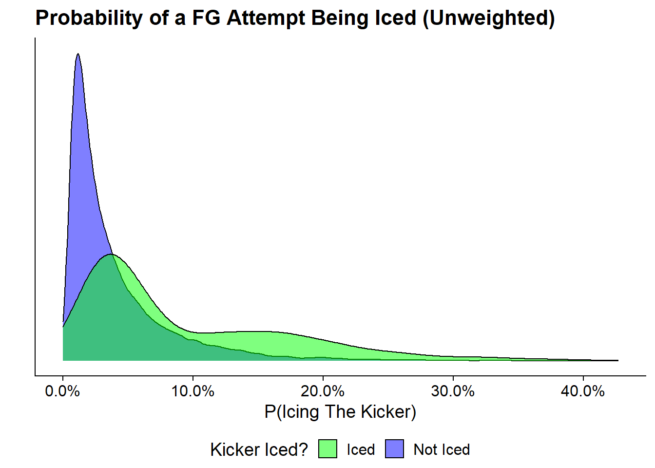
Before showing the effects of the weighting let’s first look at the unweighted propensity scores:
ggplot(weighted_dt, aes(x = .fitted, fill = is_iced)) +
  geom_density(alpha = .5) +
  scale_x_continuous(labels = scales::percent) +
  #scale_y_log10(labels = scales::comma) +
  scale_fill_manual(values = c('Iced' = 'green', 'Not Iced' = 'blue')) +
  labs(x = "P(Icing The Kicker)",
       y = "",
       title = "Probability of a FG Attempt Being Iced (Unweighted)",
       fill = "Kicker Iced?") +
  cowplot::theme_cowplot() +
  theme(
    legend.position = 'bottom',
    legend.justification = 'center',
    axis.text.y = element_blank(),
    axis.ticks.y = element_blank()
  )
This makes it very clear that the distributions of propensity to ice differs very heavily between the group that was actually iced and that which was not. Its also nice to see that the group that was actually iced generally have higher propensity scores that those that don’t.
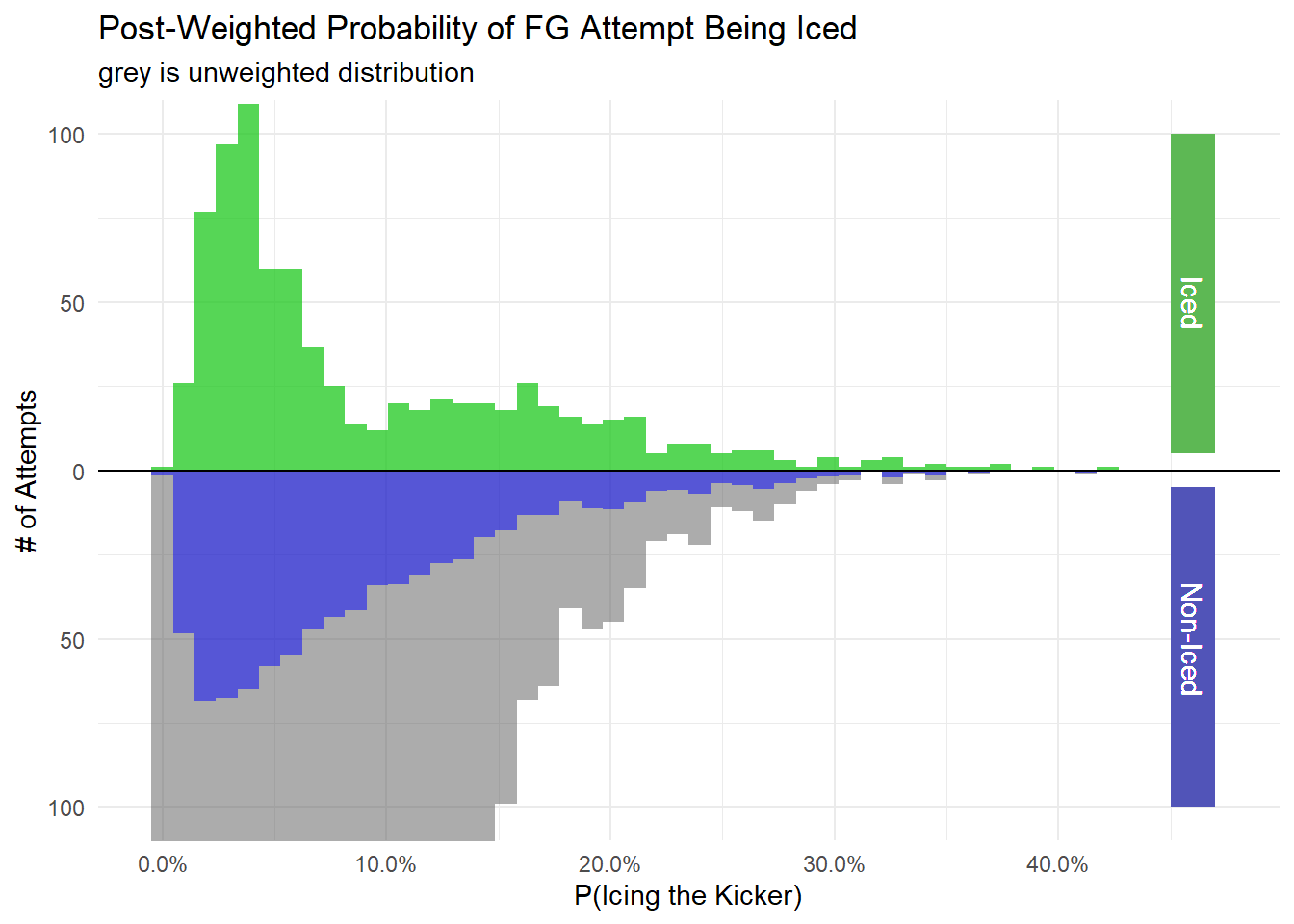
Now let’s look at the distribution of propensity score when taking the weights into account. The distribution of the Iced group is shown in green and is unchanged from the pre and post weightings. On the bottom is the Non-Iced attempts. The overall distribution is shown in grey and the re-weighted distribution is shown in blue. Notice how it more closely reflects the distribution of the iced group.
weighted_dt %>%
  tidyr::spread(is_iced, .fitted, sep = "_p") %>%
  ggplot() +
  geom_histogram(bins = 50, aes(is_iced_pIced), alpha = 0.5) +
  geom_histogram(bins = 50, aes(is_iced_pIced, weight = w_att), fill = "green", alpha = 0.5) +
  geom_histogram(bins = 50, alpha = 0.5, aes(x = `is_iced_pNot Iced`, y = -..count..)) +
  geom_histogram(bins = 50, aes(x = `is_iced_pNot Iced`, weight = w_att, y = -..count..), fill = "blue", alpha = 0.5) +
  geom_hline(yintercept = 0, lwd = 0.5) +
  scale_y_continuous(label = abs) +
  scale_x_continuous(label = scales::percent) +
  labs(title = "Post-Weighted Probability of FG Attempt Being Iced",
       subtitle = "grey is unweighted distribution",
       x = "P(Icing the Kicker)",
       y = "# of Attempts") +
  theme_minimal() +
  geom_rect(aes(xmin = 0.45, xmax = .47, ymin = 5, ymax = 100), fill = "#5DB854") +
  geom_text(aes(x = 0.46, y = 50), label = "Iced", angle = 270, color = "white") +
  geom_rect(aes(xmin = 0.45, xmax = .47, ymin = -100, ymax = -5), fill = "#5154B8") +
  geom_text(aes(x = 0.46, y = -50), label = "Non-Iced", angle = 270, color = "white") +
  coord_cartesian(ylim = c(-100, 100))
Step 3: Ensure the Post-Weighted Data is no longer Imbalanced
The next step is to run some diagnostics to make sure that the imbalance that we saw back at the beginning of this post in the standardized mean differences have gone away. I’m going to use the {{survey}} package and the tbl_svysummary() function from {{gtsummary}} to create a survey design object that incorporates the weights that were derived above. The ids = ~ 1 code tells the design object that there are no clusters in this.
svy_des <- svydesign(
  ids = ~ 1,
  data = weighted_dt,
  weights = ~ w_att
)
Then the syntax of tbl_svysummary() is identical to tbl_summary() just it uses the survey design object rather than a data frame. Like with the additional table, I’m adding in the standardized mean difference.
tbl_svysummary(
  svy_des,
  by = 'is_iced',
  include = c(regulation_time_remaining, attempted_distance,
              drive_is_home_offense, score_diff, prior_miss,
              offense_win_prob, is_iced),
  statistic = list(all_continuous() ~ "{mean} ({sd})",
                   all_dichotomous() ~ "{p}%"),
  digits = list(everything() ~ 2)
) %>%
add_difference(everything() ~ "smd")| Characteristic | Not Iced, N = 8001 | Iced, N = 8041 | Difference2 | 95% CI2,3 |
|---|---|---|---|---|
| regulation_time_remaining | 1,187.16 (875.67) | 1,170.94 (898.40) | 0.02 | -0.08, 0.12 |
| attempted_distance | 38.76 (9.34) | 38.69 (9.85) | 0.01 | -0.09, 0.11 |
| drive_is_home_offense | 51.18% | 50.87% | 0.01 | -0.09, 0.10 |
| score_diff | 0.63 (11.03) | -0.25 (10.94) | 0.08 | -0.02, 0.18 |
| prior_miss | 17.42% | 17.66% | -0.01 | -0.10, 0.09 |
| offense_win_prob | 0.49 (0.26) | 0.49 (0.24) | 0.00 | -0.10, 0.10 |
|
1
Mean (SD); %
2
Standardized Mean Difference
3
CI = Confidence Interval
|
||||
Notice that all of the SMDs are now below the 0.1 threshold.
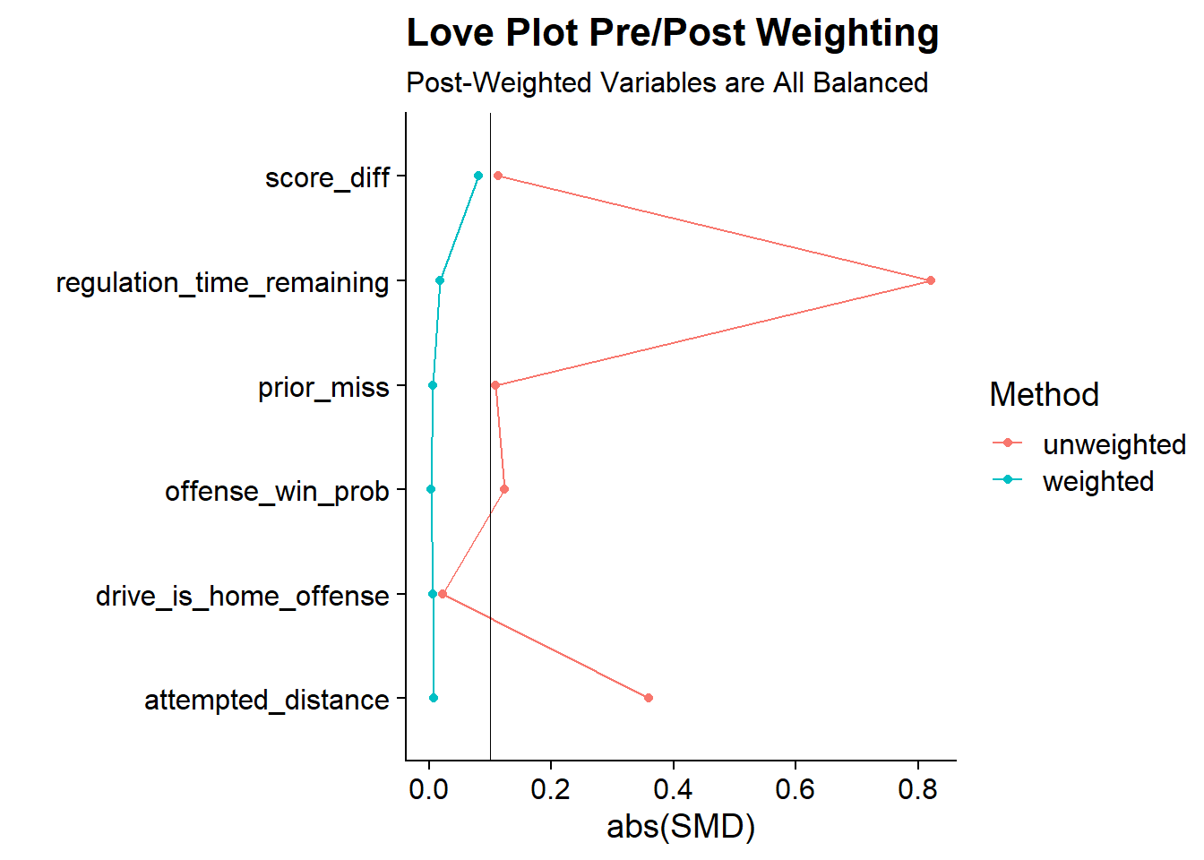
Another way to visualize the changes in SMDs between is using a Love Plot. Named after Dr. Thomas E. Love, the Love Plot is a way of summarizing covariate balance before and after weighting. In the first code block, I calculate both the weighted and unweighted standardized mean differences using the {{smd}} package. In the smd() code blocks, I pass in each variable, the group variable, and in the case of the weighted version, the weights.
smds <- weighted_dt %>%
  # Calculate the SMD for Each Variable
  summarise(
    # List Variables to run functions
    across(c(regulation_time_remaining, attempted_distance,
             drive_is_home_offense, score_diff, prior_miss,
             offense_win_prob),
           # List functions
           list(
             unweighted = ~smd(.x, is_iced, na.rm = T)$estimate,
             weighted = ~smd(.x, is_iced, w_att, na.rm = T)$estimate
           ),
           # Assign how the naming will show up in the output
           # Assign placeholder _zzz_ to split on in the next step
           .names = "{.col}_zzz_{.fn}")
  )

smds %>%
  pivot_longer(
    everything(),
    values_to = "SMD",
    names_to = c("variable", "Method"),
    names_sep = "_zzz_"
  ) %>%
  ggplot(
    aes(x = abs(SMD), y = variable, group = Method, color = Method)
  ) +
  geom_line(orientation = "y") +
  geom_point() +
  geom_vline(xintercept = 0.1, color = "black", size = 0.1) +
  labs(title = "Love Plot Pre/Post Weighting",
       subtitle = "Post-Weighted Variables are All Balanced",
       y= "") +
  cowplot::theme_cowplot()
The Love Plot clearly shows that the weighted version of the data has corrected the imbalances that we’ve seen in the unweighted version since all variables are now below 0.1. So it looks like the propensity score weighting
Step 4: Calculate the ATT
The final step is to calculate the average treatment effect on the treatment by regressing our outcome variable (Fields Goal Made) by the “treatment” (Whether the kick was iced or not) weighted by the weighting scheme we came up with above. I’m using a linear probability model for convenience so that the coefficient is more human interpretable. But there is a case to be made for using a logistic regression since fg_made is binary.
final.model <- lm(fg_made ~ is_iced, data = weighted_dt, weights = w_att)

tidy(final.model, conf.int = T) %>%
  select(term, estimate, conf.low, conf.high) %>%
  mutate(across(where(is.numeric), ~scales::percent(.x, accuracy = .01))) %>%
knitr::kable(align = 'c')| term | estimate | conf.low | conf.high |
|---|---|---|---|
| (Intercept) | 70.51% | 69.58% | 71.44% |
| is_icedIced | -2.85% | -4.16% | -1.54% |
From this model the results look like that icing the kicker results in a decreased success rate of 2.85%. The confidence intervals from the linear model would suggest that its statistically significant. However, the confidence intervals generated above are overly optimistic as the weights are treated as separate individuals rather than actual weights. In order to get more robust confidence intervals, I’ll use bootstrapping to redo the entire process 1000 times. The following function does the entire process from above (propensity score -> weights -> output model).
#### Bootstrapping Estimates
fit_ipw <- function(split, ...) {
  .df <- analysis(split)

  # fit propensity score model
  propensity_model <- glm(
    is_iced ~ regulation_time_remaining + attempted_distance +
             drive_is_home_offense + I(score_diff^2)  + prior_miss + offense_win_prob,
    family = binomial(),
    data = .df
  )

  # calculate inverse probability weights
  .df <- propensity_model %>%
    augment(type.predict = "response", data = .df) %>%
    mutate(
      w_att = ((.fitted * (is_iced=='Iced'))/.fitted) +
      ((.fitted*(is_iced != 'Iced'))/(1-.fitted))
    )

  # fit correctly bootstrapped ipw model
  lm(fg_made ~ is_iced, data = .df, weights = w_att) %>%
    tidy()
}
The bootstrapping will be done using the {{rsample}} package and the bootstraps() function. In the function I ask for 1,000 bootstrapped samples (the apparent option includes a 1001st sample that’s the entire data set). Then I apply the above function to every bootstrapped sample through {{purrr}}’s map() function.
# fit ipw model to bootstrapped samples
set.seed(20220130)
ipw_results <- bootstraps(fg_attempts, 1000, apparent = TRUE) %>%
  mutate(results = map(splits, fit_ipw))
Finally, the int_t() function generates confidence intervals from the t-distribution based on the results of the 1,000 bootstrapped samples.
# get t-statistic-based CIs
int_t(ipw_results, results) %>%
  filter(term == "is_icedIced") %>%
  select(term, .lower, .estimate, .upper) %>%
  mutate(across(where(is.numeric), ~scales::percent(.x, accuracy = .01))) %>%
knitr::kable(align = 'c')| term | .lower | .estimate | .upper |
|---|---|---|---|
| is_icedIced | -5.88% | -2.82% | 0.50% |
From the bootstrapped results, we have the a similar point estimate of -2.82% which is much smaller than the 8.3% that was seen in the naive analysis. but the confidence intervals now spans from -5.88% to 0.50% making the results not significantly different from zero.
So in conclusion, we can’t definitively say that icing the kicker is actually harmful to the kicker’s success which seems consistent with the other studies that say that either its ineffective or only mildly effective at best.
In the next post in this series, I’ll be looking at alternative causal inference methodologies like G-computation and targeted maximum likelihood estimation (TLME) to see if the results are similar or different to the results from this post.