Exploring Types of Subway Fares with Hierarchical Forecasting

In my prior post I used forecasting to look at the effect of COVID on the expected amount of New York City subway swipes. In this post I will drill a level deeper to run forecasts for various types of subway fares to see if any particularly type has recovered better or worse than any others.
The goal for this post will be to create a top-level forecast for total NYC subway fares and forecasts for each of the types of subway fares. The sub-levels of individual subway fares form a natural hierarchy with the total number. For my forecast, I’d like the forecasts for the sub-levels and for the total to match each other for the sake of consistency. This is called “hierarchical forecasting”. More details can be found in Rob Hyndman and George Athanasopoulos’ Forecasting: Principles and Practice.
The book makes use of the fable and tsibble packages.
Libraries
library(tsibble) # Data Structure for Time Series
library(tidyverse) # Data Manipulation Packages
library(fable) # Time Series Forecasting Models
library(lubridate) # Date Manipulation
library(scales) # Convenience Functions for Percents
Data Preparation
The data set will be the same as from the prior blog post which contains weekly Subway data by station, card type, and week from May 2010 through June 2022. Please see the previous post for more details on the data processing. The raw fare files come from the MTA’s Website.
dt <- readRDS(here('content/post/2022-07-13-how-much-has-covid-cost-the-nyc-subway-system-in-lost-fares/data/mta_data.rds'))In the data set there are 30 different fare types, however, I really don’t want to create 30 different forecasts. Especially if some of these are going to be small volume. The top 5 fare types make up 93% of the fares, so I’ll group the other 25 into an “other” category. Then I aggregate the data set to the week and fare_type level and add up the fares column which represents the number of swipes for each fare type.
dt_by_fare <- dt %>%
  #Remove Out of Pattern Thursday File
  filter(week_start != '2010-12-30') %>%
  #Clean Up fare types and create date fields
  mutate(
    week_start = ymd(week_start),
    year_week = yearweek(week_start),
    fare_type = case_when(
      fare_type == 'ff' ~ 'full_fare',
      fare_type == 'x30_d_unl' ~ 'monthly_unlimited',
      fare_type == 'x7_d_unl' ~ 'weekly_unlimited',
      fare_type == 'students' ~ 'student',
      fare_type == 'sen_dis' ~ 'seniors',
      TRUE ~ 'other'
    )
  ) %>%
  group_by(week_start, year_week, key,  fare_type) %>%
  # Drop all the groupings during summary
  summarize(fares = sum(fares),  .groups = 'drop')
Now the data set has gone from 7,244,430 rows to 3,702.
To be able to use the fable package to do forecasting, the data needs to be in the tsibble format. This construction takes a “key” and an “index” parameter. The “key” is the grouping factor which in this case is the fare_type and the “index” is the time parameter which will be the year_week field.
Then to create the “hierarchical” structure into the data, the aggregate_key function from fabletools is used. Telling the structure to be aggregated over the fare_types by adding up the fares will allow for forecasting reconciliation to ensure that the forecast outputs are coherent.
dt_ts <- tsibble(dt_by_fare, key = fare_type, index = year_week) %>%
  aggregate_key(fare_type, fares = sum(fares))
The dt_ts data set is now 628 rows greater than the dt_by_fare data set. This is because of the aggregated layer that was generated from aggregate_key(). The 628 is the number of distinct weeks in the data.
If continuing down the forecasting path there would eventually be an error during the forecast step due to a missing value in the initial time series. The scan_gaps() function from tsibble will look for implicit missing observations (gaps in the index). The count_gaps() function will also provide a similar summary.
scan_gaps(dt_ts) %>%
  count(year_week) %>%
kable()| year_week | n |
|---|---|
| 2011 W18 | 6 |
| 2013 W16 | 7 |
The function shows that I’m missing the data for the 18th week of 2011 and the 16th week at 2013. At first I thought this was a problem with my data processing from before. But when visiting the MTA website those files are actually missing.

Notice that the file for May 21st, 2011 is not listed. Same with May 4th, 2013.
To get around this issue, I need to first turn the implicit missings into explicit NAs. This can be done with tsibble’s fill_gaps() function which adds in NAs for the missing dates.
dt_ts <- dt_ts  %>%
  group_by_key() %>%
  fill_gaps()


dt_ts %>%
  head() %>%
kable()| year_week | fare_type | fares |
|---|---|---|
| 2011 W18 | full_fare | NA |
| 2013 W16 | full_fare | NA |
| 2010 W21 | full_fare | 11545507 |
| 2010 W22 | full_fare | 12580200 |
| 2010 W23 | full_fare | 12820291 |
| 2010 W24 | full_fare | 12707781 |
Notice that the two missing dates now appear. However, the forecasting is also going to have problems with the NA values. So I’ll need to fill in a value. For simplicity, I’m going to use tidyr’s fill function and just use the previous value.
dt_ts <- dt_ts %>%
  arrange(year_week) %>%
  fill(fares, .direction = 'down')

dt_ts %>%
  filter(year_week %in% c(yearweek('2011 W17'),
                          yearweek('2011 W18'),
                          yearweek('2011 W19')
                          ),
         fare_type == 'full_fare'
           ) %>%
  arrange(fare_type) %>%
kable()| year_week | fare_type | fares |
|---|---|---|
| 2011 W17 | full_fare | 13795196 |
| 2011 W18 | full_fare | 13795196 |
| 2011 W19 | full_fare | 13794517 |
Forecasting
The objective of this post is to determine which types of Subway fares have been most affected by COVID. In order to do this I’ll consider the time between 2010-2019 to be the pre-COVID period which the forecasting model will be built and then I’ll forecast 2020 - June 2022 and compare to the actuals.
The fable package uses the model() function to set and fit forecasts. In this case I’m creating a forecast named base and using an ARIMA model on the univariate time series for fares. If I had wanted to use Exponential Smoothing I would just change ARIMA() to ETS(). So in short, fable provides a simple mechanism to fit forecasts.
As it presently stands the base model for the aggregate time series does not have to match the total of the individual series. The reconcile() function lets you choose the method of all the key structure of the data will be made to “work”.
In this example, I’m trying out:
- Bottoms-Ups: Make the aggregate level equal the sum of the individuals
- Top-Down: Make the individual forecasts equal the aggregate series
- Min Trace: Reconciliation using the minimum race combination method which looks to minimize the forecast variances of the set of coherent forecasts
fit <- dt_ts %>%
  filter(year(year_week)< 2020) %>%
  model(base = ARIMA(fares))%>%
  reconcile(bottom_up = bottom_up(base),
            top_down = top_down(base),
            min_trace = min_trace(base, "mint_shrink"))
The fit object now contains four types of forecasts (base, bottom_up, top_down, min_trace) for each fare type and for the aggregation of the fare types.
Handling the forecasting for 2020+ data is handled by the forecast() function. The fit object is passed into the forecast() function and the 2020+ data gets passed into the new_data function.
fc <- fit %>%
  forecast(new_data = dt_ts %>% filter(year(year_week) >= '2020'))
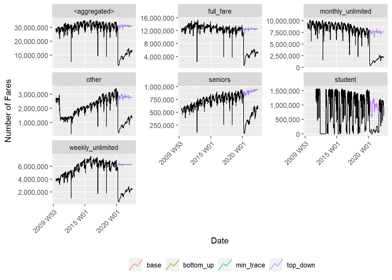
The fc object now contains the four forecasts for each fare type and the aggregate forecast for the last 2.5 years of data. This can be displayed with the autoplot() function.
autoplot(fc, dt_ts %>% ungroup(), level = NULL) +
  facet_wrap(~fare_type, scales = "free_y") +
  scale_y_continuous(labels = scales::comma_format()) +
  labs(color = "", x = "Date" ,y = "Number of Fares") +
  theme(
    legend.position = 'bottom',
    axis.text.x = element_text(angle = 45, hjust = 1, vjust = 1)
  )
So did the forecasts reconcile correctly?
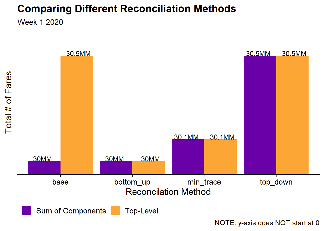
Since this post is about Hierarchical Time Series it will be important to check to see if the reconciliation works. In the following chart, I will add up the fare type forecasts for each of the four forecasting models and compare them to the aggregate forecast. For simplicity I will just choose a single data point.
fc %>% filter(year_week == yearweek('2020 W01')) %>%
  as_tibble() %>%
  transmute(fare_type = if_else(
    is_aggregated(fare_type), 'aggregated', as.character(fare_type)),
    year_week, model = .model, forecast = .mean) %>%
  spread(model, forecast) %>%
  group_by(is_aggregated = ifelse(fare_type == 'aggregated',
                                  'Top-Level',
                                  'Sum of Components')) %>%
  summarize(across(where(is.numeric), sum)) %>%
  gather(model, value, -is_aggregated) %>%
  ggplot(aes(x = model, y = value, fill = is_aggregated)) +
    geom_col(position = 'dodge') +
    geom_text(aes(label = paste0(round(value/1e6, 1), "MM")), vjust = 0,
              position = position_dodge(width = 1)) +
    coord_cartesian(ylim = c(30e6, 30.6e6)) +
    scale_y_continuous(labels = function(x){paste0(x/1e6, "MM")}) +
    scale_fill_viridis_d(option = "C", begin = .2, end = .8) +
    labs(title = "Comparing Different Reconciliation Methods",
         subtitle = "Week 1 2020",
         caption = 'NOTE: y-axis does NOT start at 0',
         x = "Reconcilation Method", y = "Total # of Fares",
         fill = "") +
    cowplot::theme_cowplot() +
    theme(
      axis.text.y = element_blank(),
      axis.ticks.y = element_blank(),
      axis.line.y = element_blank(),
      legend.position = 'bottom',
      legend.direction = 'horizontal'
    )
In the base (unreconciled) model the top-level time series is 500K fares higher than the sum of the various fare types. However, we want the forecasts to be consistent with each other and that’s exactly what we see in the three reconciled models. In the bottoms-up model, the “top-level” is scaled down to match the sum of the fare types. In top-down the sum of components are scaled up to match the “top-level”. And min_trace is somewhere in-between.
How much did each Fare Type recovery to Pre-COVID levels?
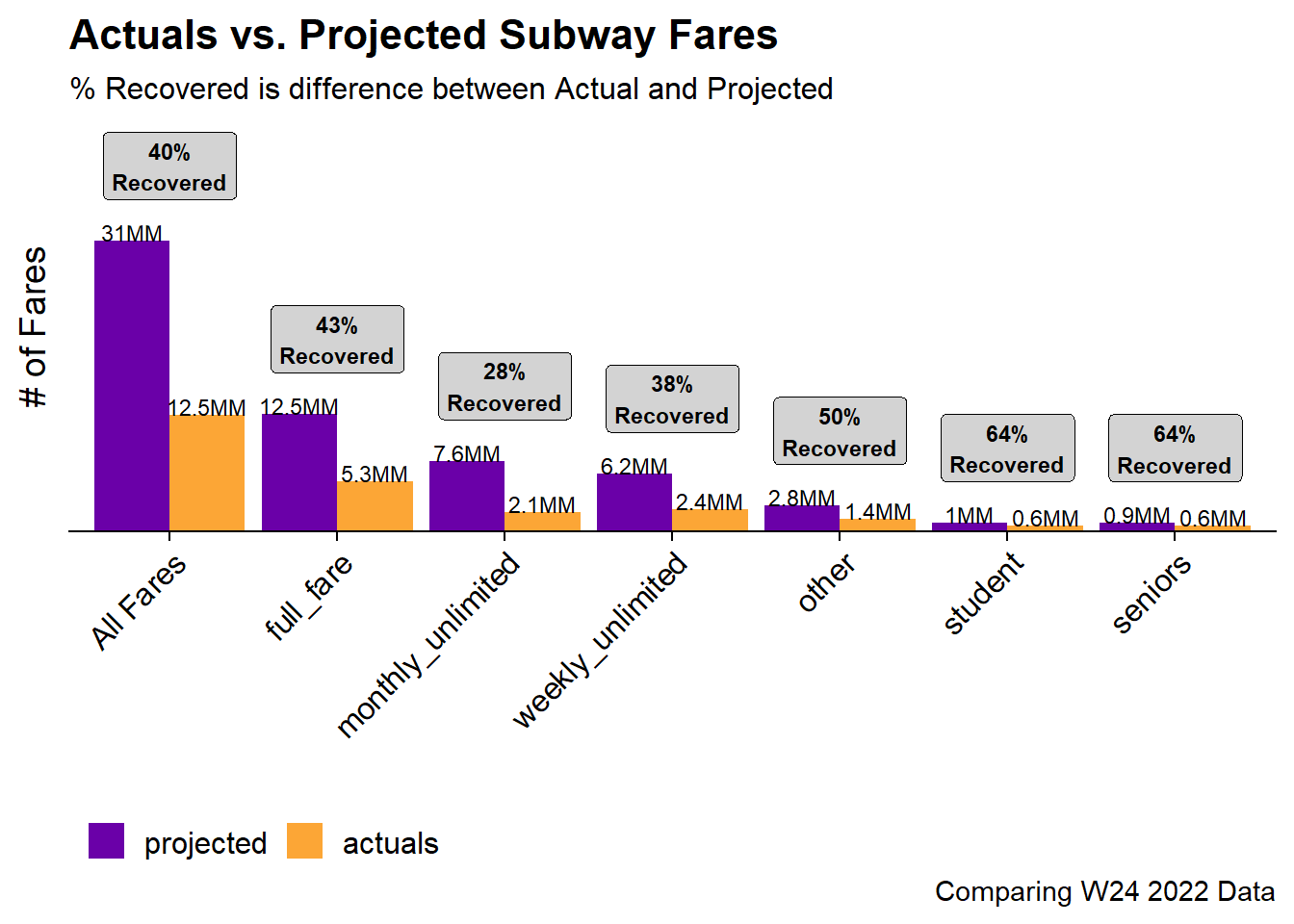
Now that we have the reconciled forecasts we’re now able to actually to the analysis to determine which Fare Types have recovered the most and least to pre-COVID levels. This will be done using the maximum available date in the data set and the min_trace forecast.
bind_rows(
  dt_ts %>%
    filter(year_week == max(year_week)) %>%
    as_tibble() %>%
    transmute(fare_type =  if_else(is_aggregated(fare_type),
                                   'All Fares',
                                   as.character(fare_type)),
              time = "actuals",
              fares),
  fc %>%
    as_tibble() %>%
    filter(year_week == max(year_week), .model == "min_trace") %>%
    as_tibble() %>%
    transmute(fare_type =  if_else(is_aggregated(fare_type),
                                   'All Fares',
                                   as.character(fare_type)),
              time = 'projected',
              fares = .mean)
) %>%
  spread(time, fares) %>%
  mutate(recovery = actuals / projected) %>%
  gather(period, fares, -fare_type, -recovery) %>%
  ggplot(aes(x = fct_reorder(fare_type, -fares), y = fares, fill = fct_rev(period))) +
    geom_col(position = 'dodge') +
    geom_text(aes(label = paste0(round(fares/1e6, 1), "MM")), vjust = 0,
              position = position_dodge(width = .9), size = 3) +
    stat_summary(
      aes(x = fare_type, y = fares),
      geom = 'label',
      inherit.aes = F,
      fontface = 'bold', fill = 'lightgrey', size = 3,
      fun.data = function(x){
        return(data.frame(y = max(x)+8e6,
                          label = paste0((min(x)/max(x)) %>% percent,
                          "\nRecovered")))
      }
    )  +
    labs(title = "Actuals vs. Projected Subway Fares",
         subtitle = "% Recovered is difference between Actual and Projected",
         caption = "Comparing W24 2022 Data",
         x = "",
         y = "# of Fares",
         fill = "") +
    scale_fill_viridis_d(option = "C", begin = .2, end = .8) +
    #This link was dope https://stackoverflow.com/questions/22945651/remove-space-between-plotted-data-and-the-axes
    scale_y_continuous(expand = expansion(mult = c(0, .12))) +
    cowplot::theme_cowplot() +
    theme(
      legend.position = 'bottom',
      legend.direction = 'horizontal',
      axis.text.y = element_blank(),
      axis.ticks.y = element_blank(),
      axis.line.y = element_blank(),
      axis.text.x = element_text(angle = 45, hjust = 1, vjust = 1)
    )
Overall, the forecast shows that subway fares have only recovered to 40% of the Pre-COVID levels. The fare types that have recovered the most are the Student and Senior cards which may make sense as schools are generally back to in-person instruction. The fare type that has recovered the least is the monthly unlimited card which also makes sense as hybrid work environments make paying for a full month of unlimited a less valuable proposition.
Appendix: Measuring Forecast Accuracy
To end this post its worthwhile to show how I would measure the forecast accuracy. The accuracy() function from fabletools makes it very easy to see forecasting accuracy metrics. Just pass in the forecast, the actuals, and a list of metrics and you get a tibble back.
####Appendix: Forecast Accuracy
fc %>%
  accuracy(
    data = dt_ts,
    measures = list(rmse = RMSE, mase = MASE, mape = MAPE)
  ) %>%
  filter(.model == 'min_trace') %>%
  arrange(mape) %>%
kable()| .model | fare_type | .type | rmse | mase | mape |
|---|---|---|---|---|---|
| min_trace | seniors | Test | 497395.6 | 9.090555 | 169.1391 |
| min_trace | full_fare | Test | 7735877.4 | 11.608419 | 199.1030 |
| min_trace | other | Test | 1835483.2 | 5.458558 | 241.3594 |
| min_trace | Test | 20683422.4 | 12.284181 | 260.5088 | |
| min_trace | weekly_unlimited | Test | 4266233.0 | 8.342853 | 295.2711 |
| min_trace | monthly_unlimited | Test | 5788133.3 | 12.763524 | 489.1300 |
| min_trace | student | Test | 703170.5 | 1.469493 | 43077.3022 |
Although since we’re trying predict “what if COVID didn’t happen” I don’t expect these forecasts to perform very well.