Celebrating the Blog's First Birthday With googleAnalyticsR

On July 4th, 2020, I posted the first article to this humble R blog as a small hobby to do something new while working from home through COVID. Very recently, this blog celebrated its first year and I wanted to leverage Google Analytics to do a look back at the last year, what’s done well as well as when and where people were visiting from. Much of this content is heavily leveraged from Antoine Soetewey’s Stats and R blog post and but the numbers contained here will be much smaller than on his.
As it says on the home page, this blog was primarily meant for me to be able have a more accessible set of code snippets / a reason to do random analyses to continue learning. That fact that people have taken the time to read it has been awesome and really the icing on a really delicious cake.
So to everything currently reading or who has read the blog in the last year. Thank you so much! Now onto the recap!!
Libraries and Set-up
The libraries I’ll use in this analysis generally serve 1 of 2 functions, either to access and manipulate data from Google Analytics which is the workhorse of this post or to do/edit data visitations (plotly, scales, gghalves, ggflags).
library(plotly) #For turning ggplots into INTERACTIVE ggplots
library(tidyverse) #General Data Manipulation
library(googleAnalyticsR) # To access the Google Analytics API
library(scales) # Making text prettier
library(gghalves) # Creating Half Boxplot / Half Point Plots
library(wesanderson) # To have some more fun colors
library(countrycode) # Convert Country Names to 2 Letter Codes
library(ggflags) # Plot Flags
Getting Google Analytics was also somewhat tricky to get set up. As someone who’s not terrible familiar with Google Cloud Platform and was a little hazy about using the generic public account that comes with googleAnalyticsR, I struggled a bit with getting the authentication correct. The googleAnalyticsR documentation provides some guidance for getting the authentication to work with markdown. But I trialed and errored so much that I don’t think I can provide much guidance for what I did. I just kindof kept running ga_auth_setup() until things seemed like they were working.
But after getting client ids and auth ids into my R Environment, I can authenticate the markdown file with:
ga_auth()As a last piece of set-up most of the functions in googleAnalyticsR take in a view_id and a date range. Since those will all be the same since I’m looking at this blog and for the first year, I’ll create those variables first so they can be referenced in each call:
view_id <- ga_account_list()$viewId

start_date <- as.Date("2020-07-04")
end_date <- as.Date("2021-07-03")
The Headlines (Users and Sessions)
The first thing to explore will be the total number of users, sessions, and pageviews that occurred over the first year of the R Blog. To access the Google Analytics API, I’ll use the google_analytics() function. The parameters are pretty self-explanatory in that you give it your ViewId, a date range, a set of metrics, and a set of dimensions to get data returned. The anti_sample option will split up the call so that nothing gets sampled.
A complete list of metrics and dimensions can be found in the Google Analytics Metrics and Dimension Explorer.
totals <- google_analytics(view_id,
                           date_range = c(start_date, end_date),
                           metrics = c("users", "sessions", "pageviews"),
                           anti_sample = TRUE
)
Over the first year of the blog (July 4th, 2020 through July 3rd, 2021), I had 3,081 users visit with 4,211 sessions and 6,685 total page views. Given the relatively minimal promotion, I’ll call that a win 🏆.
I have a hypothesis that most of my views came in the days immediately following posts as I’m connected to the R-Bloggers aggregator. To check this hypothesis I’ll compare the time series of sessions to the days when posts were first made. Since the post dates are embedded in the URLs (/year/month/day/title), I’ll get the full URLs from Google Analytics and pull out the post dates from there:
# Get all visited pages
launch_dates <- google_analytics(view_id,
                                 date_range = c(start_date, end_date),
                                 metrics = c("pageviews"),
                                 dimensions = c("pagePath"),
                                 anti_sample = TRUE
)

# Grab All the URLs that have the /year/month/day pattern and at
#least 10 page views
launch_dates <- launch_dates %>%
  #Keep only rows that match my pattern
  filter(str_detect(pagePath, '/\\d+/\\d+/\\d+')) %>%
  #Extract and convert the date components
  extract(pagePath, regex='/(\\d+)/(\\d+)/(\\d+)/',
         into = c('year', 'month', 'day')) %>%
  #Turn the components into an actual date field
  mutate(dt = lubridate::ymd(paste(year, month, day, sep = '-')),
         #Fixing an error in this logic
         dt = if_else(dt == lubridate::ymd(20201201),
                      lubridate::ymd(20201206),
                      dt)) %>%
  group_by(dt) %>%
  summarize(pg = sum(pageviews)) %>%
  filter(pg > 10)
Now I can get the sessions over time from Google Analytics and overlay the launch dates on top of them:
sessions_over_time <- google_analytics(view_id,
                           date_range = c(start_date, end_date),
                           metrics = c("sessions"),
                           dimensions = c("date"),
                           anti_sample = TRUE
)

sessions_over_time %>%
  left_join(launch_dates, by = c("date" = "dt"), keep = T) %>%
  ggplot(aes(x = date, y = sessions)) +
    geom_line() +
    geom_point(aes(x = dt), color = 'darkblue', size = 3) +
    scale_x_date(date_breaks = 'month', date_labels = '%b %Y') +
    labs(x = "Date", y = "# of Sessions",
         title = "Sessions Over the Last Year",
         subtitle = "Blue dots represent post dates") +
    cowplot::theme_cowplot()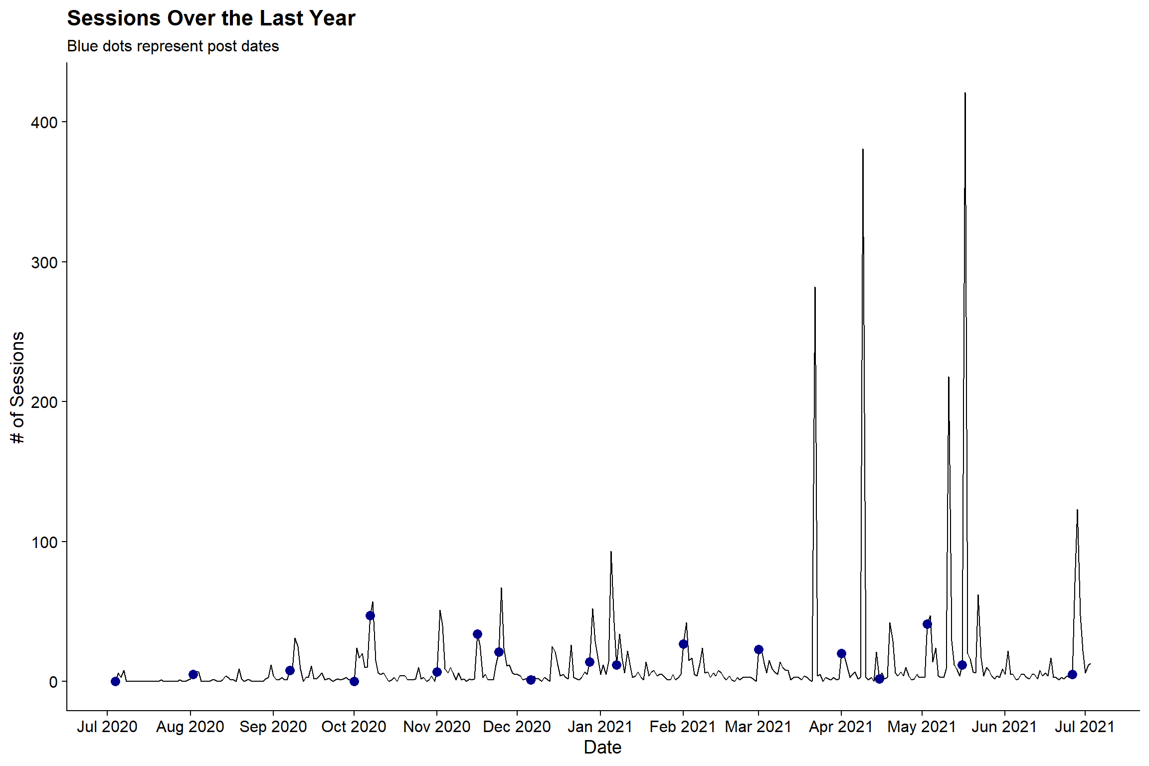
Based on the post dates (blue dotes), it does not seem like post dates correlate to the highest volume. While there are some peaks on post days, particularly in March through July, there are a number of large spikes that occur a bit after the posting dates.
Looking at Monthly Active Users
For whatever reason I thought I would be cool to have 1,000 monthly active users on the blog (1,000 unique visitors in a 30 day period). Given that there were only 3,081 throughout the course of the year it doesn’t seem likely that I made this goal. But fortunately we don’t have to guess:
mau <- google_analytics(view_id,
                           date_range = c(start_date, end_date),
                           metrics = c("30dayUsers"),
                           dimensions = c("date"),
                           anti_sample = TRUE
)

mau %>%
  ggplot(aes(x = date, y = `30dayUsers`)) +
  geom_line(color = wes_palette('Moonrise2', n=1, 'discrete')) +
  geom_smooth(se = F, lty = 2, color = wes_palette('BottleRocket1', 1)) +
  labs(x = "Date", y = "# of Sessions",
       title = "Monthly Active Users (30 Days)",
       subtitle = "Smoothed Line in Red") +
  cowplot::theme_cowplot()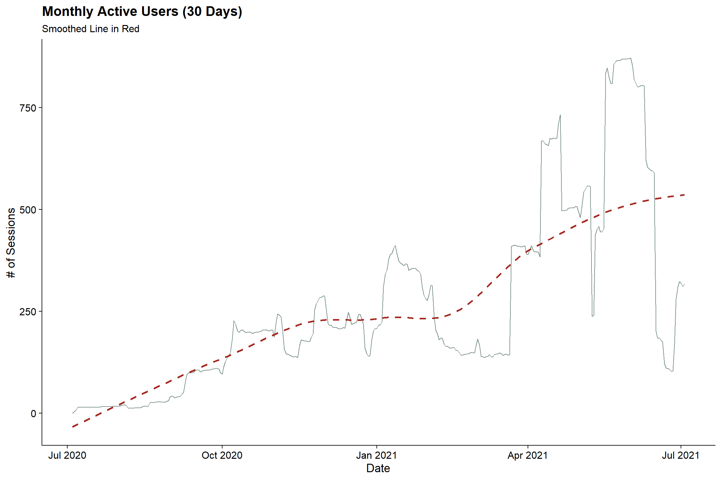
The blog definitely became more popular in April (awesome). But sadly, the monthly active user count topped out at at 872 😢. Better luck in 2021-2022.
Days of the Week
Next up is looking at the number of sessions split by days of the week. Just for fun here, I’ll utilize the gghalves package which allows you to create hybrid geoms. In this case, I’ll make a half box plot, half point plot to be able to show the distribution in box plot form but also get a better idea of the actual distribution from the points. The side parameter tells the function to plot on the left or right half.
Since most days have very few sessions, the plot is set to a log10 scale
sessions_dow <- google_analytics(view_id,
                                date_range = c(start_date, end_date),
                                metrics = c("sessions"),
                                dimensions = c("Date", "dayOfWeekName"),
                                anti_sample = TRUE
)

sessions_dow %>%
  # Code the text labels to a Factor
  mutate(dayOfWeekName = factor(dayOfWeekName,
                                levels = c('Sunday', 'Monday', 'Tuesday',
                                           'Wednesday', 'Thursday', 'Friday',
                                           'Saturday'))) %>%
  ggplot(aes(x = dayOfWeekName, y = sessions, fill = dayOfWeekName)) +
    geom_half_boxplot(side = 'l', outlier.shape = NA) +
    geom_half_point(side = 'r', aes(color = dayOfWeekName)) +
    labs(title = 'What is the Day of Week Distribution of Sessions?',
         x = "Day of Week",
         y = "Sessions") +
    scale_y_log10() +
    scale_fill_manual(guide = 'none',
                      values = wes_palette('Zissou1', n =7, type = 'continuous')) +
    scale_color_manual(guide = 'none',
                       values = wes_palette('Zissou1', n =7, type = 'continuous')) +
    cowplot::theme_cowplot()
It seems like Monday is the most popular day and then there’s a slight decline throughout the rest of the week. The median number of sessions for the weekdays are all fairly similar but there is a higher ceiling for Monday, Tuesday, Wednesday than there is for Thurs and Friday.
Sources and Pages
I don’t do I ton of promotion of the blog but I am very interested in knowing how people are getting to the site as well as what pages people gravitated to the most.
How are people getting to the Site?
Google Analytics provides the referral source for site visitors. Let’s take a look at the top 10 referral sources to the site:
sources <- google_analytics(view_id,
                               date_range = c(start_date, end_date),
                               metrics = c("sessions"),
                               dimensions = c("source"),
                               anti_sample = TRUE
)

sources %>%
  mutate(pct = sessions / sum(sessions)) %>%
  #Get top 10 rows by session value
  slice_max(sessions, n = 10) %>%
  ggplot(aes(x = fct_reorder(source, sessions),
             y = sessions,
             fill = source)) +
  geom_col() +
  geom_text(aes(label = paste0(sessions %>% comma(accuracy = 1), ' (',
                               pct %>% percent(accuracy = .1), ')')),
            nudge_y = 80) +
  scale_y_continuous(expand = c(0, 0)) +
  scale_fill_manual(guide = 'none',
                    values = wes_palette('FantasticFox1', n=10, 'continuous')) +
  labs(x = "Referral Sources", y = "# of Sessions",
       title = "Where Did People Visiting the Blog Come From?") +
  coord_flip(ylim = c(0, 1600)) +
  cowplot::theme_cowplot() +
  theme(
    plot.title.position = 'plot'
  )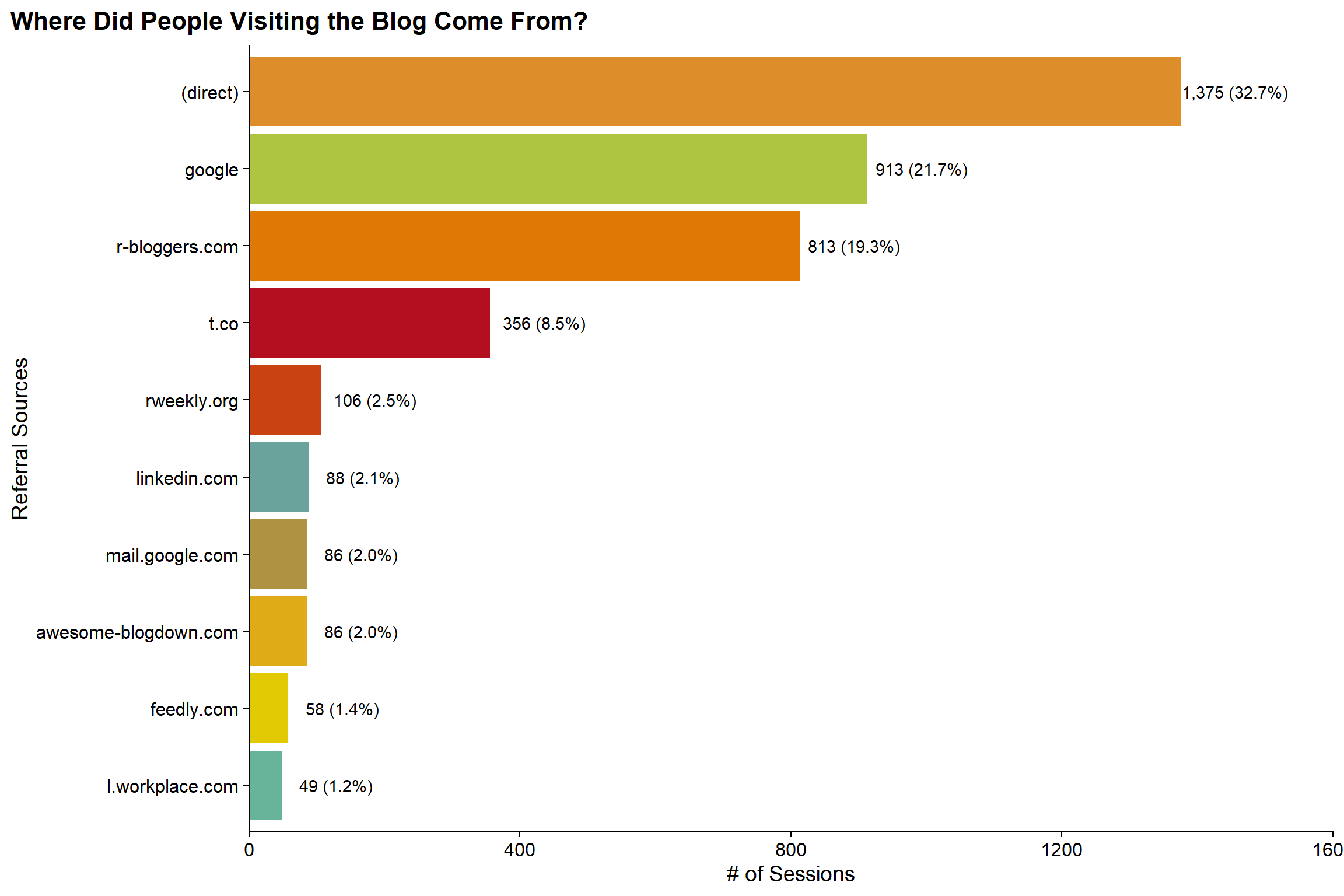
Somewhat surprising to me is that nearly a third of sessions are direct to the site and another 20% are from Google. Given that I think R-Bloggers is probably my primary mechanism of promotion, I’m not surprised that its in the Top 3, but kindof surprised that it is #3. It is also kindof cool to see referrals from rweekly.org and linkedin where I don’t know exactly how my blog is popping up.. but happy that it is!
What are the Most Visited Posts on the Site?
One of the most obvious questions for this post is what prior post generated the most views. Because there are non-post pages on the site (such as the home page), I’ll need to do some cleaning to keep only the actual posts. But then we can look at the top 10 posts by page views.
top_pages <- google_analytics(view_id,
                               date_range = c(start_date, end_date),
                               metrics = c("pageviews"),
                               dimensions = c("pageTitle"),
                               anti_sample = TRUE
)

top_pages %>%
  # Remove that all page titles end in | Jlaw's R Blog
  mutate(pageTitle = str_remove_all(pageTitle, " \\| JLaw's R Blog")) %>%
  # Remove the Main Post Page, the Home Page, and Unknown Pages
  filter(!pageTitle %in% c('(not set)', "JLaw's R Blog", "Posts")) %>%
  # Keep the Top 10 By Page Views
  slice_max(pageviews, n = 10) %>%
  ggplot(aes(x = fct_reorder(str_wrap(pageTitle, 75), pageviews),
             y = pageviews,
             fill = pageTitle)) +
  geom_col() +
  geom_text(aes(label = pageviews %>% comma(accuracy = 1)),
            hjust = 1) +
  scale_fill_discrete(guide = F) +
  scale_y_continuous(expand = c(0, 0)) +
  labs(x = "", y = "# of Users",
       title = "Most Popular Posts") +
  coord_flip() +
  cowplot::theme_cowplot() +
  theme(
    plot.title.position = 'plot'
  )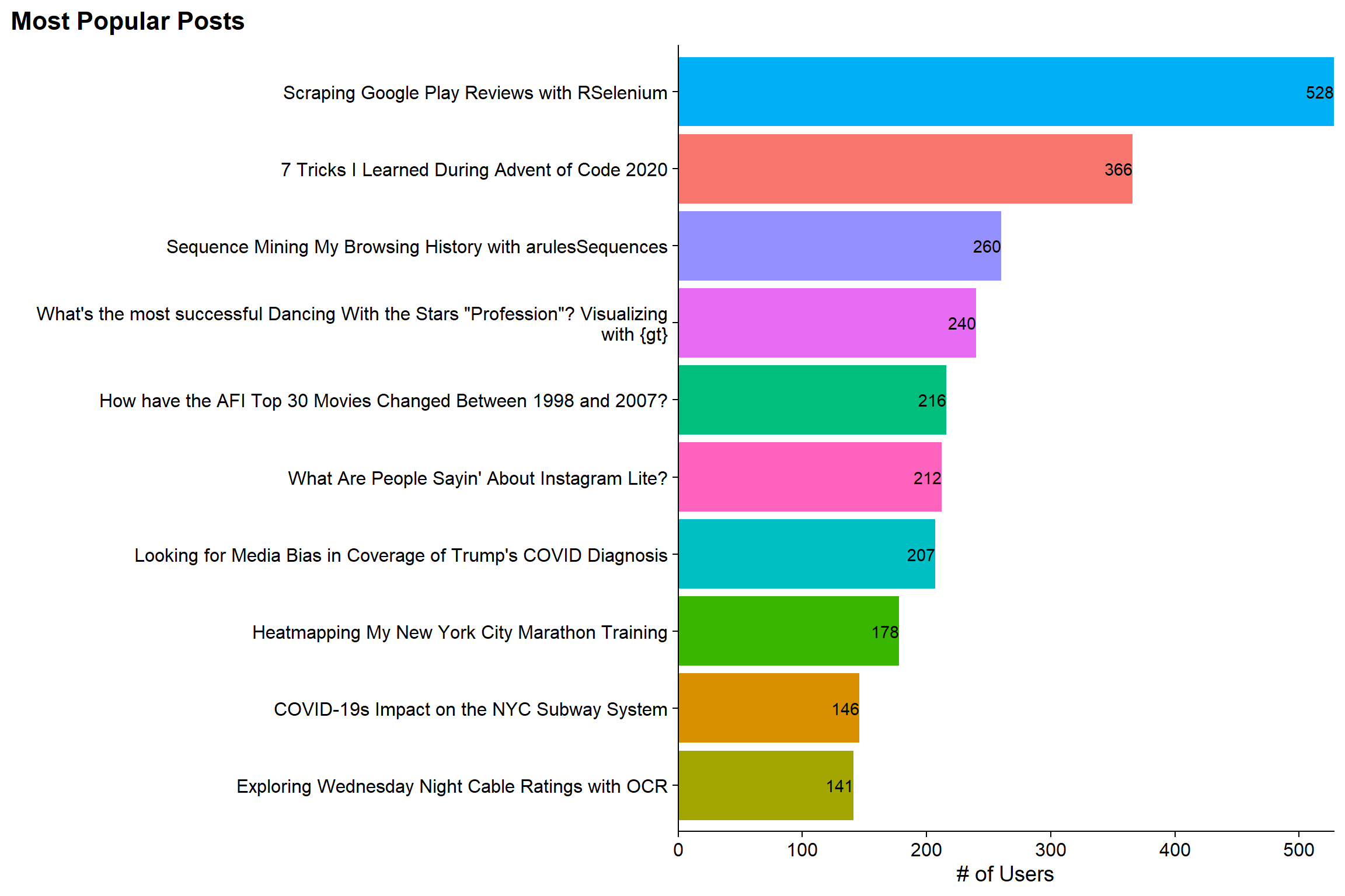
I’m not surprised that the “Scraping the Google Play Store with RSelenium” is the Top Post on the site as it got picked up by at least one other website that I was aware of. Also, as far as I know its not a very common topic. Similarly, my post on arulesSequence isn’t surprising as that’s an interesting package with not a ton of blog posts about it. However, I did not realize that the “7 Things I Learned During Advent of Code 2020” was as popular as it was. And finally, it makes me kindof happy that the Visualizing Dancing with the Stars winners with gt was number 4. I really like that post and Hugo (how I generate this site) got really confused and claims that the reading time is an hour when it is much shorter. So I’m happy that people weren’t too scared off.
HOWEVER, while its good to know which are the most popular posts in general. Some of these posts are older than others and have had more of a chance to generate page views than others. For example, the Instagram Lite post is from late June while the Advent of Code post is from December. To counter this, I can look at the cumulative number of page views from the first page view date. Then we can see which post is accumulating views the fastest. To this, I’m going to create a static ggplot but then use ggplotly to make it interactive:
pages_by_time <- google_analytics(view_id,
                                  date_range = c(start_date, end_date),
                                  metrics = c("pageviews"),
                                  dimensions = c("date", "pageTitle"),
                                  anti_sample = TRUE
)

p <- pages_by_time %>%
  filter(pageTitle != '(not set)') %>%
  #Filter out pages with less than 50 pageviews
  add_count(pageTitle, wt = pageviews, name = "total_views") %>%
  filter(total_views >= 50) %>%
  # Calculate Days Since Post and Cumulative Number of Views
  group_by(pageTitle) %>%
  arrange(pageTitle, date) %>%
  mutate(
    min_date = min(date),
    days_since_post = date - min(date),
    cuml_views = cumsum(pageviews)) %>%
  ungroup() %>%
  #The text aesthetic allows me to add that field into the tooltip for plotly
  ggplot(aes(x = days_since_post, y = cuml_views, color = pageTitle, text = min_date)) +
    geom_line() +
    coord_cartesian(xlim = c(0, 100), ylim = c(0, 550)) +
    labs(title = "Which Posts Got the Views the Fastest?",
         subtitle = "First 100 Days Since Post Date",
         y = "Cumulative Page Views",
         x = "Days Since Post Date") +
    cowplot::theme_cowplot() +
    # This will work with Plotly while scale_color_discrete(guide = F) will not
    theme(legend.position='none')

# Create Interactive Version of GGPLOT
ggplotly(p)
Now its a little clearer to see the bump that the RSelenium post got around day 8 that shot it to most popular. Also, the Instagram Lite post at 8 days since publishing is actually the most viewed for a Day 8. However, its trajectory is beginning to flatten and while it seems like it will be one of the more popular ones, it doesn’t seem like it will catch RSelenium.
What Countries are People Visiting The Site From?
The blog was visited by users from 134 countries throughout the year, which is pretty crazy to think about. We can look at the distribution of countries by users to see whether the blog is most popular in the US (which is expected) or if it has a stronger than expected International appeal. To add some pizzazz to the graph, I’ll use the countrycode package to convert the country names into two-letter codes and then use ggflag to add the flags to the plot (note that geom_flag works by having a country aesthetic set).
users_by_country <- google_analytics(view_id,
                               date_range = c(start_date, end_date),
                               metrics = c("users"),
                               dimensions = c("country"),
                               anti_sample = TRUE
)

users_by_country %>%
  filter(country != '(not set)') %>%
  #Get % Column and Recode Countries to the iso2c standard
  mutate(pct = users/sum(users),
         code = str_to_lower(countrycode(country,
                                         origin = 'country.name.en',
                                         destination = 'iso2c')
                             )
         ) %>%
  # Get Top 10 Countries by # of Users
  slice_max(users, n = 10) %>%
  ggplot(aes(x = fct_reorder(country, users),
             y = users,
             fill = country,
             country = code)) +
    geom_col() +
    geom_text(aes(label = paste0(users %>% comma(accuracy = 1),
                                 ' (', pct %>% percent(accuracy = .1), ')')),
              nudge_y = 50) +
    geom_flag(y = 30, size = 15) +
    scale_fill_discrete(guide = F) +
    scale_y_continuous(expand = c(0, 0)) +
    labs(x = "Country", y = "# of Users",
         title = "Where Did Users Come From?") +
    coord_flip(ylim = c(0, 1100)) +
    cowplot::theme_cowplot()
As expected the US is where the most users are location with close to 30% of all users. However, what’s a bit surprising is that 70% of the users are NOT from the US. And in the Top 10 countries there’s a pretty good representation across the continents with North America, South America, Europe, Asia, and Australia all represented (Africa gets its first representation at #29 with Nigeria).
Concluding Thoughts
First and foremost, thank you to everyone who has supported the blog by reading it over the past year. This really did start out as a small hobby for myself during COVID but I hope that others have found some value in the various posts. For this post in particular, I hope it displays all the things you can find within Google Analytics. For me personally, it made me happy to take this post to reflect on the first year of the blog and see the reach that a single person doing this in their spare time can have. So again, thank you all and onto Year 2 (and another shot at that 1000 Monthly Active User Goal!!)