Exploring Wednesday Night Cable Ratings with OCR

One of my guilty pleasure TV shows is MTV’s The Challenge. Debuting in the late 90s, the show pitted alumni from The Real World and Road Rules against each other in a series of physical events. Now on its 36th season, its found new popularity by importing challengers from other Reality Shows, in the US and Internationally, regularly topping Wednesday Night ratings in the coveted 18-49 demographic.
Looking at the Ratings on showbuzzdaily.com shows that the Challenge was in fact #1 in this demographic. However, it also scores incredibly low on the 50+ demo.
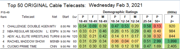
So I figured that exploring the age and gender distributions of Wednesday Night Cable ratings would be interesting. The only caveat is… the data exists in an image.
So for this blog post, I will be extracting the ratings data from the image and doing some exploration on popular shows by age and gender.
Also, huge thanks to Thomas Mock and his The Mockup Blog for serving as a starting point for learning magick.
Using magick to process image data
I’ll be using the magick package to read in the image and do some processing to clean up the image. Then I will use the ocr() function from the tesseract package to actual handle extraction of the data from the image.
library(tidyverse) #Data Manipulation
library(magick) #Image Manipulation
library(tesseract) #Extracting Text from the Image
library(patchwork) #Combining Multiple GGPLOTs Together
The first step is reading in the raw image from the showbuzzdaily.com website which can be done through magick’s image_read() function.
raw_img <- image_read("http://www.showbuzzdaily.com/wp-content/uploads/2021/02/Final-Cable-2021-Feb-03-WED.png")

image_ggplot(raw_img)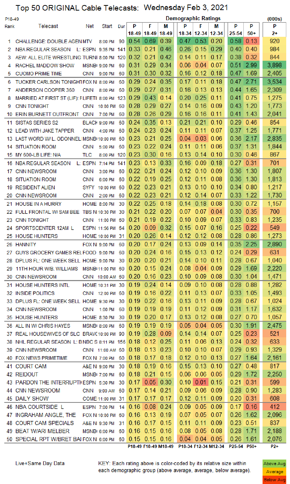
The next thing to notice is that while most of the data does exist in a tabular format, there are also headers and footers that don’t follow the tabular structure. So I’ll use image_crop() to keep only the tabular part of the image. The crop function uses a geometry_area() helper function which takes in four parameters. I struggled a bit with the documentation figuring out exactly how to get this working right but eventually internalized geometry_area(703, 1009, 0, 91) as “crop out 703 pixels of width and 1009 pixels of height starting from X-position on the left boundary and y-position 91 pixels from the top”.
chopped_image <-
  raw_img %>%
  #crop out width:703px and height:1009px starting +91px from the top
  image_crop(geometry_area(703, 1009, 0, 91))

image_ggplot(chopped_image)
Now the non-tabular data (header and footer) have been removed.
The ocr() algorithm that will handle extracting the data from the image can struggle with parts of the image as is. For example, it might think the color boundary between white and green is a character. Therefore, I’m going to try to do the best I can do clean up the image so that the ocr() function can have an easier time. Ultimately this required a lot of guess and check but in the end, I only did two steps for cleaning:
- Running a morphology method over the image to remove the horizontal lines separating each group of 5 shows (this required negating the colors of the image so that the filter would have an easier time since white is considered foreground by default). The morphology method modifies an image based on the neighborhood of pixels around it and thinning is subtracting pixels from a shape. So by negating the color the method turns “non-black” pixels to black. Then re-negating turns everything back to “white”.
- Turning everything to greyscale to remove remaining colors.
I had tried to remove the color gradients, but it took much more effort and was ultimately not more effective than just going to greyscale.
processed_image <- chopped_image %>%
  image_negate() %>% #Flip the Colors
  # Remove the Horizontal Lines
  image_morphology(method = "Thinning", kernel = "Rectangle:7x1") %>%
  # Flip the Colors back to the original
  image_negate() %>%
  # Turn colors to greyscale
  image_quantize(colorspace = "gray")


image_ggplot(processed_image)
Extracting the Data with OCR
Because I can be lazy, my first attempts at extraction was just to run ocr() on the processed image and hope for the best. However, the best was somewhat frustrating. For example,
ocr(processed_image) %>%
  str_sub(end = str_locate(., '\\n')[1])
## [1] "1 CHALLENGE: DOUBLE AGENMTV e:00PM 90/0.54 069 0.39 |047 053 0.20 |058 013} 920\n"Just looking at the top row there are a number of issues that come from just using ocr() directly on the table. The boundary between sections are showing up as “|” or “/” and sometime the decimal doesn’t appear.
Fortunately the function allows you to “whitelist” characters in order to nudge the algorithm on what it should expect to see. So rather than guess and check on the processing of the image to make everything work perfectly. I’ll write a function that allows me to crop to individual columns and specify the proper whitelist for each column.
ocr_text <- function(col_width, col_start, format_code){

  ##For Stations Which Are Only Characters
  only_chars <- tesseract::tesseract(
    options = list(
      tessedit_char_whitelist = paste0(LETTERS, collapse = '')
    )
  )

  #For Titles Which Are Letters + Numbers + Characters
  all_chars <- tesseract::tesseract(
    options = list(
      tessedit_char_whitelist = paste0(
        c(LETTERS, " ", ".0123456789-()/"), collapse = "")
    )
  )

  #For Ratings which are just numbers and a decimal point
  ratings <- tesseract::tesseract(
    options = list(
      tessedit_char_whitelist = "0123456789 ."
    )
  )

  #Grab the Column starting at Col Start and with width Col with
  tmp <- processed_image %>%
    image_crop(geometry_area(col_width, 1009, col_start, 0))

  # Run OCR with the correct whitelist and turn into a dataframe
  tmp %>%
    ocr(engine = get(format_code)) %>%
    str_split("\n") %>%
    unlist() %>%
    enframe() %>%
    select(-name) %>%
    filter(!is.na(value), str_length(value) > 0)
}
The function above takes in a column width and a column start to crop the column and then a label to choose the whitelist for each specific column. The parameters are defined in a list and passed into purrr’s pmap() function. Finally, all the extracted columns will combined together.
#Run the function all the various columns
all_ocr <- list(col_width = c(168, 37, 33, 34, 35, 34),
                col_start = c(28, 196, 307, 346, 385, 598),
                format_code = c("all_chars", 'only_chars', rep("ratings", 4))) %>%
  pmap(ocr_text)

#Combine all the columns together and set the names
ratings <- all_ocr %>%
  bind_cols() %>%
  set_names(nm = "telecast", "network", "p_18_49", "f_18_49", "m_18_49",
            'p_50_plus')
Final Cleaning
Even with the column specific specifications the ocr() function did not get everything right. Due to the font, it has particular trouble distinguishing between 1s and 4s as well as 8s and 6s. Additionally, sometimes the decimal was still missed. And since all networks were truncated in the original image, I just decided to manually recode.
ratings_clean <- ratings %>%
  #Fix Things where the decimal was missed
  mutate(across(p_18_49:p_50_plus, ~parse_number(.x)),
         across(p_18_49:p_50_plus, ~if_else(.x > 10, .x/100, .x)),
         #1s and 4s get kindof screwed up; same with 8s and 6s
         p_50_plus = case_when(
           telecast == 'TUCKER CARLSON TONIGHT' ~ 2.71,
           telecast == 'SISTAS SERIES S2' ~ 0.46,
           telecast == 'LAST WORD W/L. ODONNEL' ~ 2.17,
           telecast == 'SITUATION ROOM' & p_50_plus == 1.34 ~ 1.31,
           telecast == 'MY 600-LB LIFE NIA' ~ 0.46,
           TRUE ~ p_50_plus
         ),
         #Clean up 'W/' being read as 'WI' and '11th' as '44th'
         telecast = case_when(
           telecast == '44TH HOUR WIB. WILLIAMS' ~ '11TH HOUR W/B. WILLIAMS',
           telecast == 'ALLIN WI CHRIS HAYES' ~ 'ALL IN W/ CHRIS HAYES',
           telecast == 'BEAT WIARI MELBER' ~'BEAT W/ARI MELBER',
           telecast == 'SPORTSCENTER 124M L' ~ 'SPORTSCENTER 12AM',
           telecast == 'MY 600-LB LIFE NIA' ~ 'MY 600-LB LIFE',
           TRUE ~ telecast
         ),
         # Turn to Title Case
         telecast = str_to_title(telecast),
         # Clean up random characters
         telecast = str_remove(telecast, ' [L|F|S2|L B]+$'),
         #Clean up Network
         network = factor(case_when(
           network == 'TURNI' ~ "TNT",
           network == 'MSNBI' ~ "MSNBC",
           network == 'FOXN' ~ "FoxNews",
           network == 'LIFETI' ~ "Lifetime",
           network == 'BLACK' ~ 'BET',
           network %in% c('AEN', 'AGEN') ~ 'A&E',
           network == 'BRAVC' ~ 'BRAVO',
           network == 'COME' ~ 'COMEDY CENTRAL',
           network == 'NECS' ~ 'NBC SPORTS',
           network == 'TBSN' ~ 'TBS',
           network == 'TL' ~ 'TLC',
           TRUE ~ network
         ))
  )

knitr::kable(head(ratings_clean, 3))| telecast | network | p_18_49 | f_18_49 | m_18_49 | p_50_plus |
|---|---|---|---|---|---|
| Challenge Double Agen | MTV | 0.54 | 0.69 | 0.39 | 0.13 |
| Nba Regular Season | ESPN | 0.33 | 0.21 | 0.46 | 0.40 |
| Aew All Elite Wrestling | TNT | 0.32 | 0.21 | 0.42 | 0.32 |
Now everything should be ready for analysis.
Analysis of Cable Ratings
The decimals in the table for cable ratings refer to the percent of the population watching the show. For instance the p_18_49 field’s value of 0.54 means that 0.54% of the US 18-49 population watched The Challenge on February 3rd.
The Most Popular Shows on Wednesday Night Overall 18-49 and By Gender
The first question is what are the most popular shows for the 18-49 demographic for combined genders and broken apart by gender. These types of combined plots uses the patchwork package to combine the three ggplots into a single plot using a common legend.
##Create Fixed Color Palette For Networks
cols <- scales::hue_pal()(n_distinct(ratings_clean$network))
names(cols) <- levels(ratings_clean$network)

##Top Show By the Key Demo (Combined)
key_all <- ratings_clean %>%
  slice_max(p_18_49, n = 10) %>%
  ggplot(aes(x = fct_reorder(telecast, p_18_49), y = p_18_49, fill = network)) +
    geom_col() +
    geom_text(aes(label = p_18_49 %>% round(2)), nudge_y = 0.015) +
    scale_y_continuous(expand = expansion(mult = c(0, .1))) +
    scale_fill_manual(values = cols) +
    labs(x = "", title = "All Genders", y = '', fill = '') +
    coord_flip() +
    cowplot::theme_cowplot() +
    theme(
      axis.text.x = element_blank(),
      axis.ticks = element_blank(),
      axis.line.x = element_blank(),
      plot.title.position = 'plot'
    )

#Male Ratings only
key_male <- ratings_clean %>%
  slice_max(m_18_49, n = 5) %>%
  ggplot(aes(x = fct_reorder(telecast, m_18_49), y = m_18_49, fill = network)) +
  geom_col() +
  geom_text(aes(label = m_18_49 %>% round(2)), nudge_y = .045) +
  scale_y_continuous(expand = expansion(mult = c(0, .1))) +
  scale_fill_manual(values = cols, guide = F) +
  labs(x = "", title = "Male", y = '') +
  coord_flip() +
  cowplot::theme_cowplot() +
  theme(
    axis.text.x = element_blank(),
    axis.ticks = element_blank(),
    axis.line.x = element_blank(),
    plot.title.position = 'plot'
  )

# Female rating only
key_female <- ratings_clean %>%
  slice_max(f_18_49, n = 5) %>%
  ggplot(aes(x = fct_reorder(telecast, f_18_49), y = f_18_49, fill = network)) +
  geom_col() +
  geom_text(aes(label = f_18_49 %>% round(2)), nudge_y = .065) +
  scale_y_continuous(expand = expansion(mult = c(0, .1))) +
  scale_fill_manual(values = cols, guide = F) +
  labs(x = "", title = "Female", y = '') +
  coord_flip() +
  cowplot::theme_cowplot() +
  theme(
    axis.text.x = element_blank(),
    axis.ticks = element_blank(),
    axis.line.x = element_blank(),
    plot.title.position = 'plot'
  )

# Combining everything with patchwork syntax
key_all / (key_male | key_female) +
  plot_layout(guides = "collect") +
  plot_annotation(
    title = "**Wednesday Night Cable Ratings (Feb 3rd, 2021)**",
    caption = "*Source:* Showbuzzdaily.com"
  ) & theme(legend.position = 'bottom',
            plot.title = ggtext::element_markdown(size = 14),
            plot.caption = ggtext::element_markdown())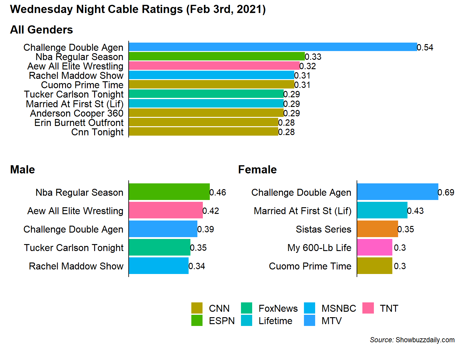
From the chart its clear that the Challenge is fairly dominant in the 18-49 Demographic with 0.21% (or 1.63x) higher than the 2nd highest show. Although while the Challenge is popular with both genders its the most popular show among 18-49 Females but only 3rd for 18-49 Males after a NBA game and AEW Professional Wrestling.
Also, because the networks for My 600-lb Life (TLC) and Sistas (BET) weren’t in the overall top 10 I couldn’t figure out how to include them in the legend. If anyone has any ideas, please let me know in the comments.
The Most Male-Dominant, Female Dominant, and Gender-Balanced Shows
From the above chart its clear that some shows skew Male (sports) and some skew Female (reality shows like Married at First Sight, My 600-lb Life, and Real Housewives). But I can look at that more directly by comparing the ratios the Female 18-49 rating to the Male 18-49 rating to determine the gender skew of each show. I break the shows into categories of Male Skewed, Female Skewed, and Balanced (where the Female/Male Ratio is closest to 1).
##Female / Male Ratio for Key Demo
bind_rows(
  ratings_clean %>%
    mutate(f_m_ratio = f_18_49 / m_18_49) %>%
    slice_max(f_m_ratio, n = 5),
  ratings_clean %>%
    mutate(f_m_ratio = f_18_49 / m_18_49) %>%
    slice_min(f_m_ratio, n = 5),
  ratings_clean %>%
    mutate(f_m_ratio = f_18_49 / m_18_49,
           balance = abs(1-f_m_ratio)) %>%
    slice_min(balance, n = 5)
) %>%
  mutate(balance = f_m_ratio-1) %>%
  ggplot(aes(x = m_18_49, y = f_18_49, fill = balance)) +
    ggrepel::geom_label_repel(aes(label = telecast)) +
    geom_abline(lty = 2) +
    scale_fill_gradient2(high = '#8800FF',mid = '#BBBBBB', low = '#02C2AD',
                         midpoint = 0, guide = F) +
    labs(title = "Comparing 18-49 Demographics by Gender",
         subtitle = 'Cable Feb 3rd, 2021',
         caption = "*Source:* showbuzzdaily.com",
         x = "Males 18-49 Ratings",
         y = "Females 18-49 Ratings") +
    cowplot::theme_cowplot() +
    theme(
      plot.title.position = 'plot',
      plot.caption = ggtext::element_markdown()
    )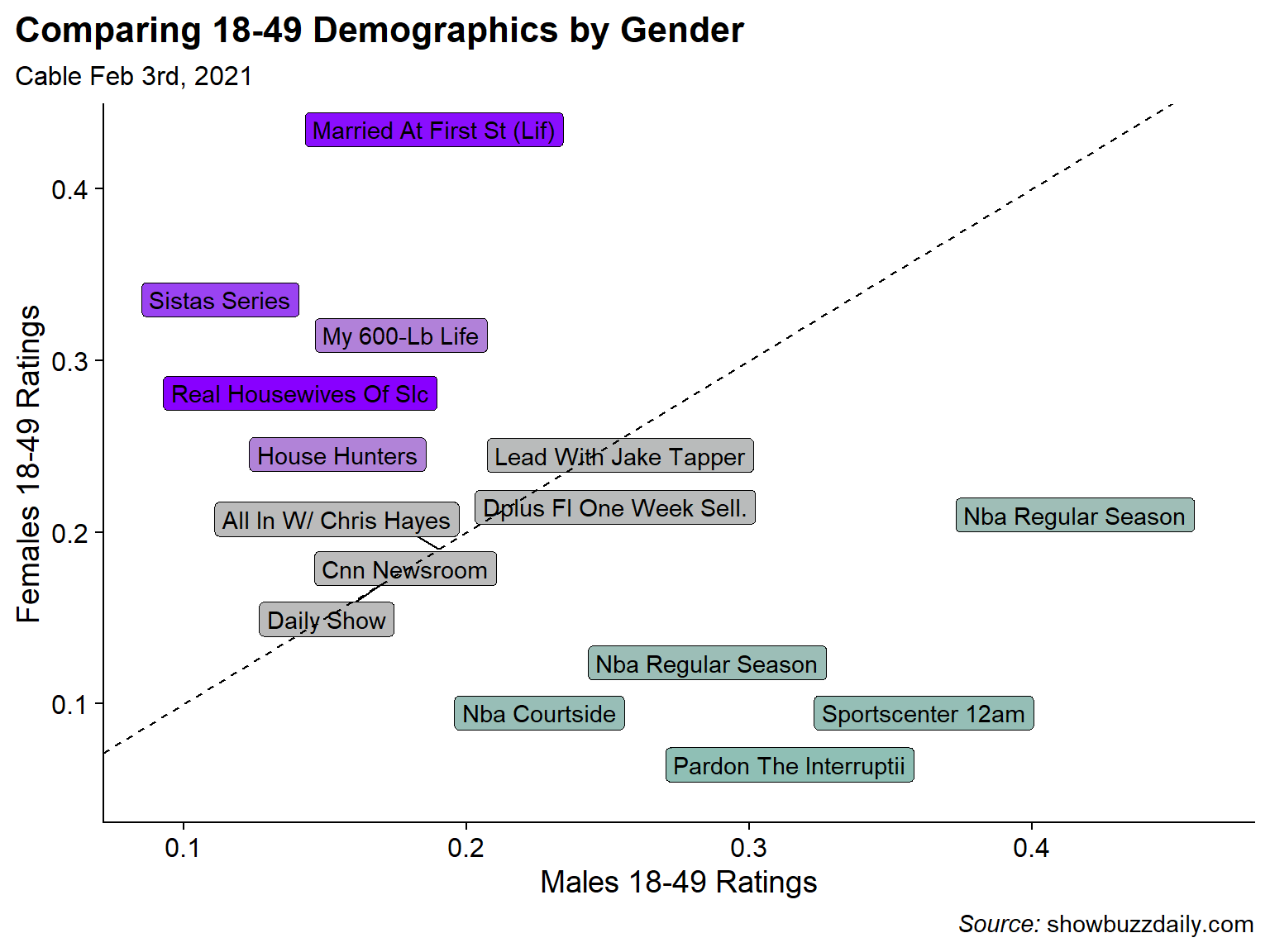
Sure enough the most Male dominated shows are sport-related with 2 NBA Games, an NBA pre-game show, an episode of Sportscenter, and a sports talking heads show. Female skewed shows are also not surprising with Married at First Sight, Sistas, My 600-lb Life, and Real Housewives of Salt Lake City topping the list. For the balanced category, I did not have much of an expectation but all the programs seems to be News shows or news adjacent like the Daily Show… which I guess makes sense.
Most Popular Shows for the 50+ Demographic
Turning away from the 18-49 demographic I can also look at the most popular shows for the 50+ demographic. Unfortunately, there is not a 50+ gender breakdown so I can only look at the overall.
ratings_clean %>%
  slice_max(p_50_plus, n = 10) %>%
  ggplot(aes(x = fct_reorder(telecast, p_50_plus), y = p_50_plus,  fill = network)) +
  geom_col() +
  geom_text(aes(label = p_50_plus %>% round(2)), nudge_y = 0.15) +
  scale_y_continuous(expand = expansion(mult = c(0, .1))) +
  labs(x = "", title = "Top 10 Cable Shows for the 50+ Demographic",
       y = '',
       subtitle = "Wednesday, Feb 3rd 2021",
       caption = "*Source:* Showbuzzdaily.com",
       fill = '') +
  coord_flip() +
  cowplot::theme_cowplot() +
  theme(
    axis.text.x = element_blank(),
    axis.ticks = element_blank(),
    axis.line.x = element_blank(),
    plot.title.position = 'plot',
    plot.caption = ggtext::element_markdown(),
    legend.position = 'bottom'
  )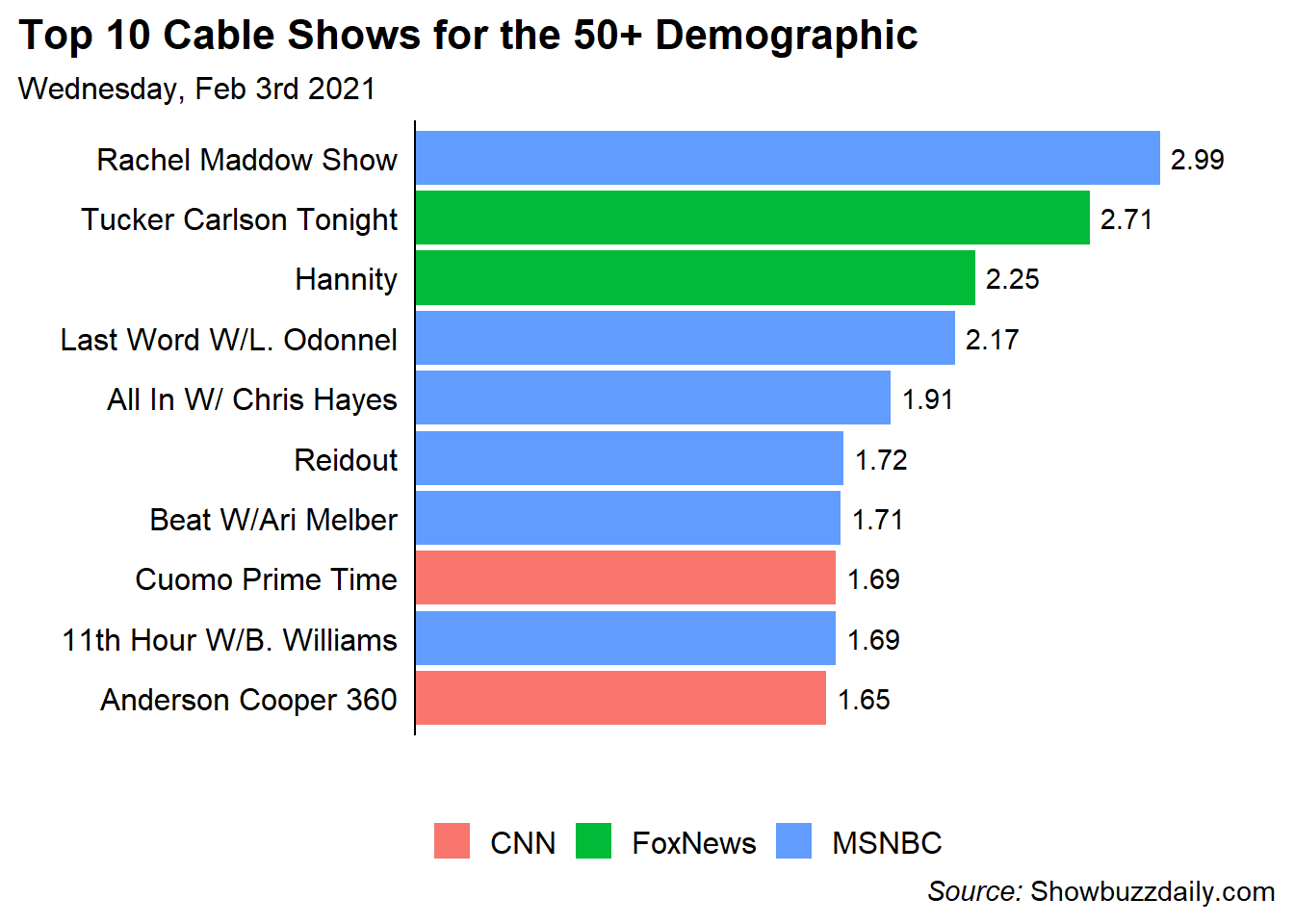
Interestingly in the 50+ Demo, ALL of the shows are News shows and they only come from 3 networks. Two on CNN, Two on Fox News, and 6 on MSNBC. Again, didn’t have a ton of expectation but it was surprising to be how homogeneous the 50+ demographic was.
The Oldest and Youngest Shows in the Top 50
Similar to the Most Male and Most Female shows in the Top 50 Cable Programs, I’d like to see which shows skew older vs. younger. To do this, I’ll rank order the 18-49 demo and the 50+ demo and plot the ranks against each other. Now there are some massive caveats here in the sense that my data is the Top 50 shows by the 18-49 demo, so its not clear that the 50+ demo is fully represented. Additionally, popularity for each dimension is relative since I don’t know the actual number of people in each demo. Finally, since both scales are ranked, it won’t show the full distance between levels of popularity (e.g, The Challenge is much more popular than the next highest show for 18-49). This was done to produce a better looking visualization.
I had run a K-means clustering algorithm for text colors to make differences more appearant. There isn’t much rigor to this beyond my assumption that 5 clusters would probably make sense (1 for each corner and 1 middle).
#Rank Order the Shows for the 2 Columns
dt <- ratings_clean %>%
  transmute(
    telecast,
    young_rnk = min_rank(p_18_49),
    old_rnk = min_rank(p_50_plus),
  )

# Run K-Means Clustering Algorithm
km <- kmeans(dt %>% select(-telecast),
             centers = 5, nstart = 10)

#Add the cluster label back to the data
dt2 <- dt %>%
  mutate(cluster = km$cluster)

#Plot
ggplot(dt2, aes(x = young_rnk, y = old_rnk, color = factor(cluster))) +
  ggrepel::geom_text_repel(aes(label = telecast), size = 3) +
  scale_color_discrete(guide = F) +
  scale_x_continuous(breaks = c(1, 50),
                     labels = c("Less Popular", "More Popular")) +
  scale_y_continuous(breaks = c(13, 54),
                     labels = c("Less Popular", "More Popular")) +
  coord_cartesian(xlim = c(-2, 54), ylim = c(0, 52)) +
  labs(x = "Popularity Among 18-49",
       y = "Popularity Among 50+",
       title = "Visualizing Popularity of Wednesday Night Cable by Age",
       subtitle = "Comparing 18-49 vs. 50+") +
  cowplot::theme_cowplot() +
  theme(
    axis.ticks = element_blank(),
    axis.line = element_blank(),
    axis.text.y = element_text(angle = 90),
    panel.background = element_rect(fill = '#EEEEEE')

  )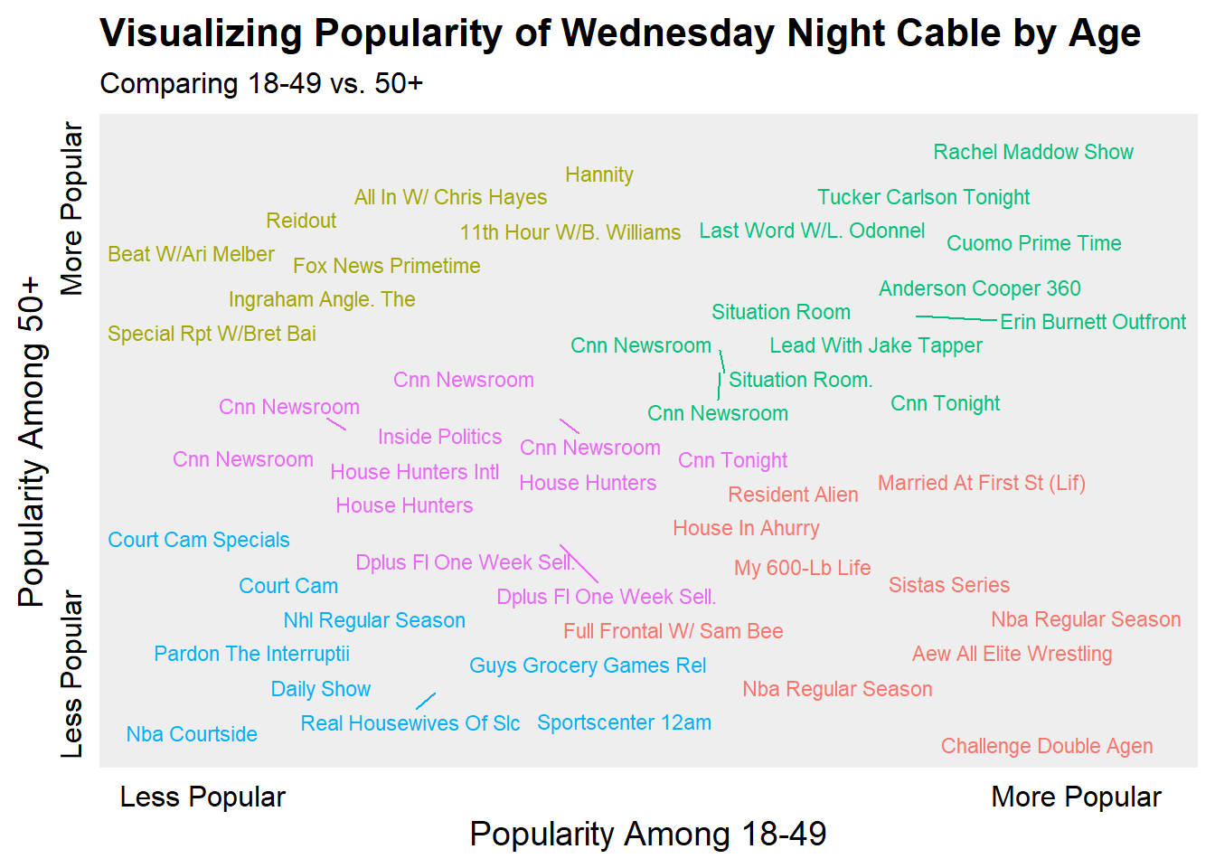
Somewhat surprising (at least to me), that Rachel Maddow and Tucker Carlson are the consensus most popular shows across the two demos. My beloved Challenge is very popular amongst the 18-49 demo and very unpopular among 50+. Sports shows tended to be generally the least popular by either demo and finally certain MSNBC and Fox News shows were popular among the 50+ demo but not the 18-49.
Concluding Thoughts
While I still love The Challenge and am happy for its popularity, its best time was probably about 10 years ago (sorry not sorry). As far as the techniques in this post are concerned, I found extracting the data from an image to be an interesting challenge (no pun intended) but if the table was a tractable size I would probably manually enter the data rather than go through this again. Getting the data correct required a lot of guess and check for working with magick and tesseract.
As for the analysis, I guess its good when things go as expected (most popular shows by gender follow stereotypical gender conventions) but I think the most surprising thing to me was how much cable news dominated the 50+ Demographic…. and I guess the Daily Show is not as popular as I thought it would be.